

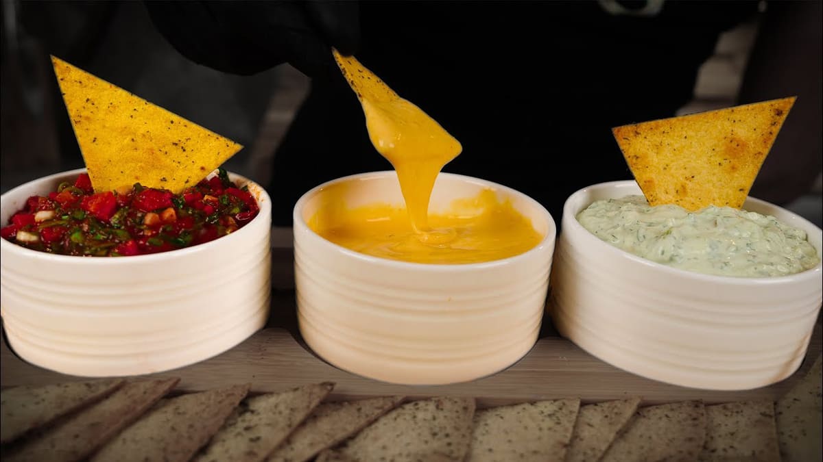
In the present world, it is difficult to get by without a variety of snacks. The younger generation is fond of these scrumptious energy sources. Along with the chips with different flavors, there are plenty of dips that can go with them and enhance the whole experience.
Few people are aware that in 1853, chips were invented entirely by accident. American businessman Cornelius Vanderbilt ordered French fries for dinner at a hotel in New York. He didn’t enjoy the dish, so the picky millionaire requested that the server bring him new potatoes that were cut thinner. In turn, Chef George Crum thinly sliced the potatoes and deep-fried them in oil until crispy.
What are the Most Popular Chips?
When choosing chips school when you and your friends are watching a movie, playing games, or taking a hike, it might be hard to make a decision. They come in a wide variety of flavors: onions, barbecue, hot pepper, cheese, and endless other varieties. For many, though, the choice is quite easy as they have favorite chips that bring nostalgic memories of childhood or fun times with friends.
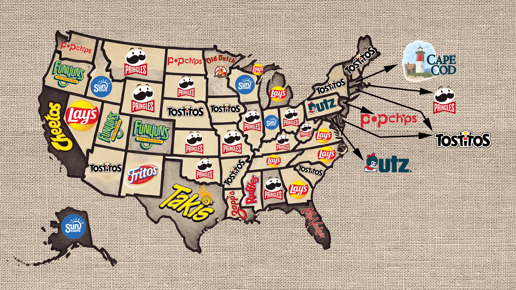
Although unusual taste qualities attract the attention of buyers, local preferences change slightly from year to year. In fact, each brand has a specific area where people reach for its product or even a specific flavor of chips. In most cases, it is a state where the brand originated and nearby states. As research shows, some brands, were able to achieve a wider fan base. Here are the top five brands:
- Pringles (13 states)
- Lay’s (8 states)
- Tostitos (8 states)
- Popchips (4 states)
- Sun Chips (4 states)
The Pringles brand has gained fame and a reputation as a quality product. However, it is the unique packaging that greatly contributed to its success. It is unlikely that people can pass by a shelf with Pringles without a desire to grab a pack or two. One of the classic Pringles flavors is Cheddar Cheese. The other brands are also well known even beyond the states where they are popular. In fact, most have international reach.
What is the Most Popular Dip?
For many, dips are an integral part of chips consumption. They surely add an extra oomph to the already delicious snack. Here are the top choices in the United States:
- Guacamole (15 states)
- Queso (6 states)
- Hummus (6 states)
- Spinach & Artichoke Dip (5 states)
- 7-Layer Bean Dip (4 states)
It is not surprising to see Guacamole first on the list. Starting in the mid-’90s, it became especially popular. One of the surprising dips that did not make it to the top five was beer cheese dip which was voted the best in Kentucky and Wisconsin. Other favorites included French onion dip, blue cheese dip, and Pico de Gallo dip. This shows that regional preferences are still quite strong in some places.
Sun Chips
![]()
Sun Chips is Frito-Lay‘s brand of fried multigrain chips. The chips have expanded to Alaska, Iowa, Idaho, Indiana, and Wisconsin since its founding in 1991. They are well-known for their unusual texture, wavy pattern, and French Onion, Garden Salsa, and Harvest Cheddar flavors.
As it could be expected the brand has a sun as part of its logo. It is actually a continuation of the letter “n” with rays added on. The overall image is very positive and energized, hinting that this is a better chip option for one’s health.
Pringles
![]()
Pringles has won over people’s hearts and palates all across the world. Its distinctive 1968 cylindrical canister design, branding tactics, and delectable flavors are major reasons for its popularity in Alabama, Illinois, Kansas, Kentucky, Missouri, Montana, Nebraska, Ohio, Oklahoma, Rhode Island, South Dakota, West Virginia, and Wyoming.
The iconic Mr. Pringles with a mustache and a red bow has become an integral part of the logo design. For many years, the name was printed in yellow with a black outline. Recently, it was changed to a white inscription on a bold red backdrop for a modern look.
Tostitos
![]()
Arizona, Connecticut, Delaware, Maine, New Hampshire, New York, South Carolina, and Vermont are all places where the Tostitos brand found its loyal fans. Tostitos is one of the many brands that make up Frito-Lay North America. Jack Liczkowski founded the business in January 1978 with the goal of creating original tortilla chips in Mexican style.
It might seem that the logo of the brand is just sans-serif letters of a black color placed in a funky, fun manner. However, the letter “i” is actually a stand with red sauce, while the yellow triangle is a Tostito chip that the two “T”s share.
Cheetos
![]()
Cheetos are a well-known brand of puffed cornmeal snacks with a cheese taste. Even though they aren’t technically chips, Cheetos are among the most popular snack foods in America, especially in California. In 1948, Charles Elmer Doolin, the inventor of Fritos, introduced Cheetos. A special success is the Flaming Hot Cheetos.
The yellow shade of the inscription has been closely associated with the cheese powder abundantly sprinkled on the crunchy Cheetos. The letters have a round shape to them, just like the puffs, with some pointed elements that reflect the speed at which a bag of Cheetos is being enjoyed.
Funyuns
![]()
The creative snack known as Funyuns—which was originally going to be called “ONYUMS”—was created in 1969 by Frito-Lay chemical engineer George Wade Bigner. A snack that combined the intriguing flavor of onions with the pleasant crunch of fried cornmeal was a risky and novel pairing for the time. Over the years, Funyuns has dabbled in a number of hit-or-miss unusual taste ventures, gaining the greatest number of adherents in Colorado, Oregon, and Utah.
The green shades of the logo create an association with a healthy snack. Besides using a rounded font with straight cuts, the designer extended the “y” and added a half circle at the end to make it resemble an onion ring. The logo is completed with a yellow bar that has “Onion Flavored Rings” printed in red.
Miss Vickie’s
![]()
Chips from Miss Vickie’s were the first to go organic. At their potato farm in New Lowell, Ontario, Vickie and Bill Kerr created the recipe for a healthier chips option. It offers six mouthwatering flavors—Sea Salt, Sea Salt & Vinegar, Jalapeno, Smokehouse BBQ, Farmhouse White Cheddar, and Sour Cream & Herbs—inspired by the farm. Currently, they are quite popular in Florida, USA.
The logo of Miss Vickie’s brand has a vintage feel to it. It is achieved by using an off-white background and an elegant cursive font. This impression is enhanced with the use of a decorative lace pattern and a small farmhouse added above the name.
Lay’s
![]()
With more than 30 state-of-the-art production facilities spread out over the nation, Lay’s transforms staples like corn and potatoes into mouthwatering snacks. Georgia, Michigan, Nevada, North Carolina, Tennessee, and Virginia consume most of the brand’s products.
A bright yellow round emblem with a red banner running across it is well-recognized across the globe. The brand’s name is printed in a traditional cursive font using a contrasting white color. The yellow circle undoubtedly stands for the crunchy, fried potato chips.
Bugles
![]()
The horn-shaped corn snack known as Bugles had its regional premiere in May 1964. It was first introduced nationally later in 1966, gaining the most recognition in Hawaii. Though there have been several variations over the years, Bugles’ four main flavors are still Original, Nacho Cheese, Chocolate Peanut Butter, and Caramel. Since the beginning, they have been manufactured at the West Chicago facility.
The brand name has a fun and happy note to it thanks to the yellow round base that holds the name. The latter is printed in all caps and appears to wrap slightly around the base. It features a blue and white color palette that instills trust and a feeling of relaxation.
Zapp’s
![]()
The business owned by Th Zapp specializes in making Cajun-crusted potato chips in a variety of flavors. Peanut oil is used to kettle-cook the chips rather than vegetable oil, as is the case with many other companies. Zapp’s has been the only kettle-cooked chip with a Cajun crunch and authentic Louisiana taste since 1985.
A cursive inscription with a capitalized “Z” was placed on a diagonal and became easily identifiable with the brand no matter which color it was printed in. A small lobster image with a chip in its claw replaced an apostrophe, adding a unique touch to the logo.
Cape Cod
![]()
When the company was founded in 1980, Cape Cod Potato Chips set out to create a snack using carefully chosen, premium ingredients—a goal that hasn’t altered over time. The efforts were not in vain. The brand expanded from a small storefront startup to a regional enterprise in the state of Massachusetts with significant growth potential in just four years.
The logo of this brand is quite picturesque and not limited to just the name. In addition to the “Cape Cod” inscription in bold, serif font of a deep blue color, there is a whole scenery. It has a red and white lighthouse in the center with a house, sea, and blue sky surrounding it. This perfectly reflects the spirit of the location where these chips are born.
Utz
![]()
This snack food maker is situated in Pennsylvania but has plenty of fans in nearby Maryland. It started out producing an amazing 50 pounds of potato chips every hour, but over the next 100 years, it expanded its flavor variety. By adding a hint of cheddar cheese to the traditional sour cream and onion combo, Utz invented one of the most distinctive and sophisticated chip flavors ever—Cheddar & Sour Cream.
Being a large company with many brands, Utz created a very bold logo using red, white, and dark blue color palette, the national colors. The image of a girl with a bow looks old-fashioned and creates an image of a company that is loyal to its traditions.
Old Dutch
![]()
Old Dutch, which Carl Marx founded in 1934 in St. Paul, Minnesota, has a long and prosperous history in the snack industry. The Aanenson family has owned it since the early 1950s and its manufacturing site has not changed since 1968. The iconic flavors of the hometown chip manufacturer are another well-known feature.
The company went for a sharp calligraphy font that matched the name. There is also an old windmill in the background for a nostalgic and old-fashioned touch. Red and yellow are the predominant colors in the logo, which gives it an energetic and powerful appearance.
Ruffles
![]()
Since their creation in the post-World War II era, Ruffles potato chips have gained popularity all over the world thanks to their mouthwatering flavors and unique crinkle-cut shape. Besides its standard flavors, it offers options such as Cheddar and Sour Cream, Sour Cream and Onion, Paprika, and Buffalo Wing. Mississippi has the largest Ruffles consumer base.
The Ruffles logo presents national colors with an accent on a bold and eye-catching red. It consists of only the name, which is printed using bold strokes and bracketed slab serifs. The distinctiveness is achieved by a specific placement of letters at different heights to create a slightly arched line.
Popchips
![]()
Popchips is a salty snack food company established in the US that makes and sells natural popped chips. Popchips belongs to the rapidly expanding “Better-For-You” snacking market. The company currently sells mostly in North America, with the majority of its clients located in New Jersey, North Dakota, Washington, and Washington, D.C. Alongside the previously beloved Popchips flavors like Sea Salt, BBQ, and Aged White Cheddar, there are also relatively new options called Fully Loaded and Fiery Buffalo.
The first half of the name literally pops in the logo. The latter “o” is placed in front of the other two letters and has the colors inverted. The same was done with the letter “i” that was squeezed between “h” and “p”. The designer played with the font to give the logo an adventurous and outgoing atmosphere.
Fritos
![]()
An iconic brand that originated in 1932 when CE Doolin purchased the patent for the original recipe, modified it, and put it on the market is Fritos. Nowadays, 36% of families eat Fritos each year, with most of those consumers originating from New Mexico. Fritos are fantastic because you can eat them on their own, enjoy them with a dip, or sprinkle some crunch on top of a Frito pie. Original Fritos, Chili Cheese Fritos, and Honey BBQ Flavor Twists are the top three flavors.
The company went for a cursive font with thick strokes and slightly rounded ends that gave the logo a friendly and appealing appearance. The white color of the inscription has a nice blue shadow and stands out against the striking red oval base.
Takis
![]()
The famous spicy rolled tortilla chip brand Takis was created in Mexico in 1999 and brought to the US in 2004. It is well-known for its exceptionally delicious flavors. Thanks to their unique shape and fiery flavors, they have earned over millions of fans worldwide. Its famous hot chili pepper and lime-flavored variation are especially loved in Texas.
Takis logo is fun and energizing. It is the yellow and purple color palette as well as rounded stroke ends that create such an impression. A swirl above the “i” perfectly reflects the exciting and thrilling time people spend with a bag of Takis.


