Even though Formula 1 is an exclusive sporting event, it has always stood on a separate stage, somewhere in the luxury area. That is why visual identity is even more important for this racing event than for the others. Surely you all remember the general dissatisfaction with the Formula 1 rebranding in 2017. It caused more talk than the standings.
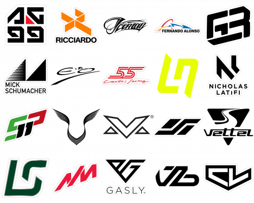
But it’s not just the main F1 emblem that’s on display, it’s also the drivers’ logos. Each of the insignias represents the character of the driver and sometimes even his manner and style on the track. Below we take a closer look at the current season’s F1 drivers’ logos. And yes, looking ahead, they all are very edgy and bold.
Daniel Ricciardo
RIC, №3, an Australian racing driver, competes for McLaren under an interesting three-dimensional geometric logo with thin strict lines, which form a stylized “DR” abbreviation. The “D” is drawn as a triangular arrowhead and lacks a vertical bar. The peak of the triangle touches one of the peaks of the “R”-zigzag — the only element of the letter, which is also written with no vertical line.
Lando Norris
NOR, №4, a British-Belgian racing driver, competes for McLaren under a pretty minimalistic yet bold logo, which depicts a stylized “LN” monogram. The abbreviation has “L” in the uppercase, and “N” — in the lowercase, although both letters feature the same size and style. The lettering is drawn in thick solid lines with diagonally cut ends and rounded angles, which makes the simple composition look sharp and dynamic.
Sebastian Vettel
VET, №5, German racing driver, competes for Aston Martin under, probably, the most ornate logo. The badge of the driver comprises a triangular crest with rounded angles and the peak pointing down, with a cut-out stylized letter “S” on its upper left part. The “S” looks like a wavy road and is split into two lanes by a medium-thick black line. The smooth contours and the literate depiction of the sportsman’s purpose are what differentiate the Vettel logo from others.
Nicholas Latifi
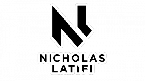
LAT, №6, a Canadian-Iranian racing driver, competes for the Williams Racing team under the most minimalist logo. It is also a stylized monogram with the driver’s initials, but the simplicity and strictness of the lines, and the lack of some bars in the letters, make it truly progressive and powerful. The right bar of the “N” is replaced by a small edgy “L”, which is set at a small distance from the larger letter, and created a kind of a “tunnel” between the bars.
Kimi Räikönen
RAI, №7, a Finnish racing driver, boasts one of the most recognizable Formula 1 logos for today. The badge with the script “Iceman” inscription resembles the iconic Los Angeles street style fonts and looks truly sharp and unique. The capital “I” in the logotype has both of its tails elongated to the left, with the top one thick and split into two parts by a white stripe. The whole lettering is slightly arched and enclosed between two black lines — from top and bottom.
Nikita Mazepin
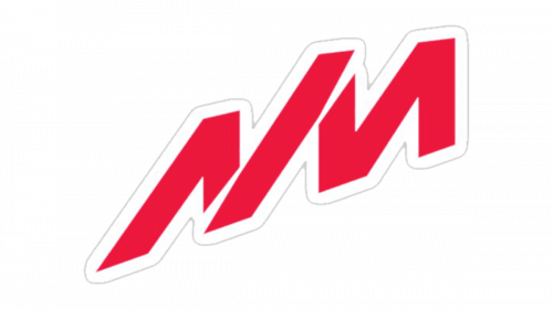
MAZ, №9, a Russian racing driver, who competes for the Haas F1 team, used a simple yet bold black badge with the stylized “NM” abbreviation, where the two letters, placed diagonally, shared one bar, which was set on a small distance from both “N” and “M”. Those small white diagonal elements were slightly flared on one end, and added the sense of dynamics and motion to simple and solid shapes of the bars.
Pierre Gasly
GAS, №10, a French racing driver, competes for the Scuderia AlphaTauri team under a cool and strong logo, with the driver’s initials inscribed into a triangular crest shape. The “P”, standing for “Pierre”, takes less space on the logo, with just a closed-up triangle coming out of the left diagonal bar, while the “G”, for “Gasly”, is more distinct and adds a square shape to the geometry of the crest.
Sergio Pérez
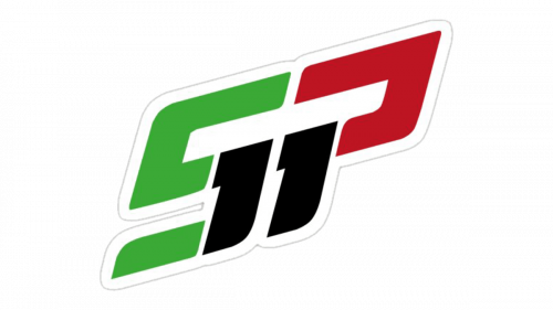
PER, №11, a Mexican racing driver, competes for the Red Bull Racing team and uses one of the not many F1 logos with the number in it. The badge of the Mexican driver is composed of a bold black “SP” abbreviation set diagonally and overlapped by a white stylized “11”, where each of the digits replaced one of the vertical bars — the first in the “S”, and the second in the “P”.
Fernando Alonso
ALO, №14, a Spanish racing driver; competes for the Alpine team under a very sharp and fancy logo, which definitely varies from all other drivers’ badges. Alonso’s insignia is composed of custom cursive lettering, which ends with an elongated bold arrow, pointing to the right. It has a zig-zag tail, coming out of the loop letter, which can both be read as an abstract “A” or “F”. The small stroke under one of the arrow’s zig-zags adds some Asian accents, making the logo even more interesting and stylish.
Charles Leclerc
LEC, №16, Monegasque racing driver, competes for the Scuderia Ferrari team under a bold and solid logo, based on a classic horizontally stretched crest shape, with two stylized letters, “C” and “L”, set in white and set on a black background, which is cut-out along the upper border of the letters. Thus, the left part of the shield looks massive and confident, and the right — is light and speedy. The whole logo is pretty simple, but this small cut-out detail makes it instantly recognizable.
Lance Stroll
STR, №18, Canadian-Belgian racing driver, who competes for Aston Martin team under a pretty standard for Formula 1 logo, with a stylized “LS” abbreviation set in white. This modern and stylish monogram was first used by the driver in 2017, and today can be seen on various backgrounds, which only elevates the mood and strength of the simple yet perfectly balanced symbol, where the bottom part of the “S” comes out of the elongated horizontal bar of the “L”.
Yuki Tsunoda
TSU, №22, a Japanese racing driver, competes for the Scuderia AlphaTauri team under a modern geometric logo, which differs from all other insignia in its shape and structure. Here you won’t see the initials of the driver, but will easily feel the Asian style and vibe. The horizontally stretched parallelogram shape features one sharp element, resembling the letter “S”, separating two small vertical figures from each other. The whole badge looks like a flag and the inclination of its sides represents speed and motion.
Esteban Ocon
OCO, №31, a French racing driver, competes for the Alpine team under another very elegant and sharp logo with initials. This badge can be put in one group with the logos of Fernando Alonso and Kimi Räikkönen, as its letters are written in a custom cursive font. The “EO” monogram is set in two elegant and smooth capitals, separated by a small apostrophe on the top part, and underlined by a bold and sharp diagonal, which has its upper-right end pointed.
Max Verstappen
VER, №33, Belgian-Dutch racing driver, competes for the Red Bull Racing team under one of the most solid and brutal logos in the line-up. The driver uses a stylized monogram, with the letter “V” as the central element, and two small black triangles on its sides, which make up the silhouette of the letter “M”. It is a pretty simple badge in terms of the design concept, but its execution, the thickness of its lines and the sharpness of the angles — is what makes the insignia powerful, confident and memorable.
Lewis Hamilton
HAM, №44, a British racing driver, competes for the Mercedes team under one of the most elegant logos in Formula 1 history. And, to be honest, it does look very British. The stylized winged image, based on the “V” shape, has nothing to do with the initials of the driver, but represents speed and freedom, reminding some iconic car marques from the UK, such as Aston Martin, Bentley, and even Rolls-Royce with its Spirit of Ecstasy. The wings on the symbol are spread up and to the sides, creating smooth side arches, and evoking a sense of lightness and air.
Mick Schumacher
MSC, №47, a German racing driver, competes for the Haas team under the most stable and geometric logo in the line-up. The badge of the driver is composed of two equal triangles, which are placed in one line and touch each other’s corners, forming the stylized letter “M”. The left triangle boasts a horizontally striped pattern, which gets lighter to the left, while the right triangle is solid black. This difference in backgrounds colors makes the badge look dynamic and energetic, showing movement and speed, along with representing the name of the driver.
Carlos Sainz
SAI, №55, a Spanish racing driver, competes for the Scuderia Ferrari team. The driver has the only badge in the line-up, fully based on numbers. Although, the “5” can also be read as the “S”, standing for “Sainz”. The logo features “55” executed in a stylized outlines typeface with the upper and bottom lines Ali gated to the sides, extending the inscription and evoking a sense of speed and motion. It is also the lightest in terms of the color badge, which makes it stand out on the list of competitors.
George Russel
RUS, №63, a British racing driver, who competes for the Mercedes team and uses a stable and brutal logo, composed of the driver’s initials set in a square shape with a slight inclination to the right and a bold underline of the first letter “G”. This underline replaced the bottom bar of the letter, and goes in parallel with the horizontal bars of the “R”, closing up the contours of the badge, and creating a complete structure.
Valtteri Bottas
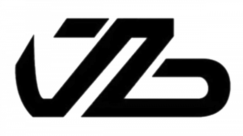
BOT, №77, Finnish racing driver, who competes for the Alfa Romeo team under a very interesting logo, composed of the lowercase initials, with some Arabic influence in the letter “V” (its elongated and sharpened left bar), and the stable and confident “B”, with the horizontally extended massive base, which balanced the elegance of the first letter, and adds brutality and strength to the overall image.
Antonio Giovinazzi
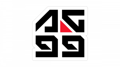
GIO, №99, an Italian racing driver, used a strong and massive logo, with stylized initials. The “A” features a triangular shape and lacks its horizontal bar, while the “G” is drawn as a square, with the bottom left part triangular and separated from the body of the letter by a thin white diagonal line. This line adds some lightness to the logo, not making the badge look overweighted and too dark, and evoking a sense of movement and speed.


