Today, Chick-fil-A generates more revenue per restaurant than any other fast food chain, and that’s clearly no accident. The history of this fast food chain dates back to the 1940s, when its founder Samuel Cathey opened the first location. Two decades later, he introduced the chicken sandwich, which became a fast food classic and the main star of the Chick-fil-A menu. The legendary logo of the Georgia-based fast food restaurant chain Chick-fil-A, whose first version was introduced in the middle of the 1960s, gives a clear hint about the restaurant’s “chicken” specialization. This cute and bright badge has its unique character which makes it recognizable in every corner of the world.
Meaning and history

The visual identity of Chick-Fil-A is based on a laconic yet powerful color combination of red and black, which can make any lettering and images modern and strong. Though the brand’s cool and friendly emblem is pretty strong on its own as is a brilliant example of how redesigns, held not that many times in the company’s history, elevate the image without losing individuality and reflect the progress and growth of the brand.
What is Chick-fil-A?
Chick-fil-A is the name of an American fast food restaurant chain, which was established in 1946 in Georgia, and by today has grown into one of the largest chains in North America, with more than 2,8 thousand locations across the United States and Canada. The chain specializes in chicken sandwiches.
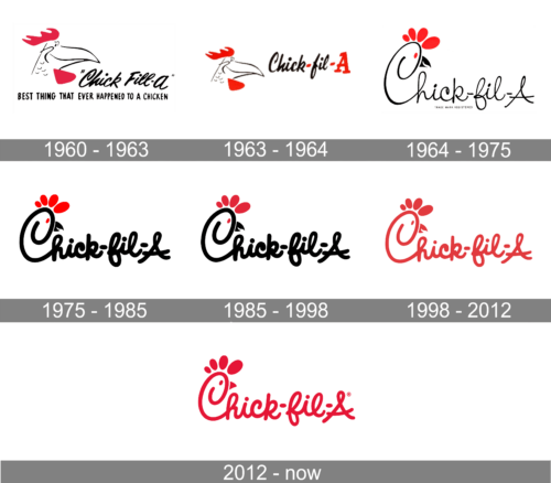
1960 – 1963

The initial logo of the fast-food chain was introduced in 1960 and only stayed with the brand for three years, though it was a fun and brilliantly executed badge, composed of a black and red chicken’s head in profile, placed on the left from the handwritten logotype. The chicken was looking to the right and was drawn in a caricatured manner, with a smiling face and cunning eyes.
1963 – 1964

The new logo preserved all the elements of the previous version. The chicken’s head, though, was not as large and placed lower. The “Best Thing That Ever Happened to a Chicken” inscription in all capital bold letters at the bottom was gone. In addition, there were now two red hyphens, the phrase lost one “L”, and the letter “A” was enlarged and colored red. The additional red elements created a well-balanced brand visual identity.
1964 – 1975

The redesign of 1970 brought Chick-Fil-A its iconic logo the whole world knows today. The new logo was recognizable thanks to the same color palette as well as the illustration of a chicken’s head. The latter, though, was now a part of the inscription as the capital “C” was stylized as the chicken. The stylized letter “C” had a black open beak on its right, a small red eye inside, and four solid red ovals above it, making up a bird’s profile. The inscription was no longer bold and had a more elegant handwriting style. The updates made the restaurant chain appear more sophisticated.
1975 – 1985

The previous logo version has undergone minimal changes. The black lettering was done using the same custom cursive typeface with rounded shapes and sleek lines that now got bold. The updated version was easier to see from afar and gave the logo a more grounded and confident appearance.
1985 – 1998

In 1985 the color palette of the logo was slightly changed colors by making the shade of red darker. This didn’t affect the look of the emblem or its recognizability, just made it look more balanced and professional.
1998 – 2012
In 1998 the company starts drawing its logo in red and placing it on a white background. No black details are left on the emblem, and the new red and white palette looks powerful and passionate, representing the brand’s love and warmth, it tends to give to its customers.
2012 – Today
The redesign of 2012 slightly refined the contours of the iconic logo, and closes the chicken’s beak. The new emblem has its color brightened and lines modernized, and today it looks fresh, stylish and very modern, brilliantly reflecting the essence and purpose of the company.
Old mascot
The chain’s original mascot, the anthropomorphized chicken, was called Doodles. In the course of time, he was replaced by a cow, and yet, he still appears as part of the “C” on the logo.
Emblem and advertising disputes
The Chick-fil-A chain is notorious for its extra-protective policy concerning its branding, which has been referred to as “corporate bullying.” In particular, quite a few businesses received cease and desist letters from the company for using the “eat more” phrase, which is part of the Chick-fil-A’s slogan “eat more chicken.” Interestingly enough, the company actually managed to successfully protest not less than thirty opponents who used the “eat more” phrase.
However, some opponents managed to defend their rights. For instance, the Vermont artist Bo Muller-Moore, who printed T-shirts with the lettering “Eat More Kale,” had this phrase trademarked by the US Patent Office in 2014.
Font
The script glyphs featured on the Chick-fil-A logo were hand-drawn specifically for the restaurant chain. The casual lines create a relaxed, laid-back mood.
Did the Chick-fil-A logo change?
The Chick-Gil-A logo has undergone several modifications throughout the years, but the most significant one happened in 1970 when the first version of the current badge changed the initial version of the chain’s visual identity.
Why is the Chick-fil-A logo a cow?
The Chick-fil-A logo is not a cow, but a chicken, a symbol of the restaurant, a depiction of its name, and the graphical representation of the chain’s specialization — the chicken sandwiches.
Who came up with the Chick-fil-A logo?
The Chick-fil-A logo was created by Louie Giglio, who in the middle of the 1960s collaborated with Evan Armstrong to come up with the iconic image.
What does the Chick-fil-Alogo symbolize?
Chick-fil-A logo symbolizes the warmth and caress of the company their customers and represents the main specialization of the company, the chicken fillet-based sandwiches.
What is the Chick-fil-A brand message?
The brand message of one of the largest American chains of fast food restaurants is “We Didn’t Invent the Chicken, Just the Chicken Sandwich”, and yes, by today the name of the restaurant chain has become synonymous with sandwiches with chicken fillet.
What is the story behind Chick-fil-A?
Chuck-fil-A was established in 1946 in Georgia, USA by S. Truett Cathy, when he and his brother Ben opened a small restaurant called “Dwarf Grill”, which was later renamed “Dwarf House”, and the name “Chick-Gil-A” (derived from the “chicken fillet”) appeared only in the 1960s.
Has the Chick-fil-A logo always had a beak?
The logo of Chick-fil-A has been having a beak in it since 1967. The company was established in 1946, under the name “Dwarf Grill”, so it was a completely different concept, however, the beak appeared in the Chick-fil-A badge right after the company got its current name.
What is the meaning behind the Chick-fil-A logo?
The meaning behind the logo of Chick-fil-A, one of the largest chains of fast-food restaurants in North America, is the representation of the company’s specialization, its fast food “cuisine” based on chicken products.
Who created the original Chick-fil-A logo?
The original Chick-fil-A logo was designed by Louie Giglio and Evan Armstrong, the famous American designers of those times. The first scratch of the logo was made on a napkin.
Why does Chick-fil-A use the red color?
Red is not only the most powerful and memorable color for branding but also a symbol of warmth and love. This shade makes a person feel at home, it represents coziness and hospitality, reflecting the main values of Chick-fil-A.


