Charles Schwab Logo PNG
Charles Schwab is a financial company, which was based in 1971 in the USA. The company provides managing and brokerage assistance and is one of the most trusted banking organizations in America.
What is the symbol of the CharlesSchwabCorporation?
The symbol of the Charles Schwab Corporation is its minimalistic yet elegant logotype, which represents the traditional approach to business, and at the same time the value of fresh ideas and innovations reflected in a vivid blue and white color palette of the laconic and pretty modest emblem.
Meaning and history
Charles Schwab Corporation is among the largest financial companies in the United States. The main growth of activity and reputation of the company occurred in the 1990s, during the explosive growth of the American stock market.
The company was founded in 1971 by Stanford University graduate Charles Schwab, who after obtaining his master’s degree worked in an investment company in California.
During its first ten years, the company went through periods of ups and downs as the brokerage industry underwent a constant change. By 1980, Schwab was the largest discounter in the country. That same year, to fund further growth, Schwab decided to take the company public. Since then the company has continued to grow and develop, acquiring new assets and opening new branches.
What is Charles Schwab?
Charles Schwab is one of the most reputable investments and brokerage companies in the United States. The corporation was established in 1971 in Texas and named after its founder. Today the company operates internationally, with more than 350 offices across the globe.
1971 – 2001

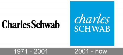
The first logo was created for Charles Schwann in 1971 and stayed untouched for almost thirty years. It was black smooth lettering with both words executed in the title case and placed without any space between each other, creating a single long logotype. It was written in a fancy and very elegant serif typeface with diagonal massive serifs and beautiful arched contours of all the letters. The emblem was drawn in simple black and placed in a plain white background, creating this timeless monochrome scheme, which made the whole logo look powerful and confident.
2001 – Today
The Charles Schwab visual identity is fresh and crispy. The logo is composed of a wordmark, placed in a bright square.
The nameplate is set in two levels and two different typefaces, which adds playfulness to the logo. The upper part of the bank name’s inscription uses lowercase letters in italicized Elegant Garamond, which is a traditional serif typeface, created by Claude Garamond.
The lower part of the nameplate, “Schwab”, features all the capital lettering in a serif Minion Regular typeface, creates by Robert Slimbach.
Both fonts, used for the Charles Schwab logo are traditional and elegant, but when placed near, they create a stylish and modern feeling, which is being elevated by the bank’s color palette.
The bright sky-blue color of the background is a symbol of freedom and movement, while the white of the inscription adds a sense of loyalty, purity and professional approach.
The Charles Schwab logo is outstanding yet simple and modest. It represents the strong company with creativity and free spirit, the one that values innovations and stability.
Font and Color
The two-leveled lettering from the primary badge of Charles Schwab company is set in two different styles: the upper line is executed in the lowercase of an italicized serif font, while the bottom line is set in the uppercase, with its letters standing straight. The upper line of this insignia uses a font, which is very similar to Granjon Italic Old Style Figures, while the “Schwab” is written in a type, similar to Adobe Bengali Bold, or Garamond Rough Pro Bold.
As for the color palette of the Charles Schwab visual identity, it is based on a delightful and fresh combination of sky-blue and white, two shades, standing for progress and growth, and evoking a sense of protection, confidence, and excellence.


