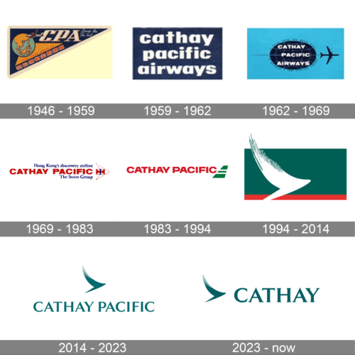
Cathay Pacific is an airline based in Hong Kong. It offers passenger and cargo services globally. The company operates flights to numerous destinations across Asia, Europe, North America, and Oceania. Cathay Pacific is owned by Swire Pacific Limited.
Meaning and history
Cathay Pacific, founded in 1946 by American Roy C. Farrell and Australian Sydney H. de Kantzow, is a renowned airline based in Hong Kong. Over the years, the company has achieved significant milestones. It expanded its operations globally, offering flights to over 190 destinations and establishing a strong reputation for its premium services. Cathay Pacific has received numerous accolades for its customer service and operational excellence. Currently, the company remains a major player in the aviation industry, continually striving to provide exceptional travel experiences to its passengers while adapting to the ever-changing market demands.
What is Cathay Pacific?
Cathay Pacific is an international airline based in Hong Kong, providing passenger and cargo services to over 190 destinations worldwide. It is known for its high-quality service, extensive route network, and strong presence in the Asia-Pacific region.
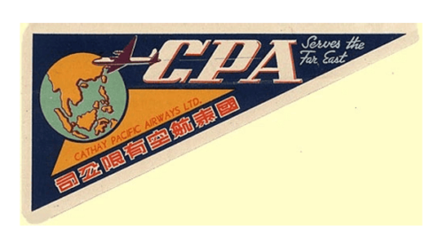
1946 – 1959
The original logo of the Cathay Pacific air carrier was designed in the middle of the 1930s and stayed with the company for more than a decade. It was quite a colorful rectangular badge, diagonally divided into two parts. The bottom triangle was set in light yellow and had no decorative elements on it. As for the top-left triangle, it had a solid dark-blue background And boasted a composition of a graphical emblem and a lettering on it. The emblem depicted a green and orange globe, while the inscription was set on slanted serif capitals, in the light shade of yellow.
1959 – 1962
The redesign of 1959 has created a very simple yet professional logo for the airlines. It was a blue rectangular banner with a white three-leveled inscription. The lettering was set in the lowercase of an extra-bold sans-serif typeface. The logo had no graphical accompaniments.
1962 – 1969
In 1962 the Cathay Pacific logo was changed again. The white lettering on a dark blue background had transformed into something more complicated. The inscription has turned uppercase and the rectangular blue background was changed into a dark-Blair horizontally-stretched globe, set on a light-blue background. The whole composition was accompanied by a minimalistic dark-blue silhouette of a plane, flying horizontally to the right.
1969 – 1983
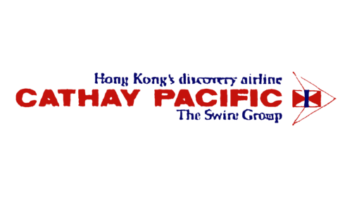
One of the earliest logos featured an aircraft in white. The body of the aircraft was replaced by a flag design. The name of the company in maroon could be seen to the left. The lettering “Hong Kong’s discovery airline” could be seen above, while the text “The Swire Group” was placed below.
1983 – 1994
The maroon was replaced by red, while the aircraft was replaced by a part of an aircraft.
1994 – 2014
A bird in flight appeared in the emblem, while the words “Cathay Pacific” now featured a lighter type. The design was developed by Landor Associates.
2014 – 2023
The box behind the flying bird disappeared.
2023 – now
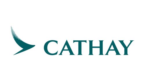
The redesign of 2023 has introduced a minimized version of the Cathay Airways logo. The style and color palette of the badge has remained the same, but the lettering part has been shortened to just “Cathay”, and the emblem has moved to the left from the inscription. Now the logo looks super progressive and stylish.


