Mercedes-Benz
Mercedes is one of the biggest German carmakers. It’s actually the first actual carmaker in the world, if you count the direct predecessors. Nowadays, they primarily build various luxury vehicles, including many basic sedans and coupes. Their logo is ring with a three-tip star inside. Usually, they make it into a 3D image, so all three tips all have two sides. The colors can vary, but the classic one is just metal. They also use the name frequently, written in stern serif letters.
Mini
Mini was a staple of British car culture for several decades. The brand was owned consequently by several European brands, each contributing something new to the design. But overall, it was always a compact, affordable car suitable for an everyday worker. Their current logo is a circle with the word ‘Mini’ inside. It’s written using big capital letters of a sans-serif style. There are also two short, linear wings on the circle’s either side.
Maserati
Maserati is an Italian car brand that mostly builds sports cars. In particular, they focus of luxury sports cars. That being said, there are also many crossover and passenger car models currently in production. The company’s logo depicts a trident with hook-like ends. It bottom is set onto a base that looks like a tip of a column. The color scheme is usually just black and white for it. The name is also used frequently, in capital serif letters with black coloring.
Mitsubishi
Mitsubishi itself is an old Japanese corporation, it was amongst the richest in pre-war Japan. Their car-building business grew in the 70s when the national economy started booming. Their cars include largely compact vehicles and crossovers, although there are also racing models and luxury vehicles. Their logo depicts three rhomb shapes, connected in the middle. They are all thin, long images, and there is equal room between them. The color of choice is normally red.
Maybach
Maybach is an iconic brand of luxury cars from Germany. Although historically a big brand, Maybach now deteriorated into building luxury versions of Mercedes cars. They don’t make too many cars, and they sell in extremely small numbers. The logo is a triangle with curved sides. Inside, they included two ‘M’ letters – one tall and narrow, the other wide and squat. But they basically stand on the same spot. The colors are black for the letters and the rims of the emblem, orange for the rest.
Mazda
Mazda is a major Japanese car producer, they’ve been making these for over 100 years now. Most of Mazda models are basic mid-sized cars, compact cars and some crossovers. They also have some high-performance vehicles to offer. Their logo uses a form somewhere between a square and a circle. Inside, they’ve put two lines that connect in the middle, creating a V-like shape. In fact, it’s supposed to be an M, if you consider the sides of the frame the extensions of the letter.
MAN
MAN SE was one of Germany’s biggest truck and bus manufacturers. Until recently, they were also the longest-surviving such brand in this country. The company particularly focused on heavy-duty long-haulers, but there were also smaller trucks. They are now being produced by one of Volkswagen’s subsidiaries. The company used just the word ‘MAN’ as the logo, written in big metal letters. However, they also liked to use an image of a lion, confined inside a rectangle frame, as an emblem.
Magna Steyr
Magna Steyr is a subsidiary of Magna, a major Canadian carmaker. This company is located in Austria, and they primarily construct vehicles for other companies – from Britain, Germany, Japan and America. These include high-performance and luxury models, mainly. The logo depicts three black shapes comprising a blocky-looking letter ‘M’. There is also a red circle above it. It’s exactly the same as the logo of their parent company.
Mahindra & Mahindra
Mahindra & Mahindra is a big Indian carmaker that builds all sorts of vehicles. Besides cars, there are also motorcycles and agricultural vehicles. But the car division mostly produces crossovers and compact cars. Their main logo is just the word ‘Mahindra’, written in big red letters. The font is a sans-serif, although the corners are all abrupt and sharp. There are also cuts all over the letters, probably to convey the mechanical sense.
Mahindra Reva Electric Vehicles
Originally just called Reva, this Indian carmaker was bought by Mahindra & Mahindra in 2010. They kept making the same products – compact electric cars. They are largely plug-in models, including their flagman, an electric microcar REVAi. These cars are also notable for their bizarre, disproportionate design. The logo uses the emblem of M&M: their name, written in sharp red letters. Except, this logo also has ‘electric’ written below it in the same font, but with the color blue.
Maico
Maico is a minor vehicle manufacturer from Germany. It is a smaller business, but they are pretty old. They’ve been making motorcycles and scooters of all variations since the 1920s. Maico uses a red emblem as a shield. Its bottom part is largely occupied by a big black letter ‘M’. On its either side, there is a small golden wing. The word ‘Maico’ is also written in the letters of this color above the big letter.
Manic GT
Manic GT is a small sports car, designed by Canadians in the 60s. The car was a roadster of sorts, although it didn’t sell in large numbers. The company that built these didn’t have any more successful models. These cars didn’t really have an emblem. They used a strip of white with the model’s name written on it in black. The font used big sans-serif letters with abrupt shapes.
Mack Trucks
Mack Trucks is an old American truck manufacturer. Their forte is medium trucks, as well as utility vehicles, such as the ones used in construction. But besides that, they built a ton of models in the previous century, and they still keep making new ones. Their favorite emblem is a bulldog, sitting on its rear legs. The head is lifted up, and the dog is generally drawn from the side. The normal color scheme is white and black.
Mansory
Mansory is a German firm that modifies cars of other makers. They usually take luxury or high-performance models and just tweak them one way or another. The brands include McLaren, Ferrari, Mercedes and several other names. Their logo is the company’s name, written in slim, serif letters. It was placed between two blocks of four lines each. They were horizontal, but varied in size. The color of choice is white or silver grey.
Marauder
Marauder was a British carmaker that was active in the 50s. They built a few models of pretty standard coupe cars. There were many variations, which mostly revolved around the roof structure (convertible, roofless, normal). Their emblem is a hammer-shaped badge stylized as a torch. The top was a wide red flame, where the name was put in silver letters. The stick of the torch stretched down. This whole composition was also put onto a vague black shape.
Marcos
Marcos Engineering was a British carmaker in 19th and early 20th centuries. The focus was on grand tourer cars, which is basically the same as the usual sports cars, but smaller and more durable. They closed production in 2007, although they made a few iconic cars before then. Their logo is a blue oval with the white name of the company written inside. It’s placed in the middle of another oval shape – this time silver and with two long, sharp extensions on the top and bottom. There was also a bigger one like that around the core part.
Marendaz
Marendaz was a British carmaker back in the 30s. They built several models of mostly high-performance vehicles – roadsters, sports cars and tourers. It was amongst the earliest sports dedicated brands in United Kingdom. Their main logo was a beige oval with the company’s full name (‘Marendaz Special’) written in red on it. There were two lines of pretty normal sans-serif font. The letters ‘M’ and ‘S’ were connected by a wavy line that went in a hook through the center.
Markranstadter Automobilfabrik
This carmaker basically translates to ‘Car Factory of Markranstadt’, the latter being a city in Germany. This factory was active throughout the 1910s and built various passenger cars. It brought mild results: small numbers of these cars were produced and sold. Their logo resembled a golden disc with three letters ‘M’, ‘A’ and ‘F’ jammed into it. The ‘A’ was put in the middle, and the other two were on the sides, tilted and converging into the single point below the letter ‘A’. The color for all of these was red.
Marlei
Marlei was a Portuguese car, built in the 50s. It was a uniquely designed racing model with a 4-cylinder Open engine. It’s considered one of the classic cars built in this country but it didn’t find much success. The emblem depicted a thin blade with a wing on top of it. It was shown piercing the double ring that encircled the blade’s middle. In addition, there was the brand’s name written in black inside the circle. Most other things were colored gold.
Marmon
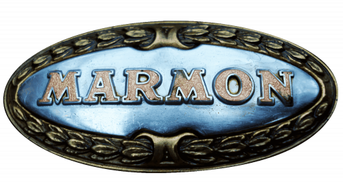
Marmon was an early American carmaker that operated until the 30s. Most of their products were racing cars, roadsters and the usual sedans of the era. The brand continued as Marmon-Herrington, which still lives. The Marmon’s logo was an oval golden badge with knots along the edges. The middle was occupied by the maker’s name. It was written in big serif letters in dark grey.
Martin
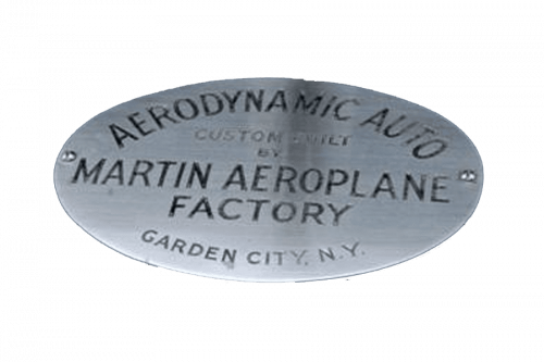
Martin Company was a major American aircraft manufacturer. Eventually, they joined with Lockheed to create one of the biggest producers of jets and other military equipment in the country. But until then, they’ve built one car – a Martin 100 Aerodynamic, built in 1928. It was by all accounts a mix between a van and a proper car. The logo depicted a circle with several layers of red on the outside, a blue circle in the middle and a white star on it. In it, they placed the words ‘Martin U.S.A.’ in blue.
Marlin
Marlin is a British carmaker, active since the 60s. Initially, they built the retro-styled roadsters. Latterly, the production refocused on the small two-seat sports cars, such as 5EXi. Their logo shows just their name, ‘Marlin Sportscars’. The first word is written in big, overly bold letters colored in grey. Right below, the second word is written in normal white letters, much smaller in size. Both bits are placed in a perspective, meaning they gradually diminish in size.
Martini
Martini was an old carmaker from Switzerland that was founded in 1897 and closed in the 30s. They made a variety of basic passenger cars. That included light roadsters, heavier luxury cars and special designs of trucks and early limos. Their latest logo depicted a red shield with a mountain slope along its left edge. There was a black silhouette of a goat climbing these rocks. The last touch is the word ‘Martini’ itself, written in tall white letters along the top edge.
Marussia Motors
Marussia Motors was a Russian car building project in 2007-2014. It amounted to developing several supercars and a prototype of a luxury crossover. All development and production was shut down due to financial difficulties. The emblem displays a big blue letter ‘M’. It’s positioned in such a way that both sides get narrower and sharper further down. Between them, there are two sections of white and red respectively. The colors represent the flag of Russia, but the form of the emblem resembles a shield.
Maruti Suzuki India
Maruti is an Indian car manufacturer, started in the 80s. The company largely makes compact hatchbacks, sedans and some crossovers. A lot of these are Suzuki vehicles (Suzuki owns Maruti), but there are also unique designs, including some that were continued even after the company was bought by Suzuki. The classic emblem is the iconic ‘S’ of Suzuki. The only different is that it’s grey here, and not red. Furthermore, they usually place the name wordmark nearby, in bold blue letters.
Mastretta
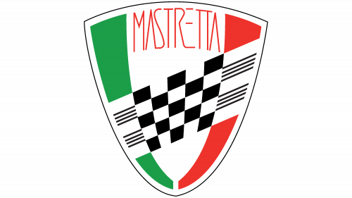
Mastretta is a big Mexican carmaker, founded in the 80s. They just build sports cars, for the most part. In particular, they’ve developed and released two car models: MXA and MXT. The logo is in a form of the shield with a sharp, narrow bottom. Both sides have strips of color stretched along them: green on the left, red on the right. Between them, there is a blank white space. There is also a checkered flag going diagonally through this whole composition. Finally, the company’s name is located along the top.
Matra

Matra has been amongst the prominent carmakers in France. In 2003 they went under, but before then the company produced several popular car models, as well as motorcycles. The cars in particular were largely compact sports cars, fit for street driving. Their logo depicts a blue shape of paper plane (or a cursor), set inside a white circle. The latter is performed in dash lines. Besides, there’s usually the word ‘Matra’ written nearby in big letters.
Matra Bonnet
Matra Bonnet (aka Matra Djet) is an iconic French sports car, released in the 60s. It was originally produced by Rene Bonnet, and later by Matra. The car was a compact high-performance car, a so-called berlinette type. Typically, the car used the badge of Matra Sports. It was an automotive branch of Matra. It depicted a black circle with a white outline of a paper plane on it. The name of the company was also written in white letters across it.
Matra-Simca
Matra-Simca normally refers to Matra-Simca Bagheera. It was a small sports car, built by the French: largely by Matra, but with the help from Simca. The car was produced throughout the 70s and had some success. This model had a distinct logo that depicted the name of the model. ‘Bagheera’ was written tilted letters with abrupt, square shapes. The color was normally either metallic grey with black shades or just black.
Matra-Talbot
By Matra-Talbot or Talbot-Matra, people usually refer to Murena, a French sports car, produced in the 80s. It was a small hatchback with a powerful 4-cylinder engine. These were built by Matra using engines from Simca’s Talbot cars, hence the name. Murena’s logo was usually just its name, written in small letters. The coloring was white with black outlines. The font they used was a pretty basic sans-serif.
Maudslay
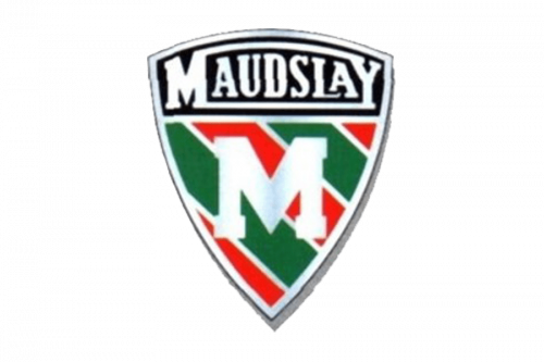
Maudslay was one of the earlier British car manufacturers. This one was active until the 40s and primarily built tourers (high-performance cars). Besides that, there were also some special products, like uniquely designed trucks, coaches and more. Their main logo was a shield, divided into two sections. The very top was colored black and given over to the company’s name, which was written in white. The rest was a pattern of green and red strips, drawn at an angle. In the middle of these, there was a big white ‘M’.
MAVA
MAVA was a Greek car company in the 70-80s. Initially just a manufacturer of Renault cars, they started developing their own models later. As a result, they developed several models of compact cars (Karma, in particular) and vans. These cars mostly used Renault badges, as the French practically owned the business. It was a rhomb shape with a hollow core. The color was normally metallic grey.
Maxwell
Maxwell Motor Company was an early American car manufacturer, abolished in 1925. It was also a direct predecessor of Chrysler (now called Stellantis). Maxwell itself focused on touring cars and roadsters. The logo was a shield shape, divided in two sections by a diagonal strip of white in the middle. On this strip, they placed the company’s name in artistic black letters. Above this strip, everything was blue; below – a stripe pattern of white and red.
MCC
Mercedes City Car (MCC) was a production title of Smart, a German brand of minicars, before the final concept was released. Back in the day, Mercedes wanted to build ecological, speedy cars. This eventually evolved into a concept of minicars that don’t take much space or fuel. Back then, the project didn’t have an emblem. The current logo of Smart is a small letter ‘c’ with an orange triangle adjacent to it, which creates an arrow-like shape. The name is usually written nearby in grey.
McLaren
McLaren is a British automotive brand, established in the 80s. They build sports cars, supercars and racing cars – in short, all sorts of high-performance vehicles. In particular, they are closely tied to the F1 races, to which they dedicated a whole branch of production. The current McLaren emblem is their name, written in black, round letters. It’s a basic sans-serif, but with soft, smooth shapes. The other common element is a thick crescent they put next to the last letter. It’s either red or black, and is supposed to resemble a racing flag.
McLaughlin Carriage Company
McLaughlin was a Canadian car brand in the early 20th century. They eventually became a subsidiary of General Motors for Canada. The cars they built initially were touring vehicles. The company’s logo was a wide rhomb, mostly colored blue and white. The word ‘McLaughlin’ was curved along the top edge, the color blue was used there. ‘Buick’ was plastered in the middle, using white letters.
MCV
MCV (short for Manufacturing Commercial Vehicles) is an Egyptian vehicle manufacturer. As such, they construct trucks of various types and also buses. The company is owned by Mercedes, so a lot of their products are of Mercedes design. The main part of their logo is the acronym ‘MCV’. It’s written in metallic grey using sharp letters with small serifs. There are also often three triangular shapes depicted behind it in several takes.
MDI
MDI (short for Motor Development International) is a Luxembourg engineering company. Mostly, they develop new ways of transportation in the city environment. For instance, their top-seller is AirPod 2.0 – a minicar that looks like a small pod that runs on compressed air. They have several logos. The most recognizable is a white circle with several spots of paint of varying length grouped around an orange circle. This design is meant to look like a flower.
Meeussen
Meeussen was a small car business from Belgium. It existed in the 50-70s, and their one finalized project was a Meeussen van. It was basically a Volkswagen Beetle, but with a longer body. Meussen was a very small company, only 6 of these vans were ever built. As such, they didn’t have their own logo, instead the cars were plastered with Volkswagen emblems. They depicted the letter ‘V’ and ‘W’ stacked on top of each other and encircled by a ring frame.
Mega
Aixam-Mega is a French car manufacturer, active since the 80s. They specialize in making minicars and small crossovers. Nowadays, the brand is owned by Polaris. Their logo depicts a blue circle with a big white ‘A’ in the middle. This emblem is then outlined in white and then in red. Normally, there’s a company name written nearby, using bold, blue letters.
Mekong Auto
Mekong Auto is one of the biggest Vietnamese carmakers. They primarily assemble cars from Italy (Fiat) and Korea (Pyeonghwa and SsangYong), but there are also some models of original make. As such, the product line includes largely crossovers, SUVs and compact cars. Their emblem is greatly inspired by Audi. It depicted an orange oval with three interlocked rings inside (also orange). The company’s name is usually written nearby in red letters.
Melkus
Melkus was a brand of high-performance cars from East Germany (later, just Germany). They built a wide array of sports and racing cars, all the way until 2011. These were usually of a compact coupe variety. Their logo depicts a blue circle with a white shield in the middle. On this shield, there is a combination of a usual sports car and a racing hull superimposed onto each other (both colored black). There is also a word ‘Melkus’, written along the top.
Mercer
Mercer is amongst America’s oldest carmakers. The company was founded in 1909, and their list of products included mostly high-performance cars. Early sports cars and racing cars were their forte. The emblem was a simple shield with three sharp peaks. On it, the words ‘Mercer Motor Cars’ were written in three lines. The letters were black and used an abrupt, square sans-serif style.
Mercury
Mercury was a line of semi-premium and premium cars, produced by Ford until 2011. The product line included various passenger cars and crossovers. In their later years, the sales kept declining and the company moved on to the less expensive models. The emblem depicts a grey circle with three lines going at an angle through the center and then turning into a horizontal pattern. They are divided by the strips of white, which makes them look like a highway. The word ‘Mercury’ is normally featured beneath, in grey sans-serif letters.
Merkur
Merkur was a line of cars produced by Mercury, which was itself a subsidiary of Ford. The cars were produced in the 80s to mild success. These were largely luxury cars, even more luxurious than Mercury vehicles themselves. The logo was a wide hexagon shape with uneven sides. Inside, four black shapes arranged the negative space into a cross. On it, the word ‘Merkur’ was written in big black letters.
Messerschmitt
Messerschmitt is best-known as a producer of aircraft for the German air force during the war. After the war, they tried their hand in the production of car, on account of being forbidden to make airplanes. They came up with several microcar models, the chief of which was Kabinenroller. Their latest logo was a black ring. In it, much of the space was white, except for a silhouette of a bird. It was pretty geometric and sharp, in addition to being almost completely black.
Metallurgique
Metallurgique was a Belgian carmaker in the early 20th century. The company chiefly made various high-performance cars, including roadsters and speedsters. These are words for small racing and sports cars of the age. The badge was a curved nameplate, which is where the name was placed in big, tall letters. In the resulting recess on top, they placed a circle. Inside was the Star of David with the inscription ‘MM’ inside. The usual color scheme was blue and gold.
MG Motors
MG Motors is a British carmaker, owned by SAIC, a Chinese manufacturer. As such, they produce the compact cars of the Chinese design, for the most part. It’s a newer company, so they didn’t get to produce too many models as of yet. Their logo is an octagon shape with a metallic frame and a red core. On it, the big ‘MG’ letters were placed and colored like metal parts. The font makes them look abrupt and geometric.
Micro Cars
Micro Cars is a carmaker from Sri Lanka. This company assembles knock-off versions of the popular Chinese and Korean cars. That includes crossovers and compact vehicles, for the most part. Micro Cars uses an emblem, shaped like a shield. Much of it is black, except for a grey image of a lion’s head (lion being the symbol of the country). The wordmark is normally used in small black letters with a bloated red dot above ‘I’.
Microcar
Microcar is a car company from France, established in the 80s. Unsurprisingly, this manufacturer largely builds microcars of many varieties. One of their more successful product lines, for instance, is the electric microcar models. The company’s logo is just a red oval with the brand’s name on it. It uses big white letters. The font is normally a typical sans-serif.
Minerva
Minerva was a major Belgian manufacturer of premium cars in early 20th century. The company continued to make exquisite cars until 1938. That being said, the brand continued into the 20th century, even beyond the 50s. The logo depicts a profile of the goddess Minerva, drawn in grey across a red circle. This circle is further put inside a white frame with grey outlines. On it, the brand’s name is written in wide serif letters.
Minetti
Minetti Sports Cars is a minor carmaker from Australia. The core of their production is sports and racing cars. Thus far, they’ve developed two fully fledged vehicles of this sort. The logo is usually put inside a black circle. The company name is written across it in the middle. Right behind, there is a pair of two lines. Each consists of a smaller blue bit and a larger red one.
Mitchell
Mitchell is an old brand of automobiles from the 1900-20s. A lot of basic, touring and luxury cars were built in this time. They were just the normal designs for the age, nothing special. The emblem for the series was just the word ‘Mitchell’. It was written in an elegant italic font, styled as handwriting. The color was normally black for these characters.
Mitsuoka Motors
Mitsuoka is a Japanese car brand, founded in the 60s. Most of their cars are modern models, styled as old American vehicles from the 30s. The list includes versions of sports cars and luxury vehicles. They’ve also built a few modern-looking models of sports cars. The Mitsuoka emblem depicts the first glyph of their name in Japanese, but drawn in a grotesque art style. Normally, they also place the company name to the right, the letters there are uppercase and bold. The color scheme for all of these is usually just grey.
MK Sportscars
MK Sportscars is an English car business. Their products include copies of older Lotus sports cars, sold as kit cars. It means they basically sell parts of the car and ship them to the customers. These versions have slight differences from the original models, including better transmissions and other elements. The emblem is just a black shield with the white space inside. On it, the letters ‘M’ and ‘K’ are drawn in black. They share the bar, which makes them look fused.
Mobius Motors
Mobius Motors is a major car project from Kenya. They develop and construct SUVs, of which there are now several models and prototypes. These are basically big jeep models, fit for off-road driving, among other things. The logo depicts a diamond shape, each side of which consists of three individual rays. The company name is usually depicted on the right big, tall letters. The color scheme usually resembles metal.
Mohs
Mohs was a series of American cars, produced in 60-70s. They were uniquely-styled sedans, crafted in small numbers. These cars were considered premium, and there were just 2 official versions. One was a basic sedan, and the other was SafariKar, a heavier protected variation. They didn’t really have a proper logo. As badges, they used eagles with folded wings.
Momo
Momo is a car company from Italy. Their specialization is the production of parts for racing and sports. That mostly just means the details on interior, making them a styling company in some sense. The logo depicts the word ‘Momo’, written in small letters. It’s further sandwiched between two geometric elements that together make up an arrow, if not for the word between them. The color for all of this is bright yellow with a black outline.
Monica
Monica was a grand tourer car, produced by the French company with the same name. They were only produced for several years in the 70s, but the model made itself quite a name. It was a relatively small two-door sedan with a powerful V8 engine. These cars didn’t wear any badges. Instead, the word ‘Monica’ was usually plastered in metal on the side. The font is a thin cursive made to look like smooth handwriting.
Monteverdi
Monteverdi was a Swiss car brand in the 1960-80s. It specialized in luxury vehicles, of which they made several prominent models. Chief among them were several 2-door sports sedans, some SUVs and a few supercar prototypes. The logo depicted a white outline of a crown inside a tall black rectangle. Its top held two horizontal lines of red and white (the color of Switzerland). The bottom was where they put the name – ‘Monteverdi’ in tall white letters.
Moose Jaw Standard
Moose Jaw Standard was a Canadian automobile introduced in the city of Moose Jaw, province of Saskatchewan, 1917. It was a long, four-seat automobile with no roof, equipped with an internal combustion engine from the Continental Engines Company. The wheels were made of iron and they had a white braiding. The car also had a small, square glass screen. Initially, the plan was to sell 25 cars across Canada and United States, but once each investor got the model, they began to concern that no one else was willing to buy it. As a result, production process was ceased, and all remaining parts were sold.
Morattab
Morattab is Iranian manufacturer established in 1957. The company generally produces sports utility vehicles. They’re also concerned on making versions of European, British and American cars under Iranian license. For example, in the year 2000 they started production of SsangYong Musso – a Korean SUV, also relaited to pickups. It is a four-seat vehicle, equipped with a front-rear engine, having different capacity which depends on variation. The company’s logotype is two metal-white lines, which cross each other in the center of the logo. They’re contoured by a gray outline.
Moretti
Moretti was an Italian manufacturer of automobiles, existed between 1925 and 1989. They produced high-performance sports cars, microcars, commercial cars and motorcycles, as well as components for them all. Today, most of their vehicles can still be found on various auto shows of Europe and America. Their logo depicted a red shield, outlined gray. In its upper part we can see several blocks, visually similar to fortress towers. In the center of the shield, there is a black line with the white name, written in strong sans-serif font. Also there is a bull, three stars and inscription ‘S.p.a’ in different parts of the logo.
Morgan Motor Company
Morgan Motor Company is a small British manufacturer of vehicles that appeared in 1909. They produce high performance luxury cars with three or four wheel. All of them are always assembled by hand. Their cars are made with strong traditions. For example, the form factor of Morgan AeroMax , introduced in 2008, is visually similar to 1939 Morgan 4/4. The company logo shows us two metal wings with a circle between them. On it, we can see a blue crest with the white sans-serif name.
Morris Motors
Morris Motors was a British motor vehicle manufacturing company, existed between 1919 and 1968. This was a company concerned on designing, development and production of passenger, commercial cars, vans, etc. One of notable products created by the company is Oxford Six – a four-seat luxury tourer with 1,938 cc engine. In was in production in 20s-30s, and for this time it got various modifications with different engines and body styles. The Morris logotype was a blue circle with white and red lines, as well as a red bull in the metallic center part. In above, we can see the brand name.
Moskvitch
Moskvitch (literally ‘a native citizen of Moscow’) was a Soviet-Russian factory, which existed between 1928 and 2008. This was one of the most successful Russian factories. Its vehicles included trucks, cars, pickups, vans. Most of them are used in Russia even decades after they were produced. One of the most popular cars by Moskvitch is the model 2141 – a 5-door mid-size hatchback, produced between 1987 and 2003. The company logo was its name, written in a bold red sans-serif typeface. To the left from it, there was an icon, visually similar to the letter ‘M’.
Mosler Automotive
Mosler was an American automotive manufacturer that existed between 1985 and 2013. They made racing and sports cars on basis of local components. Among the latest projects were MT900R and MT900S. They are two race cars, equipped with rear 5.7 L LS1 V8 or 7L LS7 V8 engines (depending on different variations). The Mosler logo depicted a black-and-yellow figure with two black letters ‘M’ and ‘T’, both having pointers at their edges. Above them we can see the black name, written in a bold sans-serif font with larger gaps between letters.
MTX (Matalex)
MTX (shortage of Metalex) is an automotive company from Czech Republic, which appeared in 1969. They generally produce sports and racing cars. Their notable products are MTX 1 and MTX Tatra 8 V8, two powerful racing models. The company’s logo is a blue rectangle with a slight tilt. Inside, the acronym ‘MTX’ is written in big blue letters with blocky serifs. To its right, there are four horizontal lines, colored red.
Muntz
Muntz was an American manufacturer of vehicles, which operated in 50s. Their most notable car is a Muntz Jet – a two-door, four-seat luxury convertible equipped with 160 hp Cadillac or Lincoln V8 engine (depending on a variant of the car). This car was in production between 1949 and 1954. The company logo depicts a triangle with the handwritten name of the company in its bottom part. All other parts of the logo are various triangular and lines of various sizes. The whole logotype was made in a black-and-white color palette.
Multicar
Multicar was a small German automotive manufacturer, founded in 1920. They produce universal cars, trucks and transporters. It’s the only car company that outlived GDR and continued to design and produce its own vehicles. Their logo is just the word ‘Multicar’, written in small blue letters. The font is a typical sans-serif without many special details. There is usually an orange line that goes beneath the text and then turns upwards immediately to its right.
Mustang
Mustang is a series of American sports and racing automobiles designed and produced by Ford. This is one of the most popular brands of American cars. Originally, Mustang is a four-seat roadster with a front engine layout and equipped with a high-quality motor. The logo of Mustangs depicted a silver horse mid-gallop. It’s usually put in the middle of a long, vertical ribbon. The ribbon is colored red, white and blue (after the American flag).
MVS
MVS is a French automotive company, which started operation in 1984. Their concern is making sports cars and racing cars. MVS made cars on basis of components of Renault, Volvo and Peugeot, combining them with their own car bodies. One of the first cars created by MVS was a prototype of a racing car made of glass-reinforced plastic, equipped with 4-cyllinder 2.2L engine, speeding up to 96 km/h for 7 seconds. The MVS logo was an oval using the colors of French flag. In the center, there was a shield-like area with an eagle, an obscure circular icon and a word ‘Venturi’.
MV Agusta
MV Agusta is an Italian producer of motorcycles. It was founded in 1945 near Milan. They made different types of vehicles, including 3-seat passenger motorcycles, racing motorcycles and scooters. One of their first products is 1946 MV Agusta 125. It was a two-seat vehicle equipped with a 125 cc single-cylinder engine. The company logo depicts two white letters ‘MV’, written in a bold sans-serif font. Above it, we can see the name, written inside a crown. On the background there are a brown cogwheel with a blue inside and a large triangular.
MZKT
MZKT, ‘Minsk Wheel Tractor Plant’ in English adaptation. It appeared in Belorussia, 1991, and now it’s one of the largest factories of military vehicles in the nation. In the list of the factory production are on-road and off-road trucks, transporters, as well as chassis for various equipment such as rocket complexes, for example. There is also a civilian division of the factory which is named Volat (literally ‘giant’ from Belorussian’). It produces tractors and trucks. The factory logo is the red word ‘Volat’, written in a sans-serif font with unusual ‘A’ character and all other letters connected to each other. Below it is the inscription ‘Minsk Wheel Tractor Plant’ in Belorussian.


