Carefree is a line of women’s hygiene products, first introduced in America by Johnson & Johnson. Nowadays, the brand sells internationally and owned by Edgewell. Party-liners are their central product, of which there is a large variety for all preferences and underwear varieties.
Meaning and History

The brand was started back in 1976, although they didn’t have a proper emblem until 2004. The only other modification happened in 2011. The brand quickly asserted itself as one of the primary sources of such products on the American market. Nowadays, more than half of the women’s hygiene market is occupied by their products.
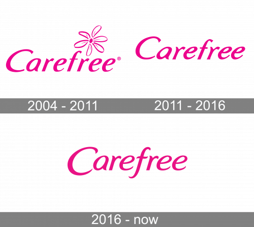
2004 – 2011
The old version featured the word “Carefree” in a delicate script slightly reminiscent of handwriting. Above it, there is an outline of a basic 6-petaled flower that might be a daisy – the common symbol for cleanliness and purity. The coloring was bright pink for both of these.
2011 – 2016
The flower symbol was scrapped in 2011. The text kept much of its style, except the letters were visibly stretched upwards. The tips became sharper and took on more of a twist here and there. The coloring also became marginally darker.
2016 – Today

The next logo was very similar to the previous design. By comparison, the letters were much shorter (which made them look normally proportioned, and not stretched), and they also extended way further below. In particular, the letter ‘C’ was lowered so that the next letters seemed on the same level as the center of ‘C’. The ‘F’ also had a longer, curly tail, whose lower tip was even lower than that of the very first letter.
Font
As a font, they used italicized letters with a slight tilt. They made these characters look elegant, smooth and pointed near the tips. Many lines were also curled or rounded at places, making the entire writing look feminine and sophisticated. They didn’t touch one another, so it wasn’t a cursive writing.
Color
The coloring has long been pink. For the last few designs, the shades were comparably darker. The 2016 design changed also changed in coloring, making the pink here lighter than it was before. It doesn’t seem as stark, however. In branding, they still use much lighter and brighter shades.


