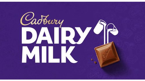
Cadbury Dairy Milk is a brand of milk chocolate bar, introduced in 1905 by the famous British company Cadbury. One of the most famous products of the label, the Dairy Milk bars are sold all over the globe and represent its brand perfectly.
Meaning and history
The history of the legendary British company Cadbury began in 1824 when John Cadbury opened a store that sold tea, coffee, and chocolate drinks. He saw his products as a healthy alternative to alcohol. Today Cadbury is the world leader in the chocolate confectionery market, after the American Mars. Cadbury is known for such products as Wispa, Picnic, and many more, but Cadbury Dairy Milk is the most famous chocolate bar of the company and is considered to be the best-selling chocolate brand in the United Kingdom.
What is Cadbury Dairy Milk?
Cadbury Dairy Milk is a British brand of chocolate, produced by Cadbury and Hershey’s since 1905. By today there are several products in the Dairy Milk line, and they all are produced from a real milk chocolate. The best-selling chocolate brand in the UK.
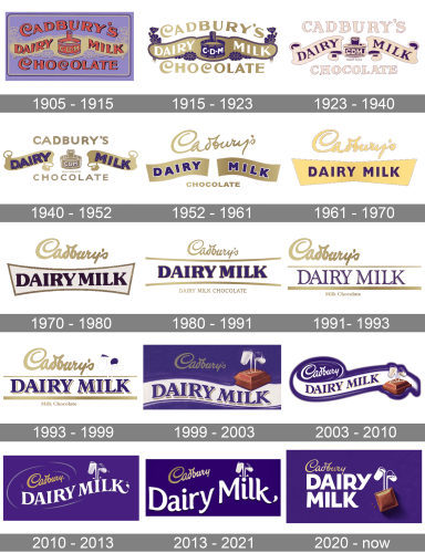
In terms of visual identity, the Cadbury Dairy Milk bars have seen many different logos on their covers, but almost all of them were set in a rich purple color palette, which looks warm, sweet, and deep, just like the taste of the chocolate of the brand.
1905 – 1915
The very first logo for Cadbury Dairy Milk was created in 1905 and stayed with the chocolate bar for almost ten years. It was a very delicate and light banner in a tender lilac shade, with the smooth red lettering set in three levels. The inscription is set in a custom font with elongated and curved tails of the letters, adding sophistication and chic to the overall concept. The middle line of the lettering is written across the light-gold ribbon, which crosses the banner horizontally.
1915 – 1923
The redesign of 1915 has refined the contours of all the Cadbury Dairy Milk logo elements, cleaned up the color palette, added darker and deeper shades to the contours, and turned the lettering into gradient gold, set against white and purple fragments of the logo. The red shades were completely removed from the composition.
1923 – 1940
In 1923 the color palette of the Dairy Milk logo was switched again, along with the typeface of the top and bottom levels of the lettering, which was now set in straight horizontal lines and executed in bold and softened serif font. The gold color turned into light cream, which in contrast with purple looks very friendly and energetic.
1940 – 1952
The gradient gold shades came back to the Cadbury a dairy Milk logo color palette with the redesign of 1940. The concept remained the same, but the font of the top and bottom lines in the lettering was switched again, turning modern sans-serif, which added a sense of professionalism and stability to the whole image, while the elegant color palette was all about taste and sweetness.
1952 – 1961
The redesign of 1952 has brought something new to the Dairy Milk logo. Although the overall concept and the color palette remained almost the same. The Cadbury inscription was now rewritten in a cursive font, which become iconic in no time. Another big change of that year was the removal of the graphical element, a barrel with the abbreviation, drawn in the center of the badge. The lettering on the golden ribbon gained a bolder font and thin white outline, which made everything look brighter and stronger.
1961 – 1970
In 1961 the word “Chocolate” was removed from the Cadbury Dairy Milk logo, and two smooth ribbons were turned into one sharp geometric banner with straight angles. The color of the banner was switched to a more yellow one, while the letters got their white outlines removed. The cursive Cadbury’s inscription got slightly enlarged and was now written in light yellow with a thin purple outline of the glyphs.
1970 – 1980
The new era of the Dairy Milk visual identity started in the 1970s. The upper cursive line of the badge turned into gradient gold, with the outline removed. As for the main part, with the name of the product, it was now executed in the uppercase of a smooth extra-bold serif font with etched lines and rounded serifs. The inscription was placed on a light horizontally oriented banner in a golden frame.
1980 – 1991
The redesign of 1980 extended the banner with the “Dairy Milk” lettering, removing its side borders, made the “Cadbury’s” lettering a bit smaller and darker, and supported the whole composition with the new tagline, saying “Dairy Milk Chocolate”, executed in the uppercase of a medium-weight serif font, with the glyphs set in gold.
1991 – 1993
The corporate logo got enlarged and emboldened and was shifted to the left, while the banner with the purple lettering became straight and the inscription turned into an elegant serif lettering with distinctive contours of the characters. As for the golden tagline, it was shortened to just “Milk Chocolate”, and was now set in the title case of a traditional serif font.
1993 – 1999
The iconic emblem with two glasses of milk was added to the Cadbury’s Dairy Milk logo in 1993, and since then has never left the badge, being refined and strengthened throughout the years. In the first version, it was drawn in white and purple and placed on the right from the golden cursive lettering.
1999 – 2003
The redesign of 1999 has turned the background of the logo into solid purple, with the emblem being accompanied by an image of a chocolate square, which had the milk pointing into it from two glasses, placed above. The cursive Cadbury’s logotype got a bit smaller and had its gold shade muted, while the uppercase serif “Dairy Milk” became heavier and brighter, gaining golden shadows to all letters.
2003 – 2010
The composition of the Cadbury’s Dairy Milk logo was changed again in 2003, with the background getting white, the smooth banner gaining a bold purple outline, and the “Cadbury’s” cursive logotype turning white. The graphical part of the logo was moved to the bottom of the logo.
2010 – 2013
The chocolate square was removed from the Dairy Milk logo in 2010, with the background turning solid purple again, and the cursive corporate logotype set in gold, while the uppercase inscription was now set in solid white, adding professionalism and cleanliness to the badge.
2013 – 2021
The redesign of Cadbury’s Dairy Milk logo in 2013 was held by the Pearlfisher design bureau, which rethought the concept of the logo, and rewrote the “Dairy Milk” lettering into a title case. The two white glasses with milk were now placed above the solid white dot of the “I”.
2020 – Today
The new version of Cadbury’s Dairy Milk visual identity was designed by the Bulletproof agency in 2020. The lettering turned uppercase again, with the cursive lettering getting thinner contours and brighter shades of gold, and the white inscription looking super modern and unique due to some softened details of the characters.
Font and color
The bold and stable uppercase lettering from the primary Dairy Mill logo is set in a custom sans-serif typeface with massive glyphs featuring smooth details, which add elegance and delicacy to the image’s tall style, and supports the sophisticated lines of the corporate Cadbury wordmark. The closest fonts to the one, used in the Dairy Milk Insignia are, probably, Integral CF Demi Bold and Salvatore Roman Extra Bold, but with some modifications.
As for the color palette of the Cadbury Dairy Milk visual identity, it is set in a combination of the bright and deep shades of purple, white, and gold, a very Royal and elegant scheme, which evokes a sense of caress, warmth, and quality.


