

![]() CA Logo PNG
CA Logo PNG
While the logo of the fast-fashion clothing brand C&A has gone through more than 10 updates over its almost 80-year history, these modifications were gradual. So, it was more like evolution rather than a series of revolutions.
Meaning and history
![]()
The C&A logo has always been very consistent and despite its números redesigns, managed to keep its original style and character, even after the removal of its most iconic part — framing — in 2020.
What is C&A?
C&A is a brand of affordable fashion clothes and accessories, which was established in the Netherlands in 1861. Today the company has its stores all over the globe, and creates clothes and accessories for women, men, and kids, constantly updating its collections.
1841 – 1912
![]()
The very first C&A badge was designed in 1941 and stayed unchanged for more than seventy years. It was a solid black roundel with an elegant white name of the brand written on its top part and accompanied by the additional cursive inscription in the same cursive style, but smaller size. The badge was enclosed in a clean circular frame in black and white.
1912 – 1913
![]()
For the first sixteen years after its establishment, the company used a simple yet elegant badge, composed of a solid black circle with white italicized Sans-serif lettering on it. The main wordmark was executed in extra-bold lines, while the tagline featured more delicate shapes.
1913 – 1928
![]()
The redesign of 1913 switched the black C&A roundel to the horizontally oriented oval. The lettering also changed its style, and the italicized serif font was replaced by a massive rounded one, with the characters standing straight, and the serifs on the ends of the lines even heavier than on the previous version of the badge.
1928 – 1947
![]()
The first redesign was held by the brand in 1928. It kept the original concept from 1912, but slightly modernized it, by stretching the circle, turning it into a horizontally oriented oval, and adding a fancy smooth framing to it. As for the lettering, its typeface was switched to a more traditional and straight serif, which looked strict yet sophisticated.
1947 – 1958
![]()
The letters got bolder and the tagline was rewritten in custom cursive in 1947. The contours of the emblem’s frame were also refined and now the badge started resembling a monochrome flower.
1958 – 1984
![]()
The first colorful version of the badge was introduced in 1958. The oval turned blue, while the framing became red and white. As for the wordmark, it remained white, and kept the typeface from the previous version, though the tagline was rewritten in capitalized Sans-serif.
1984 – 1998
![]()
The frame becomes solid red in 1984 and the tagline is being removed. The new emblem looks sleek and professional, and it’s cleaned contours look great in an intense tricolor palette, which reflects passion, reliability, and loyalty.
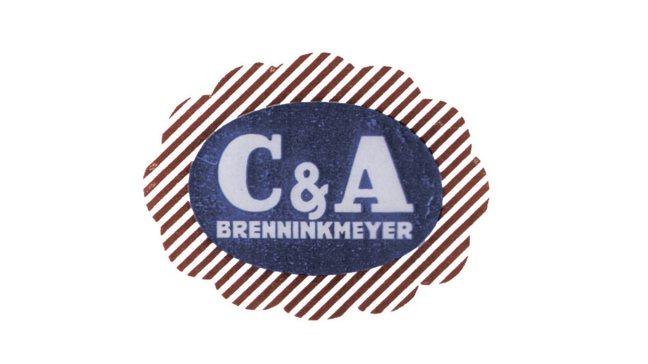
1998 – 2011
![]()
The redesign of 1998 adds a thin white outline to the oval and elevated the color palette of the badge by using a royal blue shade for the main part, and a burgundy red — for the framing. The monogram was also refined, getting stricter serifs and cleaner lines. The waves of the frame became thinner and smoother, emphasizing the brand’s name.
2005 – 2011
![]()
In 2005 some gradient shades were added to the C&A badge, and it made it look three-dimensional and vivid. All the other elements remained untouched, as were already perfectly balanced.
2011 – 2020
![]()
The redesign of 2011 switched the color of the badge, making the oval white and the lettering in it — blue. As for the frame, it is still executed in the burgundy shade of red, which looks elegant and chic. The gradient shades are gone and the badge is flat again, though it looks strong and modern.
2016 – 2020
![]()
In 2016 the color palette of the C&A logo was changed to dark red and white. All the blue elements were replaced by red ones and now the red lettering on a white background was enclosed into the smooth iconic flower-like frame, also in red.
2020 – Today
![]()
The redesign of 2020 removes the most recognizable element of the C&A visual identity — the frame and switched the color palette to a lighter one. Now the company’s logo is composed of a scarlet-red “C&A” monogram in a bold serif typeface placed on a white background.
Font
The classic serif type looks traditional and reminds of the company’s heritage
Colors
The earliest versions of the C&A logo were black-and-white. In 1958-2015, the palette was built up of white, red, and dark blue (there was some playing around with the shades). Eventually, in 2016, only red and white stayed.


