Burlington is the name of the retail company, which was established in 1972 in the United States and speckled in selling clothing items for the whole family, including pets. Today the company has more than 600 locations across America and also successfully operates through its online platform.
Meaning and history
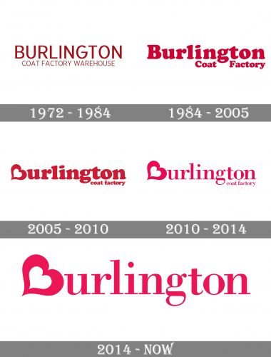
The visual identity of the famous American retailer has always been text-based, and always used a red and white color palette. Though there were different shades of red and different typefaces, if you put the very first version near the current one, you will definitely understand that it is one and the same company, with a recognizable style and design concept.
1972 – 1984
The very first logo for Burlington was composed of a dark red wordmark on a white background. The nameplate was set in two levels, with the name of the company on top, in enlarged lettering, and the “Coat Factory Warehouse” under it. Everything was written in all capitals, in one sans-serif typeface.
1984 – 2005
In 1984 the name of the company was changed, and the name “Warehouse” was removed. As for the visual identity, it gained a lighter and brighter shade of red, the one close to pink, and a new sleek serif typeface with thick lines and playful serifs.
2005 – 2010
2005 was the year when the logo we all know today was designed. The “Burlington” inscription in smooth and bold serif font has its first letter “B” stylized as a heart, placed slightly diagonally. The “coat factory” tagline was executed in the same font and style, and placed under the nameplate, in its right side.
2010 – 2014
The redesign of 2004 made the color palette chic — now it was fuchsia and white combo, representing passion and energy. As for the logotype itself, the heart-B stayed untouched, while all the other lettering got a new, cleaner, and stricter serif typeface.
2014 – Today
In 2014 the company was remanded to simply “Burlington”, so the “coat factory” tagline was removed from the logo. Now the nameplate with the heart looks perfectly balanced and evokes a sense of style and professionalism.


