Burger King is a fast-food restaurant chain, which was established in 1953 in the United States. The chain is famous for its hamburgers and french fries and today is one of the most popular fast-food brands worldwide with almost 18 locations across the globe. The company is owned by Restaurant Brands International, headquartered in Florida, and has almost 35 thousand employees.
Meaning and history
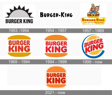
The visual identity of the world’s famous fast-food chain had five redesigns during the company’s history. It took the brand 16 years to find its signature style and three various logos were created from 1953 until 1969. However, after the success of 1969, the chain only refined and modified the iconic emblem, keeping the color palette and compositions almost untouched.
The logo of Burger King is a reflection of a modern and powerful company, which values tradition and legacy. Its emblem is a perfect reflection of the company’s nature and purpose, instantly recognizable across the globe.
What is Burger King?
Burger King is the name of a fast-food restaurant chain, which was established in the United States in 1953. Today the chain has almost 18 thousand locations worldwide, which makes it one of the world’s largest and most popular companies in the segment.
1953 – 1954
The company, known as Insta Burger King for the first year of its existence, got its first logo in 1953. It was a bold all-caps wordmark with half of the sun, rising from it. A bright and friendly emblem, which stayed with the brand for only one year.
1954 – 1957
The name was changed to Burger King in 1954, after the acquisition of the restaurants by David Edgerton and James McLamore. The logo was changed to a minimalist bold inscription in a custom sans-serif typeface, with uneven edges of the letters. It was a simple logotype, without any additional details, which was the symbol of the brand for three years.
1957 – 1969
The typeface and color palette of the logo was changed in 1957. Now the red lettering was placed on a light ochre background, looking bright and memorable. The font was changed to a bolder and neater one, it was something close to the TILT font, a modern sans-serif with playful letters.
The new logo featured a delicate “Home of the Whopper” tagline, where all letters except for “Whopper” were black.
1969 – 1994
The prototype of the iconic Bun logo was created in 1969. The red bold lettering was placed in two levels between two halves of the bun, colored in ochre. The color palette was taken from the previous logo version, yet the style, composition, and shape were completely different.
The inscription was now executed in a bold rounded sans-serif with sleek smooth lines. The “King” part was enlarged, in order to create a better balance between the layers.
1994 – 1999
The company refined the logo in 1994. The typeface is now more traditional and solid, while the ochre of the buns was changed to bright orange, making the logo more energetic and strong. The red and orange color palette symbolizes passion and young free spirit, showing the main audience of the company.
The wordmark in all capitals is executed in a bold rounded sans-serif, which is close to VAG Rounded ExtraBold font, but with the letter “G” and tails of both “R”s flattened, which makes the inscription look more solid and confident.
This logo is still in use by the restaurant chain in some of the countries and is as recognizable as the new one.
1999 – Today
In 1999 the Burger King logo was redesigned by Sterling Brands agency. The wordmark between the bun-halves was now placed diagonally, with buns colored yellow with some white strokes. The red lettering is now enlarged and executed in a new modern sans-serif typeface with sleek lines and sharp angles.
Today’s version of the logo has a rounded shape, unlike the previous ones. The emblem has a blue C-shape line, framing in on the left, an accent, making the logo brighter and more professional, adding confidence and a sense of expertise.
The Burger King logo is one of the most iconic visual identity designs in history, it is perfectly balanced in terms of color and shapes, and evokes a friendly and welcoming feeling.
2021 – Today
 In 2021 the Burger King visual identity gets a new design from Jones Knowles Ritchie. The new logo is composed of a bold red lettering placed between two orange buns. The light cream background of the image also makes a framing for the emblem, making it look warmer and friendlier. Blue color is completely removed from the brand’s palette.
Symbol
The Burger King logo uses three colors: red, yellow, and blue, which create an extremely attractive and tempting mix. It makes you want to rush to the nearest Burger King restaurant regardless of your gender, age, confession, occupation, etc.
Font and color
The bold rounded lettering from the bright Burger King logo is set in the uppercase of a heavy sans-serif typeface, which is pretty close to such fonts as Corkboard JNL and Frankfurter Std Normal, but with some contour modifications.
The color palette of the Burger King visual identity is composed of red and orange; with the background in the light shade of cream-beige. This palette is eye-catching and bright, making the badge of the chain stand out in the list of competitors, and evoking a sense of energy and dynamics.
What does the Burger King logo represent?
The logo of the fast food restaurant chain Burger King depicts bold and smooth lettering replacing a burger between two orange buns. This symbol brilliantly represents the essence of the company and the main position on its menu, the burger.
Why did Burger King change its logo?
Burger King changed its logo to a more simple and minimalistic one to give it a progressive and up-to-date look, showing the company’s ability to change and follow all the latest trends in the fast-moving world of design.
What does the Burger King logo symbolize?
The Burger King logo has no hidden meaning in it, it is quite direct and literate — the badge of the company represents a burger, where the meat layer is replaced by a two-leveled wordmark. The burger is the main product of the fast food chain, its specialty, and part of the brand’s name.
What kind of logo is the Burger King badge?
The badge of Burger King belongs to a combination type of logos, which means it contains both a graphical part (two buns), and a wordmark, which in this particular case is written in two lines between the graphical elements, using a bright shade of red, and having its uppercase characters soft and bold.
Why does Burger King have a new logo?
Burger King has changed its logo to a more modern and minimalistic one to show itself as a progressive company with a young spirit and the ability to change and evolve. The company has kept its iconic concept, although l, has rethought it, elevating the design and making the logo look stylish and strong.
Is the Burger King mascot a man or a woman?
The mascot of the Burger King fast food chain is an animated king, who first appeared in the early 1970s. In the 2010s the company didn’t use the image of its mascot often enough, accenting mostly on the food, but at the beginning of the 2020s, the creepy king came back to the stage.
When was the Burger King logo first used?
The predecessor of the current Burger King logo was created in 1969, and redesigned only in 1994. As for the original logo of the company, it was introduced in 1953 and featured a simple black-and-white composition with a geometric image of the rising sun, and modern sans-serif lettering complementing it.
What is the meaning behind the Burger King logo?
The logo of Burger King represents the main idea of the restaurant — food. And the color palette of the badge stands for warmth and coziness. It also symbolizes passion, a passion of the company for feeding people with its burgers.
Who designed the Burger King logo?
The Burger King logo has seen several versions and redesigns, with Kramer and Burns as the authors of the original version, and the Sterling Brands design bureaux as the creators of the most iconic version. As for the current badge of the international company, it was refined and strengthened by Jones Knowles Ritchie.
What is the Burger King mascot based on?
The mascot of the Burger King restaurant chain is… The Burger King, the animated man in a crown was first introduced at the end of the 1950s, and appeared again in the early 1970s, with a refined and modernized look. According to many, the king mascot is not the friendliest guy ever.
When was the old Burger King logo used?
The very first logo of Burger King was introduced in 1953 and only stayed active for a few months, with the redesign following in 1954. The second badge, based on a custom black lettering, has stayed with the chain for a bit longer — up to 1957 when the last “experimental” concept with a cartoonish king sitting on a burger was designed. This badge stayed in use for a decade.


