Brown Bears is the name of an athletic program from Brown University, a private educational institution, which was established in 1764, and is based in Providence, Rhode Island. The athletic program of one of the oldest American universities is composed of 28 men’s and women’s teams, which all
Compete in the first division of the National Collegiate Athletic Association.
Meaning and history
The teams of the Brown University athletic program play in Division I of the NCAA as members of the I y League, which is also known as The Ancient Eight, the most prestigious intercollegiate conference in America, which is composed of 8 members (all are private colleges and universities), and fields 33 sport disciplines. The conference was established in 1954 and operates in the Northeast region of the USA.
What are Brown Bears?
Brown Bears is the collegiate athletic program of Brown University, which consists of 13 men’s and 15 women’s teams, competing in various sports disciplines, including Football, Ice Hockey, Lacrosse, Water Polo, and Crew, indoor and outdoor Track and Field, and many others.
As for the visual identity, Brown Bears have stayed loyal to the color palette and the main symbol after the redesign, held at the beginning of the 2000s. The whole logo of the athletic program from Brown University is built around the drawing of a bear, executed in not the most modern manner, but looking unique and recognizable.
1973 – 1978
The very first Brown Bears logo was introduced in 1973 and looked super cool and progressive for its times. The abstract and minimalistic composition, executed in a solid brown and white color palette, depicted a modified white letter “B” drawn on a brown roundel with the left part stylized as a profile of a bear’s head. The animal was drawn in a very cool and smooth style, and its slightly extended contour added a sense of motion and power to the medallion.
1978 – 1997
The redesign of 1978 has created a more traditional and even naive logo for the sports team. It was still a brown and white color palette, but the main element was fully redrawn: the one and only hero of the new concept was a hand-drawn brown bear, depicted full-length. The animal was drawn with short and not too thick jerky strokes.
1997 – 2009
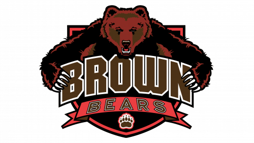
The Brown Bears logo, designed in 1997, featured an arched bold “Brown” inscription in a square sans-serif typeface, with the bodies of the letters in solid brown and a white outline. Under the main wordmark there was a red ribbon with the “Bears” written over it in thinner lines, but the same brown and white color palette. Above the “Brown” banner there was an image of a bear, with its paws spread to the sides and holding the lettering. The whole composition was set on a solid black crest in a double red and black outline. At the very bottom of the crest, there was an image depicting a bear paw, drawn in brown, and with each element outlined in white.
2009 – 2022
The redesign of 2009 introduced a simplified version of the Brown Bears logo, with the head of the bear set under the arched “Brown” inscription, slightly overlapping it at the bottom. The color palette of both the lettering and the graphical part remained untouched, and so did the style of the two parts. Although due to the lack of elements and more white color on the new badge it looks fresh and bright, evoking a sense of confidence and professionalism.
2022 – Today
In 2022 the Brown Bears’ visual identity was significantly minimized. The new idea is all about strength, stability, and simplicity. The badge of the team today features only one element the bold uppercase “B” written in a geometric serif font with a solid brown body and a double white and dark-red outline.


