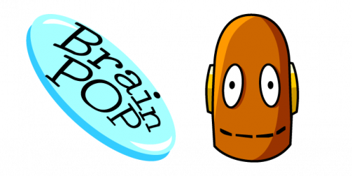
BrainPOP is a group of sites, appeared in 1999. Its operational facilities are located in New York. The sites specialize in educational courses, animated videos for students, quizzes and educational games. They cover various subjects of language, mathematics, technology, healthcare, and others. BrainPOP materials are used in more than a fifth of schools in The United States.
Meaning and history
BrainPOP, a dynamic educational platform, was brought to life by Dr. Avraham Kadar in 1999. Its inception stemmed from Dr. Kadar’s desire to explain complex medical concepts to his young patients in an engaging and understandable manner. This innovative idea blossomed into a broader educational vision, leading to the creation of BrainPOP.
The journey of BrainPOP is marked by significant milestones. It initially focused on health-related topics before expanding into a wide array of subjects, including science, social studies, English, math, arts and music, health and wellness, and technology. This expansion mirrored the evolving educational needs of its audience. BrainPOP’s unique approach, combining educational content with engaging animation and interactive features, quickly gained popularity. It became a go-to resource for students and teachers alike, revolutionizing the way educational content is delivered.
Today, BrainPOP stands as a testament to educational innovation, reaching millions of students globally. It has evolved into a multi-faceted platform offering tailored experiences for different age groups, including BrainPOP Jr. for younger students and BrainPOP ELL for English language learners. The company’s commitment to empowering educators and engaging students remains at its core, as it continues to adapt and expand its offerings in the ever-changing landscape of digital education.
What is BrainPOP?
BrainPOP is an educational technology company, renowned for its engaging learning games, animated movies, and activities. Designed to foster a deeper understanding and love for learning among students, it covers a wide range of subjects.
1999 – 2020
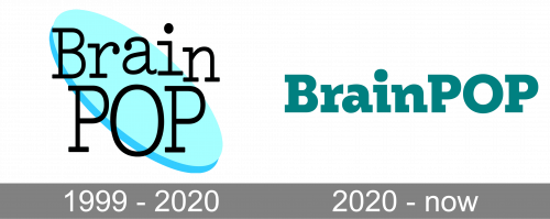
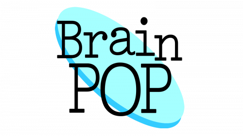
The first BrainPOP logotype was the name of the brand, written in a two-line inscription. The ‘a’ and ‘i’ characters of the upper ‘Brain’ word were lifted up a bit. The ‘POP’ lettering had large uppercase characters. Behind the inscription, we can see a bright blue oval. It’s very narrow and rotated into a diagonal position.
2020 – today
The 2020 logo is just a black nameplate, written in two levels. The font is now more a strict, bold serif style. They are now written in two homogenous lines without any additional lifting. The oval behind is also gone.
Font and color
The font used for both versions of the name has the same style: black letter with prominent serifs. However, there are huge differences between two logotypes. If the 1999 variant has the thin and slim inscription with angular style, the 2020 logo shows us bold characters with heavy serifs. The colors’ cognition also change from one logo to another: due to the bright blue oval, the first mark of the brand looks more playful and brighter than its predecessor.


