Bordeaux, or Girondins de Bordeaux, is the name of one of the oldest French football clubs, which was established in 1881. Today one of the most famous and strong clubs in France plays in Ligue 1 and has Jean Louis Gasset as the head coach.
Meaning and history
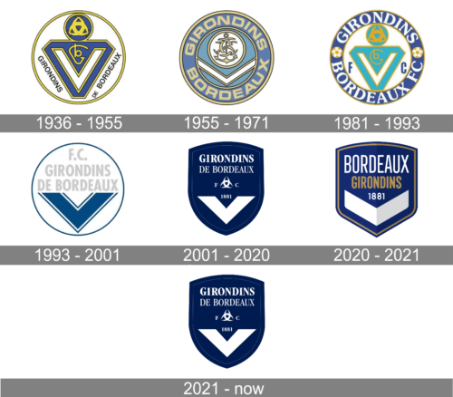
One of the oldest French football clubs has always had its visual identity based on geometry and abstract lines, rather than any animalistic or floral symbols. Strict and minimalist emblems have been redesigned several times throughout the club’s history, but the character has never been lost in those redesigns.
1936 — 1955
The logo, created for the club in 1936 featured a white circular badge in a gold and black outline, with the geometric emblem in the middle and a delicate wordmark. The emblem was composed of a white chevron, repeating the shape of the capital “V”. It was outlined in gold and placed in a triangular blue background.
Above the chevron there was an elegant gold “Gb” monogram, standing for the club’s name, “Girondins de Bordeaux”. The whole inscription was placed on the sides of the “V”, executed in all capitals of the simple and strict sans-serif typeface in calm blue.
Above the main emblem, there was a golden rounded symbol, also placed on a blue background, outlined in gold.
1955 — 1971
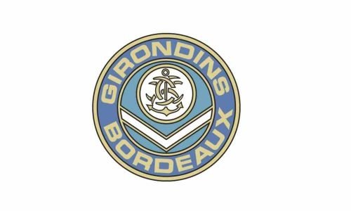
In 1955 the logo was redesigned and gained a more elegant composition and color scheme. Now the circular badge boasted a wide outline in light blue, with the massive gold lettering around its perimeter.
The inner circle of the emblem was colored in a light sea-blue shade and had a thin yet wide white chevron in a gold outline on its bottom part. As for the upper part of the circle, there was an ornate anchor with curved lines around it, placed on white and enclosed in a golden circle.
1981 — 1993
The redesign of 1981 brought back the logo from 1936, but in brighter colors and in a thicker outline. The wordmark was placed around the blue frame’s perimeter, written in a bold white serif font. Two blue letters “FC” were added to the composition and placed from both sides of the chevron symbol inside the circle.
1993 — 2001
The new minimalist badge was designed in 1993. A light gray “F.C. Girondins de Bordeaux” inscription is a bold sans-serif typeface that was placed above the blue chevron and enclosed in a thin circular frame. It was a very laconic logo, which be-came the base for all the future versions.
2001 — 2020
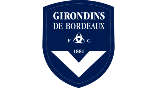
The circle was changed to the shield shape in 2001. It was a dark blue crest with a white and blue outline and white lettering and symbols on it.
The nameplate now featured a new elegant serif font, with the “Girondins” part in bolder lines. It was placed above the sharp geometric symbol either the “FC” letters on its left and right.
The white chevron in the bottom of the shield became thicker and now had “1881”, the year of the club’s establishment, in the middle.
2020 — 2021
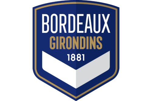
The shield became sharper and gained a new sleek color palette. Executed in gra-dient blue and white, the club’s emblem now looks more three-dimensional and pro-fessional.
The lettering, placed above the chevron with “1881”, is set in two levels, featuring different sizes, thickness, and colors of the words. The “Bordeaux” part in white is now placed on top, in bigger letters, executed in thin sans-serif. The “Girondins” in dark gold features a smaller size, but bolder lines. The new style of the wordmark is perfectly balanced by a thin gold outline of the shield.
2021 – Today
The club continued to use the shield logo it introduced back in 2001. A logo with golden accents it used during the 2020 – 2021 period was no longer representing the club. It was a good move as the solid dark blue shield emblem with contrasting white was a perfect representation of the club’s professionalism. In addition, it was a well-recognized visual.


