Bon Jovi is an American rock band, that was formed in the 1980s by a famous musician Jon Bon Jovi. The band became popular in the early 1990s and sold more than 100 million albums. Bon Jovi keeps recording new disks and tours across the world.
Meaning and history
During almost forty years of its history, the famous band has changed their logo only twice. And the first one is considered to be the most popular and recognizable one.
1985 — 1988
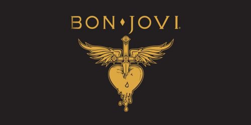
The first Bon Jovi logo was the most colorful and interesting one. It was designed in 1985 and features a heart with a dagger stabbing it.
Golden wings of the dagger’s grip symbolize freedom, while the dagger in the red heart — love, and pain.
It is a beautiful logo with gothic elements, which suit the rock band’s style and genre.
1988 — 1992
The band decided to simplify its visual identity in 1988, and the logo turns into a modest wordmark in a custom typeface, placed on an arched ribbon.
The color palette is monochrome, but black is very soft, almost gray. The Bon Jovi logo of this period is light, yet masculine and confident.
1992 — Today
The current Bon Jovi wordmark was designed in 1992 and featured capital letters with sharp angles and elongated tail of the letter “J”.
The wordmark can be used on its own or with a famous band’s heart and dagger emblem, which never left the musicians’ visual identity. The emblem changes its color scheme depending on the placement, by the style and meaning remain the same.
The Bon Jovi logo is memorable and remarkable, it is a masterpiece of music visual identity design and a celebration of the rock genre.
Symbol
The heart-and-dagger Bon Jovi logo is appeared in the times of the band’s New Jersey tour in the early 1980s. It features a red heart with a dagger stabbing it vertically, and golden wings projecting from the dagger’s grip. According to some experts, the logo symbolizes Virgin Mary’s suffering over the death of her son – Jesus Christ. Others say it depicts love and pain.


