Boeing is an aerospace corporation, which was established in 1916 in the United States. The company design and manufactures commercial and military airplanes and rockets, distributing them across the globe. The corporation, named after its founder, William Boeing, is headquartered in Chicago.
Meaning and history
The visual identity of the famous aerospace company has gone through four redesigns during its history. There were detailed pictures, Art Deco symbols, and modern logotypes, the company has tried different styles, but all of them reflected power and speed.
What is Boeing?
Boeing is the name of an American company, which was established in the middle of the 1910s, and has always been one of the leading aerospace corporations, known for the design and manufacturing of planes and rockets for both military and commercial uses.
1920 – 1930
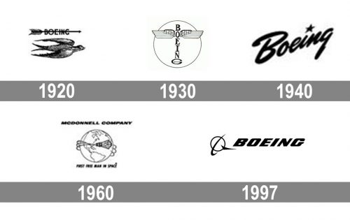
The original logo of the company was designed in the 1920s and was composed of three different badges. The first one was a detailed image of the bird, flying to the East, with an arrow above it, where the wordmark was located. It was a symbol of speed and freedom.
The second badge from this period depicted two stylized wings, elongated up, with two loops in the middle. It looked like a luxury car badge, symbolizing quality and style.
The third emblem for Boeing was composed of a wordmark with two white wings in a black outline, spread to both sides from the center. It was a minimalist logo, which fully reflected the company’s purpose and profile.
1930 – 1940
The redesign of 1939 brought a new shape and style to the visual identity of the aircraft’s manufacturer. A totem with two wings on its top part was built around a vertically set wordmark with the letter “G” extended, creating a pedestal.
It was an elegant and remarkable logo, which became recognizable fast enough and stayed with the company for another ten years.
1940 – 1960
The completely different visual identity concept was launched in 1940. The logotype was executed in a script typeface and placed diagonally, with the star replacing the dot above the letter “I”. It was a minimalist yet elegant emblem, reflecting progress, movement, and value of style and design.
The inscription became an inevitable part of the company’s visual identity and stayed for twenty years, representing a powerful and influential manufacturer.
1960 – 1997
The second version of the logotype, created in 1960, featured a strong and confident inscription in all capital letters, executed in a slightly italicized sans-serif font with thick masculine letters, boasting sleek modern lines. This logotype is still in use today, complemented by the iconic emblem.
It was modified several times during this period and was accompanied by digit codes of the planes, such as Boeing-747.
As for the color palette, the company used monochrome for printed versions and blue for placing on the planes.
1997 – Today
In 1997 Boeing merged with McDonnell Douglas company and the logo was redesigned, combining visual identities of both companies. The strong logotype adopted an elegant and unique emblem, a circle with a stylized wing on its right and a ring around it.
The current logo is executed in a blue and gray color palette, where the blue is used for the lettering and gray for the emblem, the combination of colors perfectly reflects the company’s essence and nature, symbolizing air, speed, and safety.
Symbol
In 1997, Boeing merged with McDonnell Douglas, its competitor, whose symbol – a sphere with a ring around it – was added to the Boeing logo. The new design belongs to Rick Eiber, a celebrated American graphic designer. Now the Boeing logo combines the sphere and the company name, which is written in the modern Stratotype typerface. The letters are colored in bright blue to symbolize sky. The logo itself expresses the company’s determination to reach new heights, excellence, and bright future.
What is the symbol of Boeing company?
The symbol of Boeing is an abstract geometric image, created by Rick Eiber in 1997. The emblem depicts a flat ring, standing for the globe, a bold sharp arched line, representing an orbit, and a triangular tick, showing the main specialization of the company — a plane. Three simple elements form a unique super meaningful symbol, which today is instantly recognizable in every corner of our planet.
Font
The iconic logotype in all capital letters is executed in a custom italicized sans-serif typeface, which is probably based on Tipemite Oblique or House Sans Italic Heavy fonts.
The inscription looks powerful and is ideally balanced, reflecting strength and free spirit, and evoking a sense of reliability, safety, and stability.
What is Boeing’s logo?
The logo of the Boeing company is composed of a minimalistic abstract emblem, followed by a heavy uppercase italicized logotype. The emblem of the company features a thin ring, standing for the planet, a vertically oriented orbit in its left part, and a small tick, which represents a jet. Both the lettering and the emblem are set in a calm yet the intense shade of blue.
What is Boeing’s full name?
Since 1961 the full name of the Boeing corporation is The Boeing Company. It was established in 1916 as Pacific Aero Products Co and renamed Boeing Airplane Company in 1917.
What military aircraft does Boeing make?
Apart from the most famous product, the passenger aircraft, Boeing is also specialized in the production of military planes. The company has a pretty large range of aircraft for the army, including fighters and bombers, and attack and transport planes.
How does Boeing promote their products?
Boeing is a legendary name, which today doesn’t need much advertising. The company has recommended itself as a super reliable and professional manufacturer throughout the years of its history. Today the Boeing advs can be seen in digital and printed media all over the globe.


