BMO US, also known as BMO Financial Group in the United States, is a branch of the Bank of Montreal, one of Canada’s largest banks. Established in Montreal, Quebec, Canada, it expanded into the U.S. to provide a wide range of financial services, including banking, wealth management, and investment solutions. This expansion was aimed at leveraging its expertise and reputation to serve a broader North American market, catering to both individual and corporate clients with diverse financial needs.
Meaning and history
BMO US, part of BMO Financial Group, has a history deeply intertwined with the evolution of banking in North America. Originally the Bank of Montreal, it was founded in 1817, marking the genesis of its journey. As the bank flourished, it set its sights on expansion, recognizing the vast potential of the neighboring United States market. Entering the U.S., BMO began offering a diverse portfolio of financial services, adapting and evolving with the American economic landscape. This strategic move not only broadened its client base but also integrated the bank into the financial fabric of both Canada and the U.S.
BMO US stands as a testament to strategic growth and cross-border financial integration, serving a wide array of clients with its robust banking, investment, and wealth management solutions. This expansion highlights BMO’s commitment to growing its global footprint while maintaining its core values of innovation, client service, and prudent financial management.
What is BMO US?
BMO US represents the American arm of BMO Financial Group, originally the Bank of Montreal, Canada’s oldest bank. In the U.S., it extends its heritage of comprehensive banking services, encompassing personal and commercial banking, wealth management, and investment solutions, tailored to meet the diverse financial needs of its American clientele. This expansion signifies BMO’s commitment to bridging financial expertise across North American borders.
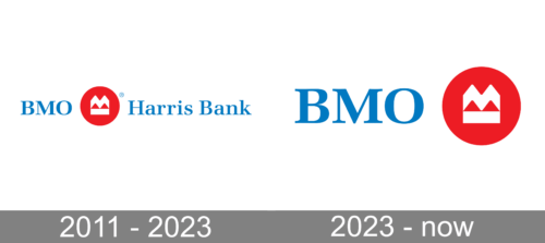
2011 – 2023
The logo harmoniously blends a stately blue ‘BMO’ with an equally hued ‘Harris Bank’, suggesting unity and coherence. Central is a vibrant red circle, a beacon of focus, enclosing a white, peak-like motif that speaks to aspirations and achievement. The design embodies a synergy of tradition and ambition, reflecting a legacy bank’s modern vision. All letters share the same serene blue, symbolizing a seamless, trustworthy financial entity.
2023 – Today
In this iteration of the logo, ‘Harris Bank’ text has been removed, simplifying the design to just ‘BMO’ in a confident blue hue. The iconic red circle remains, with the mountain-like graphic inside, now more prominent without adjacent text, symbolizing stability and strength. The logo’s streamlined appearance reflects a modern, minimalist branding approach, emphasizing a global, rather than regional, presence.


