Both the old and current logos of the New Zealand rugby union team Blues are inspired by the local nature.
Meaning and history
The Blues were originally known as the Auckland Blues.
1996 – 2000
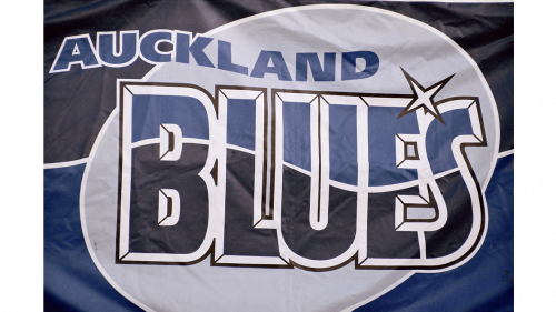
The earliest Blues logo reflected the original name of the team. Both the palette and shape of the emblem were inspired by the ocean. Each of the letters of the word “Blues” in the center of the logo was divided into two parts by a white gap. The gaps formed a wave, which seemed to be going through the glyphs. Also, the top part of the letters was light blue, while below the gap the letters were dark blue like the ocean below the sky. The white star between the “e” and “s” imitated reflections of the sun on the water.
Above, you could see the word “Auckland” also featuring a wave design. On the background, there was a gray ellipse.
2000 – Today
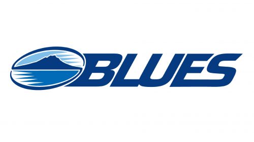
When the team dropped the “Auckland” prefix from its official name, a new logo was introduced. Here, you could see the word “Blues” in a dynamic italicized font paired with an elliptical emblem. The emblem featured the volcano cone of the Rangitoto Island.
Colors
Both the current and old logos are dominated by various shades of blue, which is hardly a surprise, taking into consideration the team’s name. White is also used in both of them as an accent color. The palette of old Blues logo comprised light gray, which isn’t present in the current version.


