Bitter is a German manufacturer of luxury cars, which was established in 1971. Mostly known for its modifications to the well-known cars, Bitter is considered to be a very reputable company, which sells its products across Europe and the United States.
Meaning and history
The visual identity of the Bitter brand is extremely sleek and represents the company’s individuality like nothing else. Composed of a wordmark and an emblem, which are used separately, the Bitter logo is unusual and instantly recognizable.
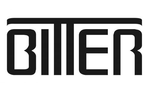
The Bitter wordmark in all capitals is executed in a custom sans-serif typeface, which resembles the 4square font, but with “B”, “R” and “T” modified. The horizontal bars of both first and last letters of the inscription are almost removed, while the bars of two “T”s are drawn as one long line, covering the whole wordmark.
The logotype is usually executed whether in a monochrome palette, of it light gray with a darker shadow.
There are two versions of the Bitter logo, which are actually very alike. The first letter “B” of the logotype has its vertical bar slightly thickened and rounded. This symbol can be enclosed into whether a vertical rectangle with rounded angles or in a gray circle, with the “Bitter Cars” inscription placed around the perimeter.
When placed directly on the cars, the brand uses a single iconic “B”, executed in a glossy silver metal, which looks elegant and chic.


