

![]() Billabong Logo PNG
Billabong Logo PNG
For decades, the core of the Billabong logo has been the depiction of two waves. The typography and the position of the elements have been modified more than once.
Meaning and history
![]()
Billabong International Limited was established in 1973. It is a surf company specializing primarily in clothing.
1973 – 2008
![]()
The original logo of the brand, the traduced in the beginning of the 1970s, was composed of a stylized uppercase inscription followed by a monochromatic emblem with a lm abstract white wave set on a solid black rectangle. The black lettering was executed in a bold narrowed sans-serif font with sharpened lines of the characters and a short underline in the center of the word with jumping letters.
2008 – 2018
![]()
The redesign of 2008 has modernized the Billabong logo by changing a typeface to a more geometric and stable one. The new inscription was set in the uppercase, with the two parts of the lettering executed in different fonts. As for the emblem, it was still a white wave on a black rectangle, but with the refined contours and more playful peaks.
2018 – now
![]()
In 2018 the emblem got slightly extended, and placed above the lettering, which was rewritten in a more minimalistic sans-serif font, with the whole wordmark executed in one typeface, and the uppercase characters placed on a significant distance from each other, letting in more air into the composition.
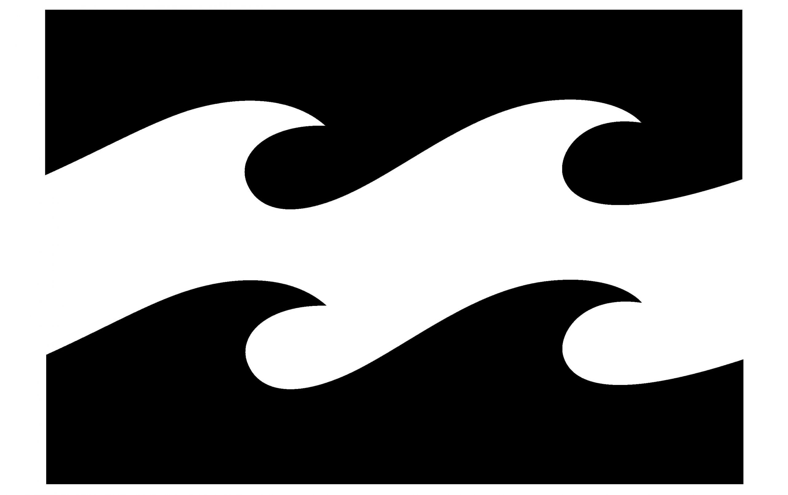
Symbol
The centerpiece of the design is a rectangle housing two stylized waves. As the company explains on its official website, the waves “run the same way and are motionless.” One of the waves symbolizes the sea, while the other symbolizes the sport of surfing, which has always been the inspiration behind Billabong products.
The name “Billabong” was adopted to create a connection with the company’s Australian roots. In Wiradjuri, an aboriginal language, the word “bilaban” refers to a creek that runs during the rainy season. Also, the word “billabong” has another translation, “an oasis.”
Emblem
The company has used several versions of its emblem. As of 2020, the brand’s website features the double wave symbol without the lettering.
You can also come across versions where the symbol is paired with the lettering “Billabong.” In some of them, the wave emblem has a black outline. The word “Billabong” can be written in a plain sans or in a more intricate type where the “L’s” and “A” partly overlap. Apparently, in this way, the Billabong logo symbolically refers to the legendary triple-stitching technique that made is products popular.


