The history of the pret-a porter brand BGN started in 1999 when it opened its first boutique in Paris. Today, the brand has a wider chain of outlets, including Russia, Ukraine, and Turkey.
Meaning and history
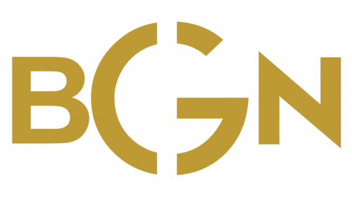
While the BGN logo contains only the three letters of the brand’s name, they look stylish enough to make a pictorial emblem unnecessary. We can say that the shape of the letters and the palette, in this case, is well enough to convey the essence of the brand.
According to the description on the company’s website, the brand builds its collections on the “easy- chic concept which combines contemporary elegance with relaxed silhouettes.” The description also mentions “effortlessly chic” style and being ready to provide the modern woman with an outfit for “every moment of her daily life.”
???? – Today
The central letter, the “G,” immediately catches your eye. This is not only because it is bigger than the “B” and “N” but also because it has an unusual shape. On the one hand, the two gaps add the “chic” vibe mentioned in the description. On the other hand, they do not create the impression that someone had to work too hard to create the glyph (like in the case of calligraphic letters with plenty of decorative curves).
The shape of the “B” and “N” is pretty clean emphasizing the “easy” part of the brand’s concept. There seem to be no unique details apart maybe from the slightly extended horizontal line on the “N.”
The gold color has been chosen as one more way to reflect the “chic” part of the brand.
To sum up, the BGN logo seems to perfectly fit the brand’s design concept.


