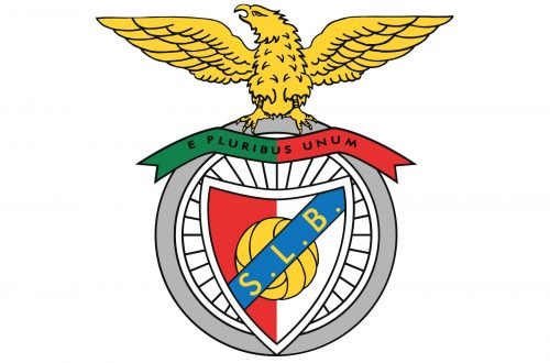
Benfica is the name of one of the most famous European football clubs which was established in 1904 in Portugal under the name “Sport Lisboa”. Today the popular and successful team is managed by Luis Filipe Vieira and has Jorge Jesus as the head coach.
Meaning and history
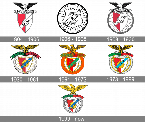
The iconic Benfica badge, which today is known in almost any corner of the world, was born as a result of two teams me crests merger — the Grupo Sport Lisboa shield with an eagle, and the Grupo Sport Benfica “wheel” badge with a crest. The two teams, responsible for the foundation of Benfica, have left their legacy for future generations, and the current logo is a celebration of the club’s history.
1904 — 1906
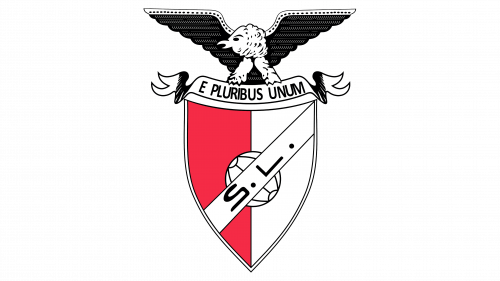
The centerpiece of this original logo was shield, divided into two halves of red and white. The middle was occupied by an old-style white ball. Over it, there was a white diagonal line saying ‘S.L.’ in black. The shield was crowned by a picture of a bird with outstretched wings, perched on a ribbon saying ‘out of many, one’ in Latin.
1906 — 1908
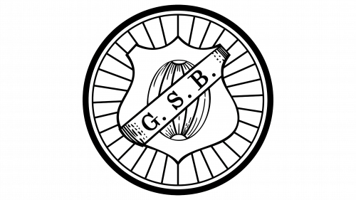
The redesign of 1906 has simplified the Benfica logo, making it look more professional and modern. The new badge featured a consular shape with a football pattern. The central part of the roundel was taken by the elegant white crest with a smaller ball in the middle, diagonally crossed by the white ribbon, with the “G. S. B.” Lettering written on it in a bold serif typeface. The badge had a triple black-and-white outline, with the external part in bold black, and the internal — in thin, and white in between.
1908 — 1930
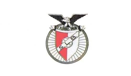
The logo for the new team, Sport Lisboa e Benfica, featured a classic shield, vertically divided into two equal parts, with an eagle on top, placed over a rounded badge, resembling a bicycle wheel. The eagle was standing on a ribbon with an “E Pluribus Unum” inscription and had his wings widespread.
The two halves of the shield featured light pink and white colors and had a monochrome football in the center. The diagonal ribbon with an “S. L. B.” The abbreviation was placed over the football.
1930 — 1961
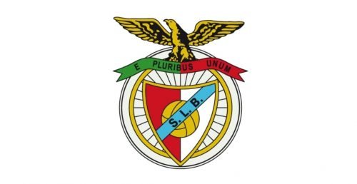
The redesign of 1930 brought a new color palette to the iconic logo. Now the eagle was drawn in gold and black, and the ribbon it was standing on featured two colors of the Portuguese flag — green and red.
The shield was redrawn and became more triangular, with its left half in red, and the right one in white. The football became yellow and the ribbon with an inscription — light blue.
The wheel now featured a golden tone and was placed inside another circle, a white one, with a thin silver outline.
1961 — 1973
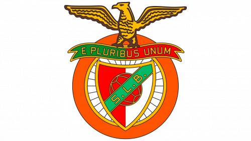
This logo resembles the old designs a lot. Except, this one uses a lot more color. The lines with text on them were repainted green and red, and the letters themselves became bronze. It also happened to the bird above. Besides these changes, a red circle was also added behind the emblem.
1973 — 1999
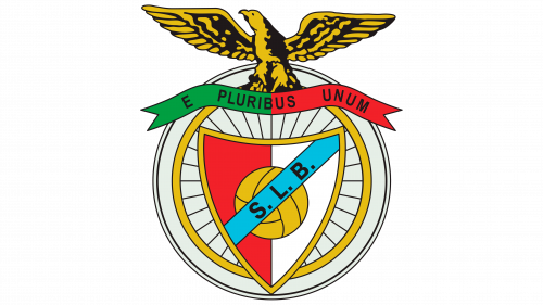
The 1973 logo uses the same design choices, except the shapes were rearranged in many places. The most notable one is probably the bird. The colors also changed again. The circle behind became white, the diagonal line turned turquoise, and the letters became black again.
1999 — Today
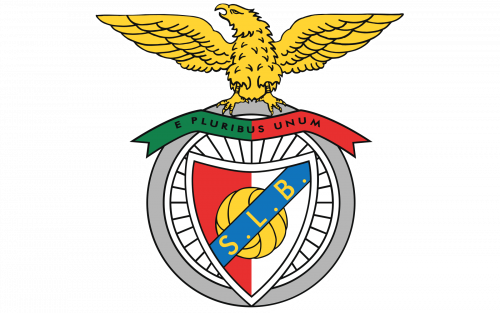
The redesign of 1999 refined the color palette of the Benfica logo again — the “wheel” now featured a thick gray outline, and the letters on the blue ribbon are written in yellow.
The eagle was redrawn and became bigger and lighter, while the shield left almost untouched, just the outline was switched from gold to white.
The Benfica logo is a celebration of the club’s history and roots, it is bright and eye-catching, keeping patriotic elements and combining them with sport and power symbols.
Font and color
The ornate heraldic Benfica logo is more about graphical components than lettering, this is why both inscriptions on a colorful badge are executed in a neat and clean sans-serif typeface with modest traditional shapes and cuts. The letters in the middle of the badge feature a bigger size, though look light and are not the main attention-catcher.
The Benfica iconic logo features a rich color palette, which includes white and gray as the main colors, and yellow, green, red, and blue as the additional ones. The light basic combination makes the badge fresh and delicate, while red and green, standing for the colors of the national flag of Portugal, reflect passion and progressiveness, and yellow and blue add friendliness and reliability to the overall look.
Benfica Colors
RED
PANTONE: PMS 3556 C
HEX: #E83030
RGB: (232, 48, 48)
CMYK: (3, 95, 95, 0)
WHITE
HEX: #FFFFFF
RGB: (255, 255, 255)
CMYK: (0, 0, 0, 0)
BLACK
PANTONE: PMS BLACK 6 C
HEX: #000000
RGB: (0, 0, 0)
CMYK: (70, 50, 50, 100)
GREEN
PANTONE: PMS 7731 C
HEX: #12814B
RGB: (18, 129, 75)
CMYK: (87, 25, 90, 12)
BLUE
PANTONE: PMS 285 C
HEX: #1074BC
RGB: (16, 116, 188)
CMYK: (86, 51, 0, 0)
YELLOW
PANTONE: PMS 810 C
HEX: #FFD432
RGB: (255, 212, 50)
CMYK: (1, 15, 89, 0)
GRAY
PANTONE: PMS COOL GRAY 4 C
HEX: #B5B5B5
RGB: (181, 181, 181)
CMYK: (30, 24, 24, 0)


