Bellier Automobiles is a French company that specializes in manufacturing compact and lightweight cars. The company is privately owned and focuses on producing vehicles for urban mobility. Bellier Automobiles operates in various regions of France and has established a reputation for its innovative designs and eco-friendly features.
Meaning and history
Bellier Automobiles is a French automobile company founded by Alain Bellier in 1968. Throughout its history, the company has achieved notable milestones in the automotive industry. Bellier Automobiles specializes in manufacturing microcars and quadricycles, providing affordable and practical mobility solutions. Their vehicles are designed for urban environments, offering compact sizes and efficient performance. The company has garnered recognition for its commitment to safety, comfort, and eco-friendliness. As of the present day, Bellier Automobiles continues to innovate and adapt to evolving market demands, striving to provide reliable and sustainable transportation options for customers worldwide.
What is Bellier Automobiles?
Bellier Automobiles is a French company that specializes in manufacturing compact electric vehicles. They are known for producing environmentally-friendly and innovative mobility solutions, particularly in the microcar segment.
1968 – 2009
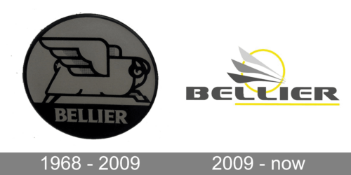
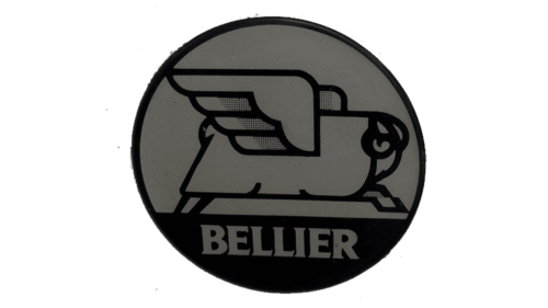
A simple drawing of a sheep with wings is an interesting element in the emblem of an automobile company. Nonetheless, the company used this logo for a little over 40 years, which makes it clear that the success of a company can make any emblem look great. The sheep is placed into a round emblem with black bottom. The brand name was printed in white using a bold font with flare serifs.
2009 – Today
This new emblem does have a hint of the wings seen in the earlier version. They are done as three feather-like lines that were colored in gray going from darker shade to lighter. The darkest shade was used to write “Bellier” underneath. It is done using a bold, sans-serif font that featured beautiful curves and looked a lot like the Sofachrome Regular typeface. These curves were complimented by a bright ring behind the “wings” and a yellow line running underneath the last five letters of the name. The two colors greatly complimented each other adding a touch of energy to a rather serious, solid brand image.


