Bass Pro Shops is the name of the American retail company, which was established in 1972 and specialized in selling items for outdoor activities, such as fishing, hiking, and camping. Today the company has almost 200 stores across the country, and also successfully operates via its online platform.
Meaning and history
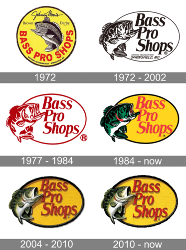 The visual identity of the Bass Pro Shops brand hasn’t changed much since the day of the company’s foundation. The iconic fish, designed in 1972 still can be seen on the retailer’s logo and is truly one of the most recognizable emblems in the industry.
What is Bass Pro Shops?
Bass Pro Shops is the name of the retailer from the United States. The chain started as a distributor of goods for fishing and then grew into a large company, which offers equipment, clothing, and accessories for all the possible outdoor activities.
1972
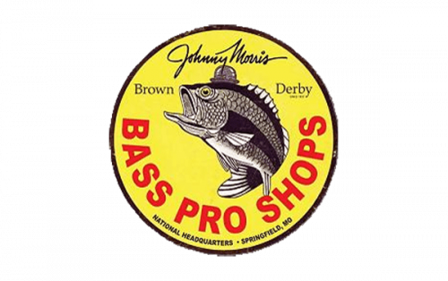
The very first logo for Bass Pro Shops was created in 1971 and only stayed with the brand for a few months. It was a circular yellow badge with the fish image in the center, a red arched uppercase lettering under it, and an additional cursive inscription in black on the upper part. The main wordmark was set in a bold and massive sans-serif typeface and was the main eye-catching element of the logo.
1972 – 2002
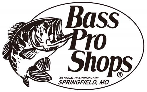
The redesign of 1972 switched the bright emblem to a calm gray and white one and the circle shape to an oval. Now the fish was set on the right of the oval frame, and all the lettering was placed inside the medallion, written in three levels with a delicate cursive tagline.
1977 – 1984
In 1977 the contours of the emblem were refined and emboldened, the tagline was removed from the badge, and the color palette tone from monochrome to burgundy in white. The logo started looking brighter and became more memorable and recognizable with the new shades.
1984 – Today
The redesign of 1984 colored the Bass Pro Shops badge in bright yellow and red shades, and the company’s fish mascot — in green, with black, white, and red details. The lettering started looking more professional and elegant in the new scarlet-red shade, while the yellow background of the oval evoked a sense of energy and dynamics, reflecting the character of the brand and its values.
1998 – 2010
The Bass Pro Shops logo is composed of an oval yellow badge with a brown outline. The vertically placed fish with its mouth opened is executed in green, white, and black and located on the left side of the emblem. In the middle of the oval, a red wordmark in three levels is set.
The color palette of the logo was created in 1984. Before the emblem was executed in red contours and set on a white background, and the earliest version featured a monochrome palette.
The logo from 1998, the one we all know today, is fully based on the version of 1974, but now it is three-dimensional and has all its contours refined. The lettering has a shadow, while the framing of the oval is rounded and gradient, which also adds volume and dynamics to the retailer’s visual identity.
The wordmark is executed in a traditional italicized serif font and all the words are written in a title case, one under another. A little glitter was added to the letters’ surface at the end of the 1990s, in order to make the logo brighter and sleeker.
The intense combination of red and yellow, reflecting passion and energy, is perfectly balanced by a calm and strict color palette of the three-dimensional fish, which shows the company as a professional one and represents its expertise and authority.
2010 – Today
It might seem that nothing has changed. However, when you compare both versions side by side, it will instantly be obvious that the new version is much lighter and brighter. In addition, the yellow background was made larger, so the letters were no longer as close to the border. This made perfect sense and greatly improved the overall look.
Font and color
The smooth custom lettering from the official Bass Pro Shops logo is set in an elegant bold serif font with slightly italicized letters. The closest types to the one, used for this insignia are, probably, Hacky Black Italic and Trooper Italic, but with some contours slightly modified.
As for the color palette of the Bass Pro Shops’ visual identity, it is set in yellow and red for the badge, and black and green for the fish. The color scheme of the logo makes it look dynamic and eye-catching, evoking a sense of passion and energy.


