Banco Do Brasil is one of the largest and strongest banks in Latin America, which was established in 1808 by King John VI. Today one of the world’s oldest banks has a yearly revenue of about 59 billion USD and almost 100 thousand employees.
Meaning and history
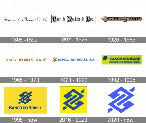
Established at the beginning of the 19th century, the most famous bank of Brazil featured an elegant inscription as its logo for almost a century. Then there were several experiments with ornaments on the letters, and finally, in 1965 the bank found its iconic badge, which has only been refined by today.
1808 – 1892
The original Banco do Brasil wordmark was executed in a smooth elegant cursive typeface with Elongated and curved tails of the capital letters. It was a monochrome logo, which looked delicate and sophisticated on official documents of the bank, as well as on the advertising banners.
1892 – 1926
For more than 30 years the bank was renamed to Banco da Republica do Brazil and got its logotype redesigned in 1892. It was an inscription in sans-serif, with each of the first words’ letters placed on an ornate square with curves, vignettes, and ornaments.
1926 – 1965
The name was changed back to Banco do Brasil in 1926 and the inscription on the logo was shortened. Now it was executed in a bold serif typeface and written in all capitals, with each “B” stylized. The logotype was placed on a narrow horizontally oriented banner with vignettes on its sides.
1965 – 1973
The minimalist and modern style comes to the bank’s visual identity in 1965. The light and clean lettering of the wordmark is accompanied by a geometric emblem on its right. Both text and graphical parts are executed in dark gold color.
The new Banco do Brasil emblem is an abstract sharp figure resembling “8” composed of two rhomboids, with their tails intertwined. It was a symbol of unity, support, and confidence.
1973 – 1992
In 1973 the new color appears on the bank’s logo — the inscription becomes light blue. Another change was with the emblem’s location, it was now placed on the left of the lettering, and executed in solid gold with delicate white details. The typeface of the logotype gained a simpler sans-serif typeface, which looked balanced in the new bright shade.
1992 – 1995
The color palette we all can see today was adopted by the bank in 1992. Both emblem and logotype were colored blue and placed on a yellow background. The inscription gained a new italicized sans-serif, which stood for progress and movement, white the emblem was kept in its original contours, but colored solid blue.
1995 – Today
In 1995 the colors of the palette for refined and cleaned. All the contours were redrawn in order to make the logo look more professional and confident. The typeface was changed and the inscription got its two “B”s enlarged.
Throughout the years there were two icons designed for Banco do Brasil, and they are both I use today — the three-dimensional blue emblem on a yellow rectangle, where the iconic blue featured gradient shades and a delicate dark outline, and the flat version, which looks more minimalist, yet keeps the character of the logo and shows the values of the financial institution.
2016 – 2020
In 2016 they adopted this secondary emblem, which was just a close-up of the blue central symbol from the main logotype (with some yellow background). Notably, the color scheme switched to a slightly brighter one.
2020 – Today

In 2020, they updated the secondary emblem by removing the yellow parts and making the symbol itself bigger and paler. That’s it.
Font and color
The Banco do Brasil logotype is executed in a minimalist and modern sans-serif typeface with thick neat lines and traditional cuts of the edges. The font of the inscription in very similar to such iconic fonts as Neue Helvetica Paneuropean and Nimbus Sans Novus.
The yellow and blue color palette of the bank’s logo is a reflection of friendliness and energy, along with reliability and trustworthiness. This bright combination shows the bank’s customers that they can be confident and secure, using the Banco do Brasil services.


