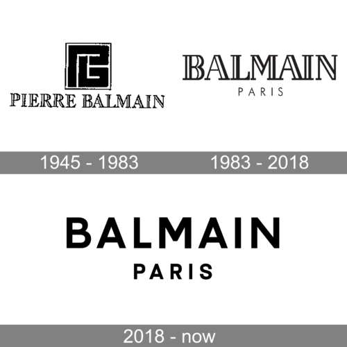
Balmain is an example of a company that is exceptionally loyal to its visual brand identity. Even when they eventually updated their logo in 2018 after almost 70 years, it was not a complete overhaul but rather a modification.
Meaning and history
Balmain is a French luxury fashion brand established in 1945.
The French fashion designer Pierre Balmain made his debut in the world of haute couture immediately after the end of World War II. In 1945 he opened his first boutique in Paris. Soon Pierre Balmain joined the elite of haute couture. Among his clients were Vivien Leigh, Catherine Hepburn, Marlene Dietrich, Brigitte Bardot, and Sophia Loren.
Unlike some couture houses that turned their backs on the ideas of the original designer, Balmain has always proudly remained true to the vision and pristine spirit of its founder. Since Pierre Balmain’s death in 1982, the house has been guided by a number of strong designers, each balancing modern trends with the need to respect the house’s foundations and traditions. These designers – Eric Mortensen, Hervé-Pierre, Oscar de la Renta, Laurent Mercier and Christophe Decarnin – were inspired by the beauty, grace and elegance of Balmain’s iconic Jolie Madame style.
What is Balmain?
Balmain is the name of a luxury French fashion house, which was established in Paris in 1945, and named after its founder, a legendary fashion designer Pierre Balmain. Today the brand is known internationally for its chic and sassy clothing collections, along with accessories, watches, and cosmetic lines.
1945 – 1983
The very first logo of the Parisian fashion house was introduced in 1945 and stayed with the brand for almost forty years. It was a black-and-white composition with the geometric emblem placed above the elegant serif lettering in contoured capitals. The emblem was a framed square with two bold stylized letters, “PB”, drawn in thick straight lines and making up a thin white “labyrinth” on a black element.
1983 – 2018
The old Balmain logo was dominated by the word “Balmain” in an elegant and somewhat heavy serif type. The thickness of the glyphs varied. In the thickest parts, there were white gaps.
The word “Paris” was given in smaller letters below. Here, the type was simpler sans.
2018 – Today
The design team was led by the brand’s creative director Olivier Rousteing.
The new brand identity includes two elements: a large “B” icon and the wordmark “Balmain Paris.”
If you take a closer look, you will discover that the “B” is, in fact, the combination of the letters “P” and “B.” While the “B” stands for “Balmain,” the “P” is the initial of the two words meaningful for the brand: “Paris” and “Pierre” (the name of the founder).
Olivier Rousteing claimed that the “B” has been inspired by Pierre Balmain’s mid-century monogram designs. He also explained that the icon would be used for patterns and adornments of the brand’s products.
The “Balmain Paris” wordmark features an austere sans. The letters of the first word are larger than those of the second word. There is no more “double letter” effect like in the original Balmain logo.
Font and Color
The bold uppercase lettering from the primary Balmain badge is set in a modern geometric sans-serif font with stable characters and straight lines. The closest fonts to the one, used in this insignia, are, probably, Colville Bold, or Neue Radial B Bold, but with the characters slightly condensed.
As for the color palette of the Balmain visual identity, it is based on simple elegance on black and white, the combination, which is associated with style, sophistication, and confidence.


