AutoCAD is a brand of a computer software, which is used by professional designers and architects. It was created in 1982 by John Walker and is considered to be one of the most progressive and reliable brands in the computer-aided design segment.
Meaning and history
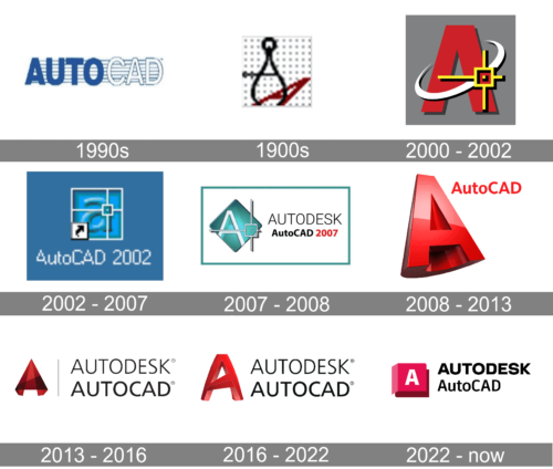
AutoCAD is a professional program for architects and engineers, for many years it’s been one of the most popular and tool of the highest quality. The AutoCAD logo was changed many times, as the program was renewed and modified.
The 1990s
The first logo was composed of a wordmark in all-caps, featuring blue color palette, where the part “Auto” has bold blue letters and the “CAD” is executed in white lettering with a blue outline. The wordmark is placed on a stripped blue background. It looks simple yet professional.
The 1990s
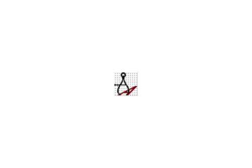
An interesting logo design can be seen here. A beam compass used for drawing casts a shadow in the form of a red letter “A” on isometric dot paper. The “A” is meant to stand for “AutoCAD”. Such a simple design has a lot of meaning behind it, showing designers and architects that this program can replace all the physical drawings that require a lot more time and effort.
2000 – 2002
The first appearance of the signature red color. The logo is composed of a single red “A” with a white orbit around it and a graphical representation of a yellow star. This logo looks brighter and stronger than the previous version.
2002 – 2007
The “A” signifier is in the lowercase and is placed into a blue square. The letter itself also featured blue color, with a gray outline, which add volume to the logo and makes it alive.
2007 – 2008
The geometrical logo was created in 2007, it is composed of the capital “A” which is executed in white fine and straight lines, placed on a sea-blue background, which is close to green.
2008 – 2014
The creation of the signature red “A”, which is three-dimensional and instantly recognizable. The company finally found its unique emblem.
2013 – 2016

The “A” is turned and looks more like a 3D pyramid now. It fully reflects the purpose of the AutoCAD program, representing the passion and professionalism of the company.
2016 – 2022

The current AutoCAD logo is a three-dimensional “A” in a deep red color with perfect and balanced bold lines. It has a lot of character and evokes a sense of reliability and confidence.
2022 – Today
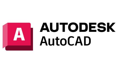
The AutoCAD software logo was redone along with some of the other products of the AutoDesk company. The rebranding allowed to create a cohesive look for all the products, strengthening the brand image. The logo of this software looks almost identical to the logo of a similar software, 3ds Max, offered by the company. It consists of a 3D illustration that creates an illusion of a cube and an inscription to the right of it. The “cube” is done in saturated pink with a white “A” in the center. The name printed on the right features a font very similar to Anant Grotesk Bold by Gunjan.


