Autism Speaks is an American non-profit organization, which is specialized in various activities, connected to helping people with autism. The organization was established by Bob and Susanne Wright in 2005 and by today it has grown into the largest agency, working on research and other activities around autism.
Meaning and history
In 2005, motivated by a deep personal connection to autism due to their grandson’s condition, Bob and Suzanne Wright founded Autism Speaks. This U.S.-based organization was established with a focus on enhancing awareness, advancing research, and improving access to resources for Autism Spectrum Disorders (ASD).
Throughout its history, Autism Speaks has achieved remarkable strides in autism advocacy and research. It has dedicated substantial resources to demystify autism’s complex nature, particularly in understanding its genetic and environmental aspects. The organization has actively lobbied for legislative changes, effectively advocating for increased insurance coverage for autism therapies and fostering a broader societal understanding and acceptance of the condition.
As of now, Autism Speaks is a crucial figure in the autism community. It leads numerous international efforts, notably World Autism Awareness Day, and offers a multitude of support and resources to those impacted by autism.
Autism Speaks’ ongoing endeavors in research and advocacy not only enhance the quality of life for individuals with ASD but also position the organization as a formidable influence in the area of autism awareness and support.
Its role in shaping public policy, driving research breakthroughs, and creating inclusive environments for people with autism underscores its commitment to making a lasting positive impact in the community.The organization’s efforts extend beyond immediate needs, aiming to build a more understanding and accommodating future for individuals with autism and their families.
What is Autism Speaks?
Autism Speaks is a non-profit organization focused on autism advocacy and research. It was founded with the goal of enhancing the lives of those with autism by funding research, influencing policy, and providing resources for individuals and families.
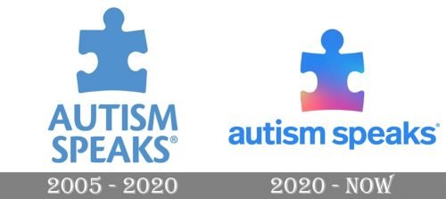
2005 – 2020

Their oldest logo consisted of a puzzle piece and a wordmark next to it. The puzzle piece was a teal blue color, same as the wordmark. They had the same height, because the latter was written in two lines, using only capital letters. The font was a pleasant sans-serif with many cut edges.
2020 – Today
The Autism Speaks visual identity is simple yet looks kind and evokes a sense of caress and tenderness. Its logo, composed of a graphical and text parts uses a bright yet calming color palette, which makes it fresh and crispy.
The Autism Speaks logo boasts a puzzle detail in gradient blue and pink and a wordmark in the lowercase on its right. The wordmark is executed in a traditional sans-serif typeface, with clean bold lines, slightly rounded contours, and straight edges. Set on two levels it looks very friendly and kind.
As for the main detail of the organization’s visual identity, the puzzle, it is executed in several calm yet intense shades and looks sleek and modern. The symbol brilliantly reflects the purpose of the foundation, as people with autism are known to be great with different quizzes and puzzles.
The blue, pink, and white color palette of the Autism Speaks visual identity represents the purpose of the organization, its character, and its willingness to help. It also stands for loyalty and unity, responsibility, and caress, which are the main qualities of any non-profit organization, aiming to make the world better.


