Attentive is the name of an American company, which was established in 2016 with the idea of creating the best mobile messaging platform for marketing purposes. The company works with various businesses to improve their SMS marketing strategy, and by today has grown into one of the world’s leaders in the industry.
Meaning and history
Attentive is one of the fastest-growing American startups, which was created in 2016 and by today has already contracted more than 5 thousand clients. In 2021 Attentive has raised over 470 million USD investments.
The main idea of the Attentive platform is to help businesses interact with their customers via automatic messages. The platform collects all client-oriented data in real-time and sends text messages with engaging content. This concept is very beneficial for all types of e-commerce companies, as all the updated information on offers, deliveries, or customer support is being sent automatically to their actual or potential buyers.
Attentive collects and analyses all the data very attentively, and this is not only the name of the company but its main principle and the secret of its success. Apart from e-commerce, the company also works with businesses in the following segments: Retail, Food and Beverage, and Entertainment. Among the clients of Attentive are such brands as Kendra Scott, Coach, Jack in the Box, and EM.co.
What is Attentive?
Attentive is a New York-based company, engaged in mobile messaging marketing. The company was established in 2016 and today has more than 5 thousand clients from all over the world, using the Attentive messaging platform to interact with their customers.
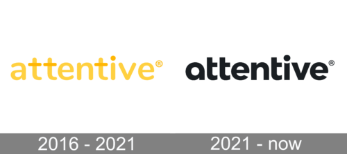
In terms of visual identity, Attentive has always been pretty minimalistic and modern. The company’s logo has undergone one major redesign in 2021, but the main features of the Attentive image remained there.
2016 – 2021
The original Attentive logo was introduced in 2016 and stayed with the company for almost five years. It was a bold lowercase logotype in a yellow and white color palette, with the horizontal bars of all three letters “T” drawn in a darker shade of yellow, as well as the dot above the “I”. These four-color accents added uniqueness to the simple yet stable inscription and turned light yellow when the logotype was set in white on a solid yellow background.
2021 – Today
The redesign of 2021 has not only changed the color palette and the typeface of the Attentive logo but also added a new element to the concept — an icon. The Attentive icon is a bold black stylized letter “A” composed of a smooth diagonal element with one of the ends rounded, and the other — curved and sharpened, and a solid circle, placed on the left, under the curved end of the bar. The black elements of the “A” are placed on a pale yellow background.
As for the primary version of the badge, the Attentive logotype, it is still set in the lowers, but has changed its typeface to a more modern and sleek one, with the horizontal bars of the “T”s shortened and only coming out to the right, and the vertical bar of the “I” having its upper edge arched to the center, creating a yellow smile between itself and the solid black dot above it.
Font and color
Although the typeface of the lowercase Attentive logotype was designed exclusively for the brand, it has some resemblance to such commercial fonts as Ghino Bold, Monsal Gothic Bold, and Draft A Bold, but with the contours of the “T” and “I” modified.
The color palette of the online messaging platform is composed of black and pale-yellow, which together create a very unusual and friendly combination, where pale-yellow stands for calm energy and joy, and black adds professionalism and stability, representing the strong points of the company.


