Atlassian is an Australian software company, which was established in 2002 and became instantly popular due to its tracking program Jira. The company is based in London and is one of the most reliable and innovative players in the software market.
Meaning and history
Atlassian is an Australian-born corporation that creates software development management software. It all started when two native Australians, Mike Cannon-Brooks and Scott Farquhar, met at the University of New South Wales. In 2002, they formed a firm that provided outside help to a software company from Sweden. The startup has been actively developing with its funds for several years, building and upgrading the Jira bug-tracking system.
Jira is the most popular product of the Australian company Atlassian, which offers a balanced and very flexible set of tools for process management, Agile projects, knowledge publishing, and developer support.
In 2007, the company took over the company Cenqua – creator of Crucible, FishEye, Bamboo, and Clover. They were retained and provided further development in Atlassian.In 2014 it was decided to register a management company in London. However, its head office, management, and engineering divisions operate in Sydney.In 2017 Cannon-Brooks began collaborating with Elon Musk to apply Tesla Hornsdale Power Reserve battery production techniques to South Australia, which has been hit hard by energy problems.
Now Atlassian has more than 100 thousand customers in different parts of the world, and its portfolio includes twelve products.
What is Atlassian?
Atlassian is the name of a software development company, which was established in Australia in 2002, and today is based in London, operating globally. The most famous product of Atlassian is Jira, the bug-tracking and agile project management software.
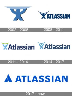
2002 — 2008

During all its history, the Atlassian logo has always referred to the myth of Atlas, which is part of Greek mythology. Atlas was a Titan who was condemned to hold up the sky for eternity.
In the original logo, Atlas was blue with black shades, while the sky was of a lighter blue tint.
2008 — 2011
Atlas was redrawn. There were fewer curves in his body, which now resembled the letter “X.” The sky became a curve rather than a bowl. Also, the name of the company in an all-caps sans was added on the right.
There was only a single color in the palette now, dark blue.
2011 — 2014

The Titan was more stylized now. In fact, many people who looked at the emblem didn’t even understand that the intricate picture was supposed to represent a figure of a giant holding the sky. As if to make the matters worse (or better, depending on how you look at things), the sky became green.
The style of both the emblem and the wordmark became softer, curvier. It was partly due to the fact that most of the letters were lowercase now (except for the initial “A”).
2014 — 2017

The design grew slightly more minimalist. This was partly due to the fact that the sky became blue (the same color as Atlas).
Also, the shade of the wordmark grew a little grayer.
2017 — Today
The Atlassian logo, redesigned in 2017, looks bright and professional. It is composed of a wordmark with an emblem on its left.
The wordmark in all capital letters is executed in a custom sans-serif typeface, where the horizontal bars of the “A”s are curved, resembling a smile.
The sleek smooth lines of the inscription are perfectly balanced by a bold brand’s signifier, which is a graphical representation of the letter “A”, composed of two pillars, which reinforce each other.
The brand also explains the symbol as a mountain, ready to climb on, which is a great reflection of the company’s united spirit and progressive approach.
The bright blue color of the Atlassian logo shows the company as trustworthy and reliable, as well as celebrates the professionalism, stability, and authority of the brand.
The Atlassian logo is bright and contemporary. Its simple bold lines make it look strong and memorable, while the color is the main attention-catcher.
Font and Color
The fresh uppercase lettering from the primary Atlassian badge is set in a bold geometric sans-serif typeface with strong characters and distinctive contours. The closest fonts to the one, used in this insignia, are, probably, Helvetica Now Micro ExtraBold, or Bauziet Norm Extra Bold, but with some modifications of the characters’ contours.
As for the color palette of the Atlassian visual identity, it is based on a bright and intense shade of blue, which looks lively and energetic, evoking a sense of excellence and progressiveness and showing the brand as a professional and reliable one.


