Like many Chinese companies working internationally, ZTE has two versions of the logo (in English and Chinese).
Meaning and history
Describing its logo, the company uses the following adjectives: “harmonious, integrating, flexible, and interactive.” The flowing shape symbolizes the free flow of information.
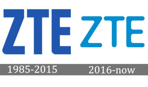
1985 — 2015

The old ZTE logo had the same core as the current one. You could see the abbreviation “ZTE” set in a simple all-caps sans serif type. The letters were blue.
However, the shape of the glyphs used to be different. Although some of the angles were rounded, the majority of the ends was rectangular. Also, the shade of blue in the previous logotype used to be darker.
2016 — Today

Describing its logo, the company uses the following adjectives: “harmonious, integrating, flexible, and interactive.” The flowing shape symbolizes the free flow of information.
The ZTE logo used abroad is absolutely minimalistic. There’s nothing more than the three capital letters of the company name. Moreover, the type itself is also a very simple sans serif one – it doesn’t seem to have any features making it stand out. The ends are rounded; the glyphs have a traditional shape. Yet, it looks modern, sleek, and perfectly readable, which seems only natural for a company dealing with telecommunication. Here, getting the message across and being understood is more important than being unique.
Emblem used in China
In addition to the letters “ZTE” from the global logo, the version used domestically also includes the name of the company in Chinese.
Colors
The shade of blue featured on the ZTE logo is saturated and eye-pleasing. It’s dark enough to make the necessary contrast with the white background, and yet, it doesn’t sacrifice its bright and vivid mood for the sake of contrast. According to the company, the color was chosen for its “youthful and lively” feel.


