ATI is a Canadian brand of computer processors manufacturer, which was created in 1985 in Ontario. The brand was acquired by AMD in 2006. The use of ATI branded products was ceased in 2010.
Meaning and history
ATI Technologies is a Canadian company, a developer and supplier of graphics processors and motherboard chipsets, which operated from 1985 to 2006 as an independent company, which is one of the largest in its industry.
July 24, 2006, ATI was acquired by AMD Corporation and became part of it as the graphics division of AMD Graphics Products Group; ATI products continued to be produced under the ATI Radeon brand.
After the acquisition of the company by AMD, the second largest computer processor manufacturer, the ATI brand has been functioning for four more years, but the brand was closed in 2010, as AMD found that its brand represents a higher value to customers.
What is ATI?
ATI is the name of a defunct computer processor manufacturer, which was established in Canada in the middle of the 1980s and ceased all operations in 2010. The company was bought by AMD in 2006, and today its technologies are used for the production of processors under this brand.
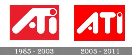
1985 – 2003
The name of the brand, ATI, stands for Array Technology Inc, founded by the Lau family in 1985.
2003 – 2011
The ATI logo is not traditional for the industry. It is an example of intense and bright color design.
The logo is composed of a wordmark placed in a scarlet red square. The white lettering makes the red even brighter, creating a perfect contrast.
The all-caps nameplate is executed in custom typeface with smooth and soft lines and rounded angles of the letters. It is perfectly accompanied by two circle elements of the logo.
The first is a white circle, which replaces the bar of “A”, and the second one is a red circle, placed inside the letter “I”. These elements add creativity to the logo and make it look more playful and vivid.
The ATI logo is full of energy, showing the brand as powerful and young minded, looking into the future but thinking of the quality. The color scheme reflects the brand’s brave and strong spirit and evokes the sense of trust and confidence.
Font and Color
The ExtraBold rounded designer lettering from the primary badge of ATI is set in a custom typeface with its uppercase characters drawn in thick lines with softened edges. The closest fonts to the one, used in this insignia are, probably, Store Clerk JNL Solid, or Pastrami Super, but with the shapes modified.
As for the color palette of the ATI visual identity, it is based on a powerful and intense combination of red and white, which adds a sense of passion and energy to the whole badge, making smooth shapes look a bit aggressive.


