Founded in 1976, today Apple is one of the world’s top consumer electronics manufacturers, whose products include smartphones and computers, as well as software and facilities for online services. Apple has been a leader in the world of computer software and home appliances for decades. The launch of any Apple product is accompanied by a huge amount of press coverage, and fans of the brand line up to be among the first to get their hands on the latest gadget. The innovative products and online services produced by this company are as familiar to most users as the iconic Apple logo.
Meaning and history
There are names and brands which do not need an introduction, and Apple is one of them. The company, which invented iPhone and iPad, made a revolution in not only the technological world but also in the fashion one. Apple is known for the exquisite design of its gadgets, and its minimalistic approach to its visual identity. This minimalism is very edgy though, and considering the famous Apple logo first saw the light in the late 1970s, we can see how progressive and innovative the company was from its first days.
Steve Jobs, the founder of the brand, and the philosophy is definitely a trendsetter. And there are undeniable facts, such as – Apple is the most famous smartphone, and the Apple logo is the most recognizable consumer electronic label across the globe.
The iconic Apple logo was introduced just one year after the company’s establishment and hasn’t changed at all since that time. It is one of the examples of brilliant branding in contemporary marketing history, which proves, that not everything has to follow the trends, but there are logos, which set them.
Who designed the Apple logo?
The current Apple logo was developed by Rob Janoff, a graphic designer known primarily for corporate logos and identities. The author of the concept was Steve Jobs. By the way, the original Apple logo was created by Steve Jobs and Ronald Wayne.
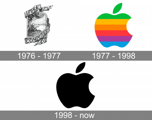
1976 – 1977
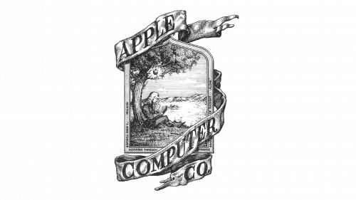
Though even such company as Apple started with the trial version of the logo, which was placed on their first computer. It was a classic and elegant badge surrounded by a smooth ribbon, where the “Apple Computer Co” lettering was placed. The inscription was executed in a bold serif typeface, which made its capital letters solid yet sophisticated. The badge itself depicted a very detailed image of Isaak Newton sitting under the apple tree with a book in his hands.
1977 – 1998
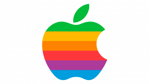
The iconic bitten Apple logo was designed by Rob Janoff in 1977. It was a clean and perfectly balanced image, with a horizontal rainbow pattern. The representation of knowledge, diversity, creativity, and inspiration, this logo remained untouched until now and is truly one of the most recognizable visual identities in history. The color palette of the Apple icon stayed rainbow until 1998.
1998 – Today
The Apple logo was renewed in 1998, and this is when the rainbow version was replaced by its monochrome twin. The black bitten Apple was used by the brand for several years but became official only after the release of iMac. Today the black icon on a white background is a symbol of style and technologies, a synonym for quality and excellence.
Symbol
Later, Jobs confessed that he had gone on a fruitarian diet and visited an apple farm, and it was then that the idea came to him. Rob Janoff, a graphic designer, suggested an image of an apple with a “bite”, so that it would not be confused with other fruits.
It is historically so, that the best ideas come up when they are not expected. And exactly the same happened to Isaac Newton and his apple fruit.
The fruit is also known to be a symbol of life in ancient mythology. Gods were gathering for an important meeting under apple trees, discussing the most important questions — of life and death, of happiness and immortality. And even today, the fruit is associated with life and wellbeing.
Logo meaning
There is also more about the ‘bite’ taken out of the apple than just distinction from a cherry or any other fruit. Indeed, the idea goes back to the time of Adam and Eve, who bit from the apple of knowledge. Thus, the image suggests human thirst for knowledge, and using Apple products would help people get knowledge and quench it. Also, the ‘bite’ symbolically puns with ‘byte’ – the unit of digital data.
Who “bit” the emblem?
When Rob Jan first met Steve Jobs in 1977, the Apple company was less than one year old. The process of creating the Apple emblem took just a couple of weeks. While working on the logo, Rob Jan, according to his own confession, cut a lot of apples in halves, and used them as models to make the picture look realistic.
Icon
In 1977, Rob Janoff developed a beautiful new design with an apple and the word “Apple. The new logo was aimed at a young audience and symbolized the computer’s unique ability to display colors. And so that the apple would not be confused with the cherry, it was decided to make it a bite.
In 1984, with the release of the Apple Macintosh, Apple executives decided the logo had already acquired enough fame to represent the firm on its own, without the brand name. This decision turned out to be right. Since 1984, the company didn’t change its legendary symbol, experimenting only with colors and shadows.
The Apple Icon today is a minimalist and clean image of the bitten fruit, executed in plain black and most cases placed on a white background. As for the devices of the brand, the icon is usually being engraved or embossed and its color depends on the color of the metal or glass of the gadget.
Shape and colors
 After shutting down the ‘rainbow’ logo in 1998, Steve decided to use a monochromatic apple image. The logo’s shape remained unchanged. The reason was that the many-colored logo did not go well with the metal casing of new Mac computers. Today, the logo comes in different colors depending on the background.
It should be noted that there were a few color transformations in between. In 1999, an Aqua-themed version of the logo was introduced, and it was in use until 2003.
In 2007 the designer team came up with a glass-themed logo, which was used until 2013.
Font
What is the story behind the Apple logo?
The first Apple emblem, introduced in 1976, was nothing like the now world-famous logo. It depicted Isaac Newton sitting under a huge tree with an apple falling from it. The author of the new company’s logo was Ronald Wayne, who left the company the second week after its opening. The company used Wayne’s picture as its mark for almost a year. Then Steve Jobs decided to use the services of a professional. Rob Janov was chosen. Jobs had the following requirements for the company’s future logo: simplicity, modernity, and good recognizability. A week later, the designer presented the finished work to the client — a colored apple with a bite.
Why Apple’s logo is a bitten apple?
There is speculation that the sign depicted on the Apple logo is nothing more than the “symbol of sin” that Adam took from the hands of Eve in the Garden of Eden, having learned the taste and sweetness of vice. The second, most common, says that the biting apple is the fruit of knowledge and that each person, by biting science, learns new things and leaves a little for himself. Although, the most common explanation of the iconic Apple badge is that it got “bitten” to avoid being confused with a tomato.
What is the real Apple logo?
The real Apple logo is a plain black contour of apple fruit, with the right side bitten, and being cut out with a clean arched contour. Depending on the needs of the company, the logo can be seen in flat black, or voluminous glossy silver.


