

![]() Tassimo logo PNG
Tassimo logo PNG
Tassimo is a French hot beverage system brand, founded in 2004 by Kraft Foods. Tassimo is a home brewing system that uses what it calls “T Discs” to produce coffee, tea, espresso drinks, lattes, and hot chocolate. The brand is owned by Jacobs Douwe Egberts.
Meaning and history
![]()
Tassimo is a capsule coffee preparation system that was introduced in France in 2004. Production was taken over by Kraft Foods until 2012 known as Mondelez International, an international beverage, food, and confectionery conglomerate that owns the Jacobs brand in particular. The first coffee machines were made under the Brown and Saeko brands, but since 2008 all machines have been manufactured by Bosch.
Tassimo capsules are based on specially selected and ground arabica beans, which give the drink in a coffee cup a special rich flavor and thick creamy foam.Each capsule contains a unique barcode that indicates the serving volume, water temperature, cooking time, and degree of extraction.
Today, Tassimo is confidently feeling itself on the market, it has earned the trust of customers with its reliability and convenience in everyday life. Repair of Bosch coffee machines is a rare event and is usually caused by improper operation.
There are 5 basic models and several modifications in the line. They differ in cost, functionality, availability of display, and filtering system.
What is Tassimo?
Tassimo is the name of one of the food brands, owned by Kraft Foods company, and created in 2004. The brand is known for its coffee and tea products, along with hot chocolate and different coffee drinks, like lattes. The main Tassimo competitor is Nespresso.
2004 — 2009
![]()
The original Tassimo logo looks inviting and friendly. Its golden hues conjure up the warmth of a hot beverage on a winter day. The gradient supports the “liquid” feel, while the rounded shape of the letters supports the “friendliness” theme.
The initial “T” is placed in a shape representing a cup as seen from above.
2009 — 2013
![]()
“Diversity” is the central theme of the second logo. It already looks pretty much like the current one and totally different from its predecessor.
The “T-cup” design has disappeared. Now, there is a flower made up of multiple petals of different colors. They represent the variety of tastes Tassimo has to offer, and, of course, the vivid impressions they promise you.
The type is new, too. The shape of the “a” has been inspired by the cup (although it looks different, more minimalist and sleeker than in the previous version). All the other glyphs have a more traditional structure. They combine sharp and rounded angles, to echo the shape of the flower petals next to the wordmark.
2013 — 2016
![]()
The next version weighs less. It seems more transparent due to a shift in the palette. Some of the colors just grew lighter (for instance, the purple), while others changed more considerably (for instance, the brown petal from the old logo was replaced by a magenta petal).
The wordmark was colored gray instead of the old black.
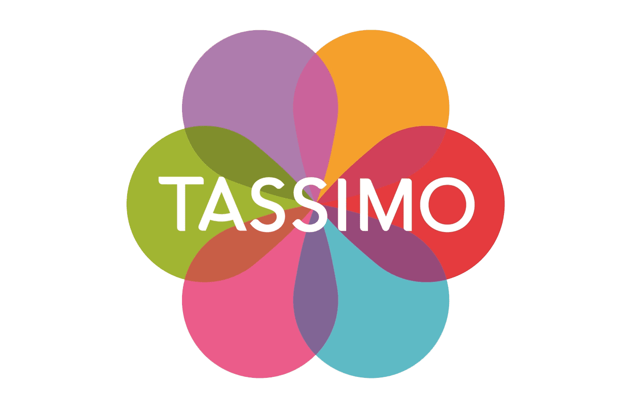
2016 — Today
The Tassimo logo is warm, welcoming and playful. The brand uses a simple font for its wordmark, while putting the main accent on the colorful graphic icon.
The Tassimo icon resembles a flower with 6 colorful petals, symbolizing the variety of flavors the brand can offer. The logo takes the shape of the T-Discs — circle with one pointy corner — to create the petals as well as the “A” in the wordmark. The icon is pretty and looks good on the packaging.![]() The Tassimo logo looks friendly and airy due to its white background, the colorful icon and fine clear lines of its black elegant typeface. It is a very consumer friendly logo that looks makes the product stand out on the shelf.
The Tassimo logo looks friendly and airy due to its white background, the colorful icon and fine clear lines of its black elegant typeface. It is a very consumer friendly logo that looks makes the product stand out on the shelf.
Font and Color
The bold and stable uppercase lettering from the primary badge of Tassimo is set in a smooth modern sans-serif typeface with the horizontal bar of the “A” arched, looking like a tender smile. The closest fonts to the one, used in this insignia, are, probably, Oblivian Medium, or Brushability Sans Semi Bold, but with the contours of the “A” modified.
As for the color palette of the Tassimo visual identity, it is based on several bright shades, including red, fuchsia, purple, green, sky-blue, and oranges the delightful hues standing for positive emotions and a variety of tastes, offered by the brand. The black lettering on the badge point to the professionalism and reliability of the company.


