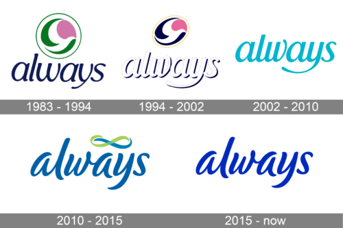
Since 1983 when the brand of feminine hygiene products Always was introduced, its logo has undergone at least three overhauls.
Meaning and history
The Always brand is widely known by women around the world. It belongs to the largest multinational corporation Procter & Gamble, which was created back in 1837. The history of Always brand began in the eighties of the twentieth century. In 1985 it became a sales leader in the sanitary pads market. Today the turnover of the brand is more than one billion dollars.
They were considered one of the first feminine hygiene products in the critical days. And today Always pads are in the first place in sales among other competitive companies. They are trusted and loved by women around the world.
Today the Always brand is represented in countries such as the USA, Russia, Japan, India, Singapore, China, South Korea, Taiwan, the Philippines, Hong Kong, Taiwan, Indonesia, Australia, Italy, Turkey, Portugal and Spain. It is a world leader in feminine hygiene products, which is constantly expanding its horizons through technological breakthroughs and marketing activities.
What is Always?
Always is is a brand of feminine hygiene products manufactured by Procter & Gamble. It was first introduced to the U.S. market in 1983. Procter & Gamble is one of the American and world leaders in the production and sale of feminine hygiene products. Today Always products are in the first place in sales among other competitive firms.
1983 – 1994
The original Always logo comprised a roundel emblem with pink, green, and white elements, which formed a collection with a stylized pigeon in the negative space. Pigeon is known to be a symbol of tenderness and caress, which the products of the brand aim to give its female customers. Below, the name of the brand in a handwriting-inspired script could be seen.
1994 – 2002
The roundel turned into an ellipse after the redesign. If 1994. The lettering grew white and gained a thin dark blue outline with a narrow shadow in the same color. As for the graphical part of the Always logo, it also got refined, with the green turning dark blue, and the shape getting a significant slant to the right.
2002 – 2010
After the redesign of 2002, the Always logo lost its graphical part, leaving solely the lettering in a recognizable yet still slightly refined wordmark. The inscription was rewritten in a bright shade of turquoise against a plain white background, with the refined and more italicized shapes of the lowercase cursive characters.
2010 – 2015
In 2010 the idea of the Always logo remained the same, but the style and execution were completely different. The inscription was rewritten in a more modern cursive, with a more intense yet smoother shade of blue. Also, the logotype got a new graphical addition — a Green and blue infinity symbol, which was supposed to mean eternal protection.
2015 – now
The redesign of 2015 has removed the infinity emblem from the primary logo version of the Always brand but kept the style of the lowercase cursive lettering. Another change was made to the color palette of the brand’s visual identity, which has become darker and flatter, yet still stayed in blue, a color of safety and reliability.
Font and color
The smooth and feminine Always logotype in the lowercase of a custom cursive typeface looks tender, yet evokes a sense of reliability and safety due to the use of bold lines. The typeface, used by the brand for its visual identity looks pretty close to such fonts as Boughies Italic and Brisbane Regular, but with some lines modified.
The combination of intense sea-blue shade and a grass-green make the Always logo look bright and calming, showing the brand’s professionalism and expertise and pointing to such of its qualities and responsibility, protectiveness, and loyalty.


