Alice Cooper is a US singer, songwriter, and actor.
Meaning and history
While the Alice Cooper logo has been modified plenty of times, we can mention a couple of recurrent motifs present on quite a few versions.
1969
The debut studio album, Pretties for You (1969), featured the name of the band in a totally generic sans based on the circle shape.
The second album, which was released the following year, showcased a 3D wordmark with shades. It combined wide letters based on a circle shape with sharp, angular glyphs.
The fourth studio album, Killer (1971), already included the name of the band written in block letters by hand. The eerie style echoed the picture on the album cover (the snake). Each of the albums released by the band during the following three years (School’s Out, Billion Dollar Babies, and Muscle of Love) used different wordmarks.
1975
Welcome to My Nightmare was Alice Cooper’s first solo album (the previous ones were band efforts). The wordmark on the album cover was made up of the letters “broken” into two parts.
The 1976 album cover had a Gothic feel and used a historic-style type, whereas the font on the Lace and Whiskey album cover (1977) included a generic sans. The same can be said about the Flush the Fashion, Special Forces, and DaDa album covers (1980, 1981, and 1983 respectively), although the type was different.
1986 – 2020
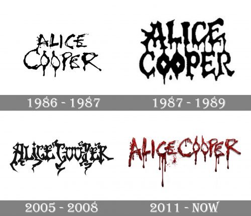
The logo used by Alice Cooper from 1986 to 2020 was all the same dripping lettering in two levels. Executed in thin rounded lines in black color the inscription looked dramatic yet stylish and was instantly recognizable. Due to the use of a monochrome color palette, the emblem could be placed on any background of the album cover or posters.
1987 — 1989
The redesign of 1987 introduced one more version of the Alice Cooper logo. Though it was a bold and confident badge, it stayed official only for a few months. The dripping letters got bold and tall, with the contours a bit narrowed, but due to the thickness of the lines, it didn’t look compressed, on the contrary, the inscription was solid and stable.
2005 — 2008
Constrictor, the ninth solo studio album, which was released in 1986, started a new era in terms of the logo design.
It appeared to be the first time when the musician used a “bleeding” logo with the distinctive “O’s.” The double “O” was inspired by the makeup Alice Cooper used to wear on his eyes during his performances (with the characteristic vertical elements above and below the eyes).
The following album, Raise Your Fist and Yell (1987), supported the same theme. While the shape of the glyphs was different (much bolder), the visual metaphor was the same: the name appeared to have been written with a finger and using blood instead of the paint.
2011 — Today
While that’s an utterly generic style, no one seemed to bother about that, and the “bleeding” logos have been used multiple times during the years to come.
We should point out, though, that the musician also often turned to simpler typefaces, including bold sans serif ones and more elegant serif fonts. Each time, the design depended on the overall style of the album cover, so we cannot say that the musician cared much about keeping a consistent visual brand identity.
Among the most unusual ones was the Alice Cooper logo from the 2005 album cover (Dirty Diamonds). We should also mention the 2011 release, Welcome 2 My Nightmare – the same wordmark can still be seen on Cooper’s website, as of 2020.


