Alfamart is a chain of convenience stores from Indonesia. It boasts more than 10 thousand stores across Southeast Asia. The full name of the company is PT Sumber Alfaria Trijaya Tbk.
Meaning and history
The history of the chain can be traced back to 1989 when Djoko Susanto together with his family started a trading and distribution company in Jakarta. Ten years later, he began working in the convenience store business and named his company Alfa Minimart.
What is Alfamart?
Alfamart is one of the largest mini-market chains in Indonesia, which was established at the end of the 1990s and by today has grown into a giant company with more than 17 thousand stores across the country and the Philippines. The chain offers groceries and drinks, along with some household chemicals and pet foods.
1999
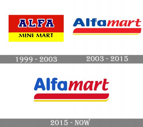
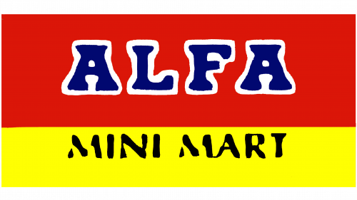
The earliest Alfamart logo resembled a flag broken down into two large fields (red and yellow), with a black line between them.
The top field was larger. It was red and housed the word “Alfa” in a saturated shade of blue. The typeface had pronounced serifs with a slightly rounded shape. We cannot say this type could ever have won a prize for legibility. Yet, the letters were large and rather bold and had a white border making them stand out against the red background. As a result, the customers didn’t have problems figuring out the name.
The smaller yellow field below housed the lettering “Mini Mart,” which reflected the original name of the brand. The type was a simpler sans.
2003
While the updated design preserved some of the features of its predecessor, it looked new and more professional.
To begin with, the name was simplified to “Alfamart” without sacrificing the meaning. The “flag” was reduced to the combination of two stripes (a bolder one above and an orange one below, with a thin white stripe separating them). The ends of the stripes had a curved shape providing some implied motion.
The typeface grew laconic, better legible, and friendlier. The company introduced Abi, their mascot.
2015
The letters grew slightly higher. The blue on the Alfamart logo shifted to a lighter and brighter shade, while the red, on the contrary, appears to be darker.
Font and color
The Alfamart inscription looked very kind and friendly due to the use of bold smooth lines in the letters. Although the lettering is set in two different fonts, the parts are very well balanced. The first, “Alfa”, is set in a classic rounded sans-serif, which is very close to such fonts as Swiss 721 Rounded Std Rounded Black and BB Anonym (Pro) Semi Ultra. While the lowercase “Mart” uses a more elegant italicized font, which looks similar to Ciabatta Semi Bold Italic and Malvie Regular.
As for the color palette of the Alfamart badge, it is composed of blue, red, and yellow, three bright and intense colors, which together evoke a sense of happiness and friendliness. While separately they also have pretty suitable for the supermarket chain meanings: blue is for reliability, red is for warmth and love, and yellow — is for joy.


