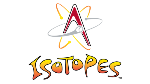
The logo of the baseball team the Albuquerque Isotopes, which belongs to the Pacific Coast League, shows how a designer can give a “sporty” feel even to a chemical concept.
Meaning and history
The Albuquerque Isotopes, which are now the Triple-A affiliate of the Colorado Rockies, were founded in 1971 under the name of the Salt Lake City Gulls. The current name was adopted in 2003, following the club’s relocation to Albuquerque from Calgary. It was then that the team unveiled its iconic “atom” logo.
1998 – 2002
This logo belonged to the team’s precursor, the Calgary Cannons. The central piece was a big bronze cannon with facial featured, aligned into a determined expression. It was placed inside an upturned, red horseshoe with the word ‘Calgary’ on its top. Between the top and the cannon, there were several mountain peaks, pressed into the free space. They also put a white baseball hat with a red maple leaf onto the cannon’s head. Beneath, there was a word ‘Cannons’ styled as wrought iron with bronze coloring.
2003 – 2023
They adopted this one after becoming Albuquerque Isotopes. The core feature is a letter ‘A’, except without the central bar and with a shortened left side. They colored it red and gave it a black line along the fringe. There are two golden particles, floating like electrons around the ‘A’. There is also a grey one in the background and a big baseball-shaped one in the foreground.
2023 – Today
The Albuquerque Isotopes logo is a vibrant and imaginative design that captures the playful yet competitive spirit of the team. Central to the logo is a stylized red and black “A,” standing for Albuquerque. The “A” is creatively integrated into the structure of an atomic symbol, which consists of elliptical orbits in shades of orange and yellow, each ending with a small circular node. These orbits surround the “A,” symbolizing atomic particles in motion, a clever nod to the team’s name, “Isotopes,” which are variants of a chemical element’s atoms.
Enhancing the atomic theme, a grey and white baseball is depicted as if it is orbiting around the “A,” adding a dynamic element that conveys motion and energy. This baseball orbit not only ties the logo back to the sport but also reinforces the scientific motif in a fun and engaging way.
Below the atomic structure, the word “ISOTOPES” is prominently displayed in a bold, stylized font that transitions from yellow to orange, mimicking the gradient of a rising sun. The playful curves and vibrant colors of the lettering give the logo a lively and approachable feel, appealing to fans of all ages.
The overall design of the Albuquerque Isotopes logo is a successful blend of science and sport, encapsulating the unique identity of the team. Its bright colors, dynamic elements, and creative integration of atomic imagery make it a standout emblem in the world of minor league baseball, celebrating both the local culture and the universal appeal of the game.
Symbol
The Albuquerque Isotopes logo is a combination of the capital letter “A” (the initial of “Albuquerque”) and a stylized depiction of an atom, where neutrons move at an unbelievable speed. One of the neutrons is actually a baseball, which makes the logo more relevant.
The logo is connected with the name of the team – isotopes are variants of the same chemical element with equal numbers of protons but a different number of neutrons. So, an isotope was depicted on the logo in the form of one of its atoms.
Alternative emblems
The club uses cap logos featuring the same shape but different colors schemes. They also have a capital “I” logo with a neutron revolving around the letter.
Colors
The Albuquerque Isotopes logo features red, black, grey, and several shades of orange and yellow on the white background.


