The varsity teams playing under the name of the Alabama Crimson Tide represent the University of Alabama. Although the teams have had a number of logos during their more than 45-year history, many of the emblems return, in one form or another, to the core visual elements: a depiction of an elephant and a capital “A.”
Meaning and history
The secondary emblems used by the teams in 1974-2000 looked exactly as the primary one, except for the lettering on the white banner. There were two variations: “Bama” or “Roll Tide.” Also, since 1976, the club has been using a script “A” logo as an alternative for its primary mark. The roundel having the status of the primary logo now, used to be a secondary logo in 2001-2003, while the aggressive elephant, which was the primary emblem in 2001-2003, got the status of the secondary logo in 2004.
1952 – 1973
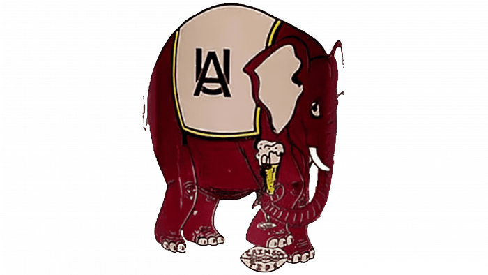
We can’t say that the original Alabama Crimson logo was not attractive or recognizable. And yet, there were a lot of details that didn’t work well in a sports emblem. For instance, the elephant, which was the visual center of the logo, didn’t represent any of the qualities that are supposed to give a team better chance for a victory. Instead, he looked rather friendly and laid back. He was holding an ice cream in his trunk, as if to give a hint that he was not against sharing it (as well as the victory) with an opponent.
To make matters worse, the elephant’s foot was placed over a football with the lettering “Crimson Tide” on it. This could be perceived as a symbol of a defeat for a team symbolized by the football.
Either for these, or for some other reasons, the logo didn’t survive long. It was replaced in 1958, six years after its introduction.
1973 – 1998
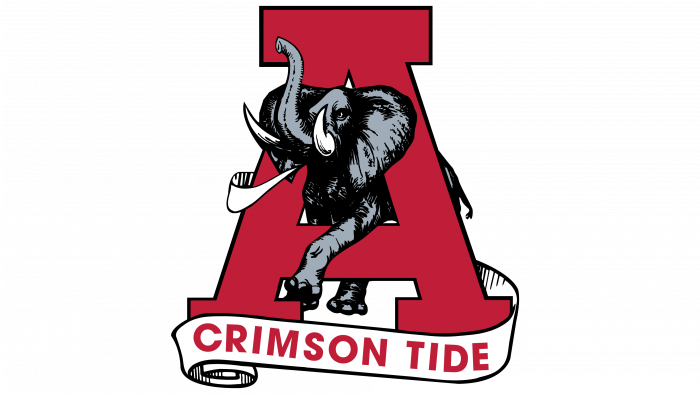
For more than 25 years, from 1974 to 1998, the Alabama Crimson Tide logo depicted an elephant busting out of an “A.” The lettering “Crimson Tide” in red was placed below, on a white banner. The color scheme was completely new, in comparison with the previous version of the logo. For the first time, the iconic dark shade of red was introduced, pared with noble grey.
1998 – 2004
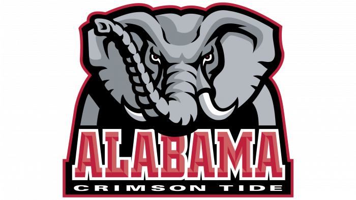
The logo introduced in 1998 has been the only one that looked aggressive. The elephant, whose head was the visual center of the emblem, had very sharp tusks and quite a menacing muzzle expression. Also, the logo depicted the front view of the head, which added something aggressive. Right under the trunk, the lettering “Alabama” in red with a white frame was placed, while the text “Crimson Tide” in white was positioned below.
The font used for the lettering was different from the previous one, which could be clearly seen when comparing the “A” on both the logotypes.
2004 – 2018
The Alabama Crimson Tide logo is built around a crimson capital “A” over the white background. The letter is encircled with the team name in grey on the crimson background. The roundel has a black frame.
2018 – Today
The Alabama Crimson Tide logo, created in 2018, is the most minimalistic of all the club’s badges. It is just a dark crimson “A” in a recognizable cursive font, just like the one on the previous version of the logo. The letter is now written against a plain white background with no additional elements. Simple, stylish, and memorable.
Font
The typeface in which the lettering “Alabama Crimson Tide” is given looks very much like the City Bold published by Berthold or Square Slabserif 711 created by Bitstream. The script “A” doesn’t belong to any of the existing fonts.
Colors
CRIMSON
HEX COLOR: #9E1B32;
RGB: (158, 27, 50)
CMYK: (25, 100, 79, 20);
PANTONE: PMS 201 C
GRAY
HEX COLOR: #828A8F;
RGB: (130, 138, 143)
CMYK: (52, 40, 37, 3)
PANTONE: PMS 430 C
WHITE
HEX COLOR: #FFFFFF;
RGB: (255,255,255)
CMYK: (0, 0, 0, 0)


