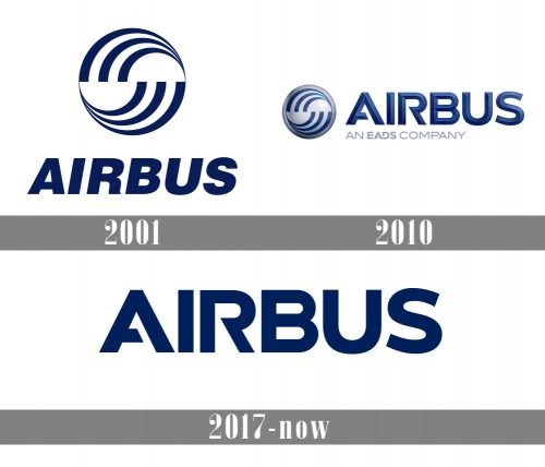
During the previous two decades, the Airbus logo has gone through two modifications. While the alterations have been rather notable, we can surely say that each new design was based on its predecessor. Due to this, the overall style has remained consistent.
Meaning and history
Airbus S.A.S. is one of the largest aircraft manufacturing companies in the world, formed in the late 1960s through the merger of several European aircraft manufacturers. It produces passenger, cargo and military transport aircraft of the same name.
The history of Airbus dates back to July 1967 when the governments of the three countries – France, Germany and Great Britain concluded an agreement on development and beginning of production of the first European passenger airliner.
The result of this work was demonstrated at the air show in Paris in 1969 as a 300-seat airliner A-300, which became the first child of the new airline concern, which the following year was named Airbus Industrie.
What is Airbus?
Airbus is the name of one of the largest aircraft manufacturing companies in the world, formed in the late 1960s through the merger of several European aircraft manufacturers. It produces passenger, cargo and military transport aircraft under the Airbus brand.
2001
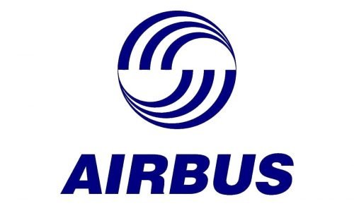
The design is dominated by a circle broken down into two identical halves. In each of the halves, there is a dynamic abstract pattern inspired by curves, whirls, and swooshes. On the symbolic level, the emblem can be interpreted as the earth (the circle) and airlines as the fastest way to get from one place to another (the dynamic curves).
The company name in a bold, classic sans can be seen below. The fact that the letters are italicized adds some dynamism.
2010
Now, the roundel has a 3D effect due to the addition of the gradient to the background. The word “Airbus” features a different type. While it is still a sans, it is not italicized now and has a couple of distinctive details – the gaps in the “A” and “R,” for instance. Also, the lettering has a 3D look due to the addition of the gradient.
2017
The updated Airbus logo is flat and does not feature the whirl emblem – only the wordmark. The dark and rather saturated shade of blue has remained pretty much the same.
Font and Color
The heavy geometric lettering from the primary Airbus badge is set in a custom sans-serif font with massive sharp terms and straight lines of the bars. The closest fonts to the one, used in this insignia, are, probably, Avalors Regular, or HWT Republic Gothic Solid, but with some significant modifications of the “A” and “R”.
As for the color palette of the Airbus visual identity, it is based on a dee and intense shade of blue, which is commonly known as the symbol of professionalism, quality and security, three main characteristics for any company, connected to transportation.


