Air Europa is the 3rd-largest airline carrier in Spain. The company’s official name is Air Europa Líneas Aéreas, S.A.U. The headquarters are located in Llucmajor, Mallorca, Spain.
Meaning and history

The airline was established in 1986 under the name of Air España SA and was part of the British company ILG-Air Europe Group.
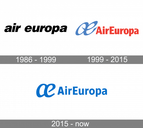
1986 – 1999

The original livery looked very much like that of Air Europe.
1999 – 2015

When Air Europe ceased operations in 1991, Air Europa started working under its current name and introduced an independent visual brand identity.
The highlight of the old Air Europa logo was the “ae” emblem. The letters were interlaced in an unusual way – they did not look like a medieval monogram but had a modern style. It looked dynamic, too. The bold swooshes were inspired by the ethereal trace the aircraft leaves in the sky. The blue color only reinforced the “sky” theme.
To the right of the emblem, the name of the brand in red could be seen. We cannot say it looked appropriate here – the lettering appeared a tad too heavy in comparison with the symbol, and it also lacked the dynamism of its neighbor. Also, the shape of the letters did not in any way echo that of the “ae” symbol.
On a more positive note, the “r’s” had a slightly unusual top directed high up, which alluded to an aircraft taking off.
2015 – Today
The updated version has resolved some of the problems of its predecessor. There is much more breathing space here, which better fits the “airline” theme. The effect is achieved by reducing the weight of the letters and also by positioning them at a slightly larger distance from each other than in the original wordmark. The “r” with the effect of a plane taking off is gone. Instead, there is a more generic glyph.
Also, the design team decided to get rid of the red color leaving the logo all-blue. This reinforces the “sky” and “flight” associations in your mind, although the picture now is not as eye-catching as it used to be.
The shape of the “ae” symbol is less dynamic and less reminiscent of the trace of the aircraft. That’s because some of the sharp ends have disappeared, while the curves have grown smoother.
On the whole, while the updated Air Europa logo appears smoother and more professional, it, unfortunately, lacks the dynamism of its predecessor and some of its implied meaning.


