Aigle Azur is an airline company based in France. It specializes in providing both domestic and international flights to various destinations. The company’s operations range from passenger transportation to cargo services. Aigle Azur was previously owned by Frantz Yvelin, who acquired it in 2001. The company operates from its main hub at Paris Orly Airport, with a focus on connecting France with countries in North Africa and other Mediterranean destinations. Aigle Azur has established a reputation for its reliable and efficient services, making it a preferred choice for travelers in the region.
Meaning and history
Aigle Azur, a French airline, was founded in 1946 by Sylvain Floirat. Initially operating as a charter airline, Aigle Azur gradually expanded its services to scheduled flights, serving both domestic and international destinations. The company had a rich history and played a significant role in connecting France with various countries. However, in September 2019, Aigle Azur filed for bankruptcy due to financial difficulties. Despite efforts to find potential buyers, the company was unable to secure a sustainable solution. As a result, Aigle Azur ceased its operations, leaving a void in the aviation industry.
What is Aigle Azur?
Aigle Azur was a French airline that operated scheduled and charter flights primarily between France and destinations in Algeria. It was established in 1946 and operated for several decades before filing for bankruptcy in 2019. Aigle Azur played a significant role in connecting the French and Algerian communities and promoting travel between the two countries.
1946 – 1950s
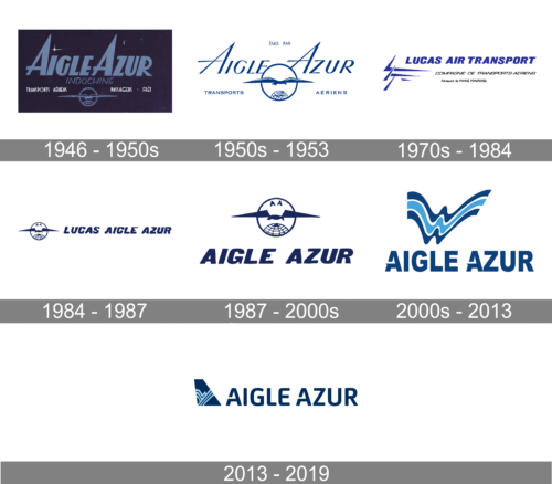
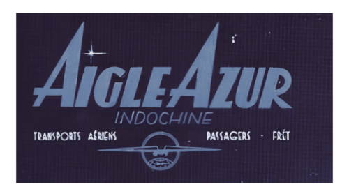
The rectangular backdrop creates an illusion of a night sky with a dark blue woven pattern and a few white stars across it. The name of the airline was printed in muted light blue using all uppercase, italic letters. The inscription was bold, while enlarged “A”s looked like peaks of a mountain. Right underneath, the logo had “Indochine” printed in smaller font of the same blue. The latter means “a peninsula in SE Asia, between India and China”, specifying the main direction of the airline. Across the bottom, the logo said “Transports Aeriens Passangers Fret”. There was one other detail – a ring with an outline of a globe at the very bottom and a flying bird with its wings widely spread and going beyond the ring frame. It was a symbol for the airline flying passengers across the globe.
1950s – 1953
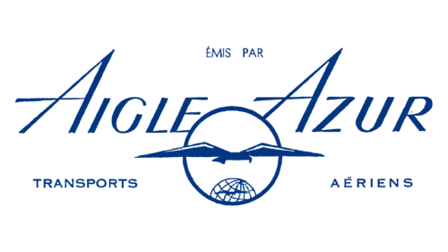
The font used to print the name of the company closely resembles Taffeta-ExpandedItalic. Besides changing the font, the designers removed the dark background and replaced it with white. Instead, they used dark blue for all the elements in the logo. The symbolic ring with a bird was enlarged and squeezed halfway between the two words of the name, connecting both. The bottom line of the previous log was shortened to just “Transports Aeriens”. This logo looks much lighter, reflecting the airy nature of the flights, while the blue color creates an association with the sky and the reliability and security of the company.
1970s – 1984
The company was now called “Lucas Air Transport”. The designers used blue color and Derek Italic font to print the name using all uppercase letters. The round emblem was replaced by abstract lines on the left of the emblem. The updated taglines were done in black with “Compagne De Transports Aeriens” printed using larger uppercase letters and “Aeroport de Paris Pontoise” written using a smaller font. This logo has the same feel as the previous with minimal design and conservative color choices.
1984 – 1987
The logo features the same font as the previous logo, but now it presented the new company name – Lucas Aigle Azur, which translates as “Lucas Azure Eagle”. There are no taglines, but it brought back the round emblem with the bird that was originally used by the company for almost ten years. To honor the original company name, Aigle Azure, they added two relatively small “A”s above the bird.
1987 – 2000s
Although the company brought back the original name, the inscription is still done using a font very similar to Derek Italic font. The round symbol featured in earlier versions got enlarged and placed above the name. The logo design turned out very professional and presented the company as a trustworthy entity.
2000s – 2013
The logo was redrawn again. The name is printed using a customized font with the letter “A” having a slit above the horizontal stroke, while the latter has a pointed end going beyond the vertical line on the left. The font closely resembles Pragmatica Condensed Extra Bold font, but uses the custom “A” and features a less curved leg of the “R”. The inscription is accompanied by several wavy lines with darker blue lines on either side of a lighter blue line separated by white space. It can be interpreted as the sky, sea, or the flight of an airplane. It surely added dynamics to the emblem.
2013 – 2019
This time, the company went for another sans-serif font but with rounded corners. It looks like FS Joey Bold font was customized to feature a slit in the letter “A” that the company introduced in the 2000s. The logo was accompanied by a rectangular emblem with a top corner cut off. This made it resemble the tail of the plane. The shape was done in dark blue and had decorative lighter blue wavy and straight lines.


