AfterPay is the name of a “Buy Now Pay Later” (BNPL) online service, which was created in 2014 in Australia. The idea of the platform is splitting the purchase into fours installments, with the first payment — 25%. By today the app has more than 1,5 million users, and the audience is constantly growing.
Meaning and history
AfterPay is a popular payment method in Australia, which was introduced at the end of 2014. The platform allows you to buy anything now and pay for it later in installments. This allows people to buy more expensive goods, which is a win-win for both buyers and sellers.
The main idea of Afterpay is that customers can pay for their purchases in four installments. You should simply download the Afterpay app and create an account. The first payment will be 25% of the price. At the same time, retailers, both online and offline, can integrate with Afterpay to offer their customers this payment option. The service is usually valid on items priced at A$35 or more.
What is AfterPay?
AfterPay is an online payment solution, created in Australia in 2014. The service allows its users to buy items online, splitting the payments. This is one of the most popular “Buy Now Pay Later” applications in the region, with more than 1,5 million users.
In terms of visual identity, the platform has been very consistent — AfterPay has only slightly modernized its original emblem, without changing the initial concept and idea.
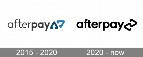
2015 – 2020
The very first logo for AfterPay was designed in 2015, just a few months after the launch of the service. It was a bold yet simple composition of lettering in the lowercase, and a minimalistic emblem placed on its right. The inscription was set in dark gray color, with the first part written in thinner lines, than the second.
As for the emblem, it was composed of two stylized softened arrowhead-like triangular elements, with the contours opened, which made the negative space inside the elements look like white arrows. The elements were set in two shades of blue, with the darker one standing straight, and the lighter — set on its right, diagonally slanted and pointing right.
2020 – Today
The redesign of 2020 refined and modernized the AfterPay badge, keeping its original mood and style. The logotype was emboldened and changed its color to black. So now all letters of the inscription were set in the same thickness of the lines.
As for the graphical part of the AfterPay visual identity, the two arrowheads are now set horizontally, pointing to different sides and merged with a short horizontal line in the middle. The emblem is also executed in plain black and the whole logo is placed over a white background, which sometimes can be replaced with a bright and vivid one, for example, turquoise-green.
Font and color
The bold lowercase lettering from the primary AfterPay logo is set in a modern sans-serif typeface, with one interesting detail, making the whole inscription unique and recognizable. This detail is in the merged horizontal bars of the “F” and the “T”. The closest fonts to the one, used in the AfterPay insignia, are, probably, YD Yoonche Bold, Mont Bold, or Glence Heavy, but with some slight modifications.
As for the color palette of the AfterPay visual identity, it is very laconic and strict, based on a timeless combination of black and white, which looks professional, and confident and evokes a sense of expertise, at the same time looking modern and progressive, and showing the company’s approach to business.


