Aeroméxico Connect is a Mexican regional airline that operates as a subsidiary of Aeroméxico. The company specializes in providing domestic and international flights to various destinations. As of today, Aeroméxico Connect is owned by Grupo Aeroméxico, one of the largest airline groups in Mexico. The airline operates from its main hub at Mexico City International Airport, offering convenient connections and a wide range of services to passengers. With a fleet of modern aircraft, Aeroméxico Connect continues to play a significant role in the aviation industry, ensuring reliable and efficient air travel experiences.
Meaning and history
Aeroméxico Connect is a Mexican regional airline founded in 1988 by Aeroméxico. It operates as a subsidiary of Aeroméxico and serves as a feeder airline for its parent company.
Over the years, Aeroméxico Connect has achieved several milestones. It has expanded its route network to include various domestic and international destinations, connecting passengers to major cities in Mexico and neighboring countries. The airline has maintained a strong focus on providing efficient regional air transportation services to passengers, catering to both business and leisure travelers.
Aeroméxico Connect was continuing its operations as a regional airline under the Aeroméxico brand.
What is Aeroméxico Connect?
Aeroméxico Connect is a regional subsidiary airline of Aeroméxico, Mexico’s flag carrier. It operates domestic and international flights to various destinations within Mexico and neighboring countries. Aeroméxico Connect provides a convenient and efficient air travel option, offering connectivity and seamless connections for passengers traveling within the region.
1988 – 1998
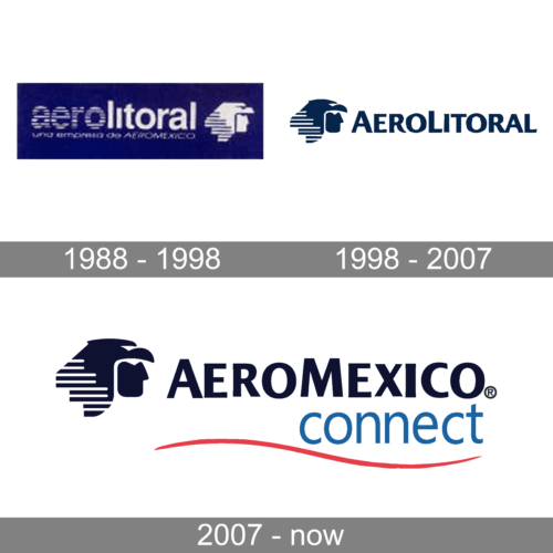
The airline was established under the name Aero Litoral, so the first two logos were based on this name. The original badge featured a solid blue horizontally-oriented rectangle with a white pelleting followed by an emblem and underlined by a delicate “Uma Empresa de Aeromexico” tagline. The main wordmark was set in two styles, with the first part featuring a horizontally striped pattern, and the second — solid lines. This was supported by the two parts of the iconic Aeromexico emblem.
1998 – 2007
The redesign of 1998 has strengthened and modernized the logo of the AeroLitoral brand. The color palette got darker and calmer, with the emblem moving to the left part of the composition, and the wordmark being rewritten in a title case of a modern sans-serif typeface. Both elements were now set in dark blue against a plain white background.
2007 – now
In 2007 the air carrier was renamed Aeromexico Connect, and the logo got redesigned accordingly. It was the badge from 1998, with the “AeroLitoral” replaced by “Aeromexico”, and the color getting darker. This was not the only change. The main wordmark was underlined by a light blue lowercase “Connect” in a traditional sans-serif font, and a red wavy line.


