The Maytag Corporation was founded in 1983 as a small washing machine manufacturer. The company logo has undergone several modifications since then.
Meaning and history
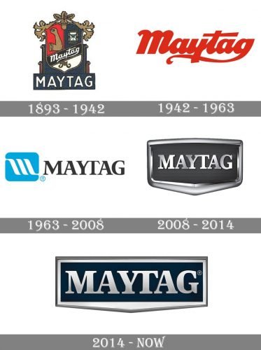
The visual identity of the American brand has a pretty intense history, which includes four major redesign and several completely different style concepts. The most ornate and colorful logo was used by Maytag until the middle of the 20th century, and then the company decided to go more laconic and modern and started using a logotype as the main accent of the badge
1893 — 1942
The initial logo for Maytag was introduced in 1893 and featured an ornate crest surrounded by fancy ribbons on top and an architectural banner with the wordmark at the bottom. The crest itself was divided into three parts — two vertical in red and dark blue, and the bottom segment colored white. On the red part, there was an image of a hand, while the right comprised a delicate picture of an hourglass, and on the white, there was just a fancy elegant letter “M” in black and gold. The diagonal banner with the cursive lettering was placed in the crest, separating two upper sectors from the bottom one.
The main wordmark was written under the badge on a dark blue background and used white color for its capitalized letters, executed in a strong and strict sans-serif typeface with clean and confident lines.
1942 — 1963
After the emblem, which was used by the brand for almost fifty years, Maytag introduced its new logo in 1942, and it is something new for the company. The new visual identity concept was based on a simple yet bright color palette (red and white), and smooth bold lettering colors which could be seen in several variations during that period.
1963 — 2008
In 1963 Chapman, Goldsmith & Yamasaki design bureau created a new logo for Maytag, and it became iconic in no time, staying with the brand for almost four decades. The new composition features a light blue and white emblem and a custom black wordmark on its right. The emblem comprised a solid rectangle with rounded angles and a stylized letter “M” formed by three smooth white lines. As for the logotype, it was written in an elegant serif typeface and had “Y” and “T” connected in their top parts.
2008 — 2014
The new Maytag logo was adopted by the brand after its acquisition by Whirlpool. The badge, designed in 2008 featured a chic and modern silver and dark gray color palette and was made three-dimensional by using glossy metallic surfaces on letters and framing of the emblem. The bold serif inscription was placed on a dark gray, close to the black, background and enclosed into a voluminous silver frame, which was triangular in its bottom part, and rectangular — in the upper one.
2014 — Today
The contours of the Maytag logo were refined and strengthened in 2014. The frame of the badge was horizontally stretched, and the lettering — enlarged. These changes were followed by the straightening of the frame’s lines and angles, which made the whole image look more powerful and professional.
Emblem colors
The Maytag logo is a combination of dark blue (PMS 295 C) and several shades of grey, which create a gradient texture.
Font
Although the serif typeface looks straightforward and ultra-traditional, it also has a unique design element: the letters “Y” and “T” merge to form a single glyph.


