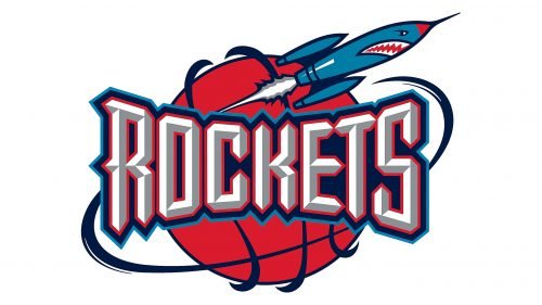
The “rocket” theme has been present, in one way or another, in every Houston Rockets logo so far. Yet, it is the current logotype that is definitely the most sophisticated and modern one.
Meaning and history
The history of the basketball club started in 1967 in San Diego, and during the first period, the team was not very successful, though, after its relocation to Houston in 1971, things started going better.
The visual identity of the Houston Rockets basketball club is famous for its “Ketchup and Mustard” logos, which were used by the team for two decades and are still remembered by its fans.
1967 – 1971
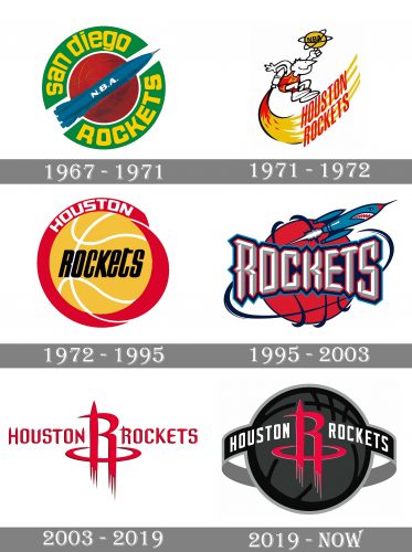
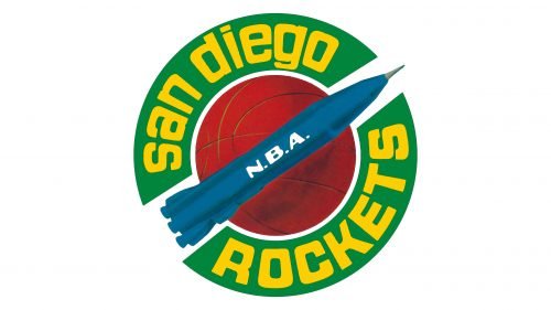
The very first badge was created for San Diego Rockets in 1967 and featured an orange basketball enclosed in a thick green circular frame with a yellow inscription around its perimeter. The blue flying rocket was placed diagonally on the basketball, moving upright and symbolizing progress and growth.
1971 – 1972
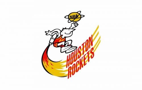
After the relocation of the club to Houston the new logo was designed in 1971. It was a caricature of a basketball player with a rocket behind his back. The new logo was executed in a yellow and red color palette, which later got nicknamed “Ketchup and mustard”. It was a very bright and funny image though it only stayed with the club for a year.
1972 – 1995
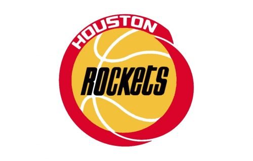
The redesign of 1972 brought a more modern badge to the club. It was a mustard-yellow basketball with white lines enclosed into a smooth red frame with a white “Houston” lettering written on its upper part. The black “Rockets” wordmark was written in a narrowed and italics sans-serif typeface right in the yellow ball. This emblem stayed unchanged for more than twenty years.
1995 – 2003
In 1995 the new logo was designed for Houston Rockets and the new color palette was introduced. It was a red basketball with a stylized bold “Rockets” lettering executed in white and gray in a double red and blue outline. The ball was surrounded by a smooth blue orbit and had a funny scary rocket flying above the lettering, to the right.
2003 – 2019
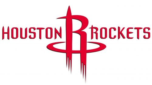
The concept of the Houston Rockets’ visual identity was changed in 2003. The new logo featured a stylized letter “R” with its vertical bars elongated and forked, resembling a rocket flame, surrounded by a horizontal orbit. The emblem was placed between two parts of the wordmark, executed in the same dark red color, and a fancy custom sans-serif typeface with slightly elongated and thickened ends of some letters.
2019 – Today
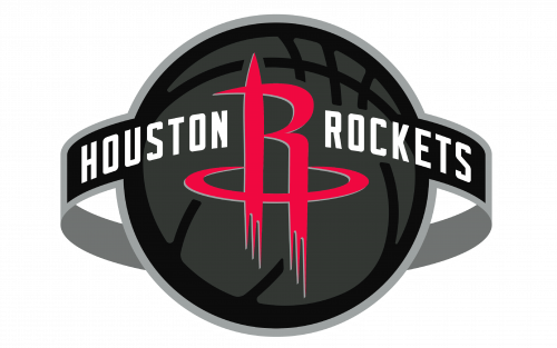
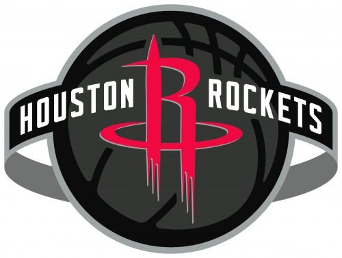 The rocket red “R” was placed in a gray and black basketball in 2019. The white sans-serif lettering is now set on a wide gray and black orbit, surrounding the ball, and looks modern yet strict and strong. The “R” with an orbit can also be used on its own without any additions, just clean lines, and a sleek red shade.
Font

The distinctive letters with many sharp angles (reminding a rocket) were custom drawn specifically for the logo.
Colors
There are only two colors in the regular Houston Rockets logo: red (PMS 200) and white: the red “R” appears against the white background. However, the list of the team’s colors also includes silver (PMS 877) and black (PMS Black). In fact, the brand guidelines also mention the following versions: the white “R” on the red background, the red letter on the grey or black background, and the black letter on the white background.
RED
PANTONE: 200
HEX COLOR: #CE1141;
RGB: (206,17,65)
CMYK: (0,100,65,15)
BLACK
PANTONE: BLACK
HEX COLOR: #000000;
RGB: (6,25,34)
CMYK: (30,0,0,100)
SILVER
PANTONE: 877
HEX COLOR: #C4CED4;
RGB: (196,206,211)
CMYK: (5,0,0,20)


