Green Day is an American punk rock band founded and led by Billie Armstrong. The band originated in 1986, and since then it has sold more than 85 million records around the globe.
Meaning and history
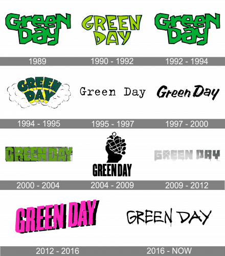
The visual identity of the American rock band has undergone several redesigns throughout the years, but each of the created emblems was a reflection of the current band’s mood and music. There were not many logos designed with graphical elements, as Green Day mainly used the insignias, based on the logotype.
1989
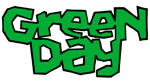
The starting logo of the band was the bright-green band name with a black contour. The whole inscription is written in the angular typeface.
1990 — 1992
The original logo for the band was introduced in 1990, with the release of their debut album, “39/Smooth”. It was a solid black background where the bright graffiti-style wordmark in two levels was placed. The inscription was executed in a bold cartoonish typeface and had its letters colored light green and outlined in white.
1992 — 1994
The new album and new logo were created in 1992. It was a bolder and more aggressive wordmark, which was now executed in dark green, and had a thin black outlined for a better contrast with the white background. The letters of the new logotype were glued to each other, and some of them even merged.
1994 — 1995
The logo from the “Dookie” album, released in 1994, featured more accurate lettering, which was set in two levels and arched. The green and yellow inscription had thick smooth lines around it, symbolizing smoke. The handwritten wordmark had its sans-serif letters extra-bold and solid.
1995 — 1997
The insignia, designed for the band’s “Insomniac” album, featured a completely different style. It was a typewriting white inscription placed on a black background, which was placed in a stylized poster, looking as if it was a torn piece.
1997 — 2000
In 1997 the Green Day logo was composed of a smooth bold and italicized lettering in white, which was executed in a modern and soft sans-serif typeface and placed on a black background with some gradient yellow accents, which added texture to the whole image.
2000 — 2004
The redesign of 2000 brought a new visual identity design, writing the band’s name in extra-bold sans-serif typeface with massive shapes and “cracked” texture. The calm green letters were placed on a monochrome photo background. Though there were no dark shades in this version, the emblem looked gloomy and a bit depressive.
2004 — 2009
The logo, designed for the Green Day “American Idiot” album, which was released in 2004, was the first to have additional graphics on it. The new visual identity consisted of a narrowed black logotype and an emblem above it. The emblem depicted a hand holding a grenade, which was stylized as a heart. The whole composition featured a black and white color palette and looked stylish and modern.
2009 — 2012
The new album, “21st Century Breakdown”, was introduced in 2009, along with the new logo. It was a monochrome badge with blurred and muted logotype in an extra-bold custom stencil typeface, with the contour of the letters dripping and the upper part of the letter “R” having a white “X” on it.
2012 — 2016
The emblem, created for Green Day in 2012 stayed with the band for fours years and could be seen on three of their albums — “¡Uno!”, “¡Dos!” And “¡Tre!”, differing only in the main color of the letters. It was a narrowed sans-serif inscription, placed slightly diagonally, in the upright direction. The original version featured a bright fuchsia-pink inscription on a green grass-patterned background. As for two following emblems, the second was executed in turquoise and brown, and the third — in yellow and turquoise, with some black accents.
2016 — Today

In 2016 the band releases its 12th album, “Revolution Radio”, and the new visual identity concept is being designed for it. The modern and bright Green Day logo is composed of only black logotype, placed on a white background, but the cool dripping letters, executed in a custom handwritten typeface with medium-weight lines and rounded ends, look progressive and stylish.
Shape
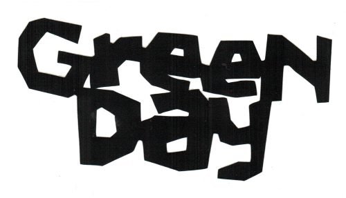
In most cases, the band uses its name written in black letters on a white background or vice versa, as its logo. For example, one of the first logos was the black-lettered name that imitated a graffiti script.
Colors
In the punk context, the combination of black and white expresses a person’s wild-and-out-of-control attitude to life.
Font
This attitude is quite observable in the numerous fonts and letter styling options. For example, the logo on the Insomniac album uses the FF Trixie font; American idiot features a logo with Champion Gothic letters; on 21st Century Breakdown we see dripping letters.


