Citibank is an American banking corporation, which was established in 1955 in New York. Today the division of Citigroup is an international institution with more than 2 thousand offices in almost 20 countries across the globe. The bank also has over 700 branches nationwide.
Meaning and history
One of the world’s largest financial institutions features a stylish and recognizable logo, which is composed of a simple wordmark with a delicate graphical element above it. It might not look like something deep and meaningful, but once you get to know the company’s history, everything starts making sense.
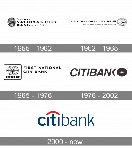
The timeline of the bank’s logo can be divided into two periods — the era of First National City Bank, from 1955 to 1976, and the Citibank period, which started in 1976, with the company’s rebranding.
What is Citibank?
Citibank is a financial institution, which was established in New York in 1812, and today has its subsidiaries worldwide. The company is specialized in providing a full spectrum of financial services, including credit cards, mortgages, loans, and commercial banking.
1955 – 1962
The very first insignia for Citibank was performed in 1955. The company, named The First National Citibank, was formed in the same through the merger of the First National Bank and The National Bank of New York, two strong financial institutions.
The logo was composed of a bold traditional wordmark with some old-style details in the typeface of cursive “The” and “of New York”, and an ornate seal on the left. It was a strong and elegant logo, which showed a powerful and confident financial company, evoking a sense of trust and seriousness.
1962 – 1965
The first redesign of the logo was held in 1962. The company changed it according to its expansion on the international markets, made it more modern and progressive.
The wordmark was now written in a sans-serif font, with a delicate small tagline, saying “ the Leader in Worldwide Banking”. The cursive lettering from the original logo was gone, now the wordmark only consisted of “First National City Bank” in all capitals.
The seal was also replaced. The new emblem features the image of the globe with a wind rose symbol on it. The image was enclosed in a circular frame with the company’s name written around its perimeter.
1965 – 1976
In 1965 the logo was redesigned again, the tagline was removed and the wordmark was now set in two levels, having the emblem on its left side. The emblem got rid of its rounded frame and was now placed inside a square with a thin black outline and rounded angles.
This variant of the visual identity looked stronger and more contemporary than the previous ones, reflecting a powerful and influential financial institution with a perfect reputation.
1976 – 2002
The name of the company was changed to Citibank in 1976. They kept the emblem from two previous versions of the visual identity but modified it. The rose wind was now drawn in white and placed inside a black circle, and the “Citibank” wordmark was executed in all caps and italicized, located on the left of the symbol. Two lost letters of the inscription were connected and shared one vertical bar.
This version of the visual identity was designed by Dan Friedman from the New York-based Anspach Grossman Portugal agency.
Though the new official logo was designed in 2000, the version of 1976 was still in use by the company until 2002.
2000 – Today
The company merged with Travelers insurance group in 1998 and started working on the new visual identity in collaboration with the famous Pentagram agency. Travelers Group had a very remarkable and recognizable logo — a red umbrella, symbolizing protection and security.
Paula Scher, one of the Pentagram designers, created a very minimalist logo, which instantly was accepted by the company and became one of the most iconic emblems in the modern history of visual identity design.
The logo featured a lowercase “Citi” lettering which a red arch, starting above the first “I” and finishing above the last one. Letter “T” in this construction resembled a handle of the umbrella but was colored white, like all the other letters of the wordmark.
The red arch also symbolized the connection and merger of two big companies, along with unity and movement from past to future.
The white, blue and red color palette of the iconic logo is a representation of trustworthiness, professionalism, and loyalty of the financial institution, it was aiming to evoke a sense of protection and reliability and to make the bank’s customers feel confident and comfortable.
In 2002 the company started using a “Citibank” inscription instead of “Citi”, but the style of the lettering and the red emblem remained untouched.


