Zoom is a cloud-based video conferencing tool provided by Zoom Video Communications, Inc., a US company based in California. It was founded in 2011, but the software was introduced only in 2013. Starting from 2020, the software experienced a dramatic global increase due to the COVID-19 pandemic.
Meaning and history
Today, when many brands would leap from one logo to another, Zoom cannot be criticized as a company with a fluid visual brand identity. The design remained the same for at least the first decade of the brand’s existence.
What is Zoom
Zoom Cloud Meetings is one of the world’s most popular cloud platforms for video and audio conferencing, chat, and webinars. It is best known for HD video chat and conferencing. While many users opt for the free plan, there are also paid plans offering up to a thousand concurrent participants and a 30-hour time restriction.
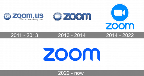
2011 – 2013
The very first logo of the Zoom software was created in 2011 and stayed untouched for more than two years. It was a very confident for its time, yet simple and calm badge, composed of a circular emblem and lowercase lettering, executed in a smooth muted shade of blue and white. The emblem of the platform featured a stylized minimalistic image of a camera side view with the blue letter “Z”
Drawn on it. The white camera was placed inside a solid blue circle.
2013 – 2014
The redesign of 2013 has simplified the original concept of the Zoom logo, deleting the “.us” part of the inscription, and removing the blue letter “Z” from the emblem. As for other changes, made to the Zoom badge, they include the darkening of the shade of blue, and the refinement of the emblem, with the typeface of the inscription, also changed. All the details became bolder and brighter now.
2014 – 2022
The main Zoom logo is just the wordmark. There is also an icon, which can be used independently. In addition to these, there is also a full version, where the wordmark is paired with the emblem, which looks almost exactly like the icon but has a slightly different shape.
2022 – now
The redesign of 2022 has simplified the smooth and sleek Zoom logo, removing the graphical part from the composition, and making the lettering the main hero of the badge. The logotype of the software has kept the custom typeface from the previous version, but the blue, used in this logo, has been brightened up and intensified, giving a more vivid and progressive look to the whole composition.
Wordmark
The type used for the wordmark is a rare example of a perfectly legible and minimalist, yet unique font. On the one hand, the overall shapes of the letters and the proportions of their parts seem classic. You may call them generic, but, anyway, it is the classic glyphs that are the most legible and that work best at any size.
Yet, the designers behind the logo managed to add a unique touch by transforming the ends of the letters “z” and “m.” They are neither rounded nor sharp, but a combination of both. This creates a fluid impression, adding some dynamism to the otherwise static design.
Another distinctive nuance is the shape of the “turns” on the “z.” Similar to the letters, they are a combination of curves and angles.
Full logo
This combination gets additional meaning and function, when the wordmark is paired with the emblem. The camera on the emblem has two of its ends rounded, while the other two ends represent the right angle. As a result, the two elements of the full logo harmonize with each other. Of course, the fact that they feature the same color plays a role in it, too.
The camera emblem is a blue roundel with white and gray rings forming its borders. The rings add some depth. A negative color scheme is also possible, as are alternative positions of the elements.
When it comes to the meaning of the Zoom logo, it is all pretty transparent. The cam is an indication of the function of the software sold under this brand.
Icon
The Zoom icon is pretty simple and predictable for the application, designed to connect people via video conference calls. The blue and white color palette of the icon is also no surprise, as most of the mobile messengers and call apps use this color scheme for their visual identities.
The Zoom icon is composed of a solid blue circle, placed on a white square with rounded angles. The white background is complemented by a stylized image of the camera, drawn on a blue circle, and turned in profile to the right. The clean contours feature some of the angles sharp, and some — rounded.
The icon can also be seen in its monochrome version, with all the solid elements. There is also the third option — black and white contouring.
Colors and font
The distinctive vivid and light shade of blue is the signature of Zoom. This color is often referred to as sky blue.
What reasons could the company have to choose this palette? On the one hand, blue is probably the most popular color in the logotypes of tech and communication companies, which makes it the most obvious choice. On the other hand, the brand dared use a rather bold, eye-catching hue, which resulted in enhanced recognizability.
The typeface on the Zoom logo is a custom one. This approach is perfectly natural as the brand was trying to create a distinctive wordmark that would “rhyme” with the camera emblem.


