Zalman Tech Co. is a South Korean public company dealing with the production of computer hardware, first of all, cooling systems. The firm was registered in 1999 in Seoul, Korea. From the outset, it focused on intensive product development and investments in research activities. Today, Zalman Tech Co. is one of the world leaders in the IT industry. It has obtained many patents in the sector, paying special attention to the noise-reduction characteristics of the cooling equipment. Apart from that, Zalman brand marks computer cases and water cooling systems, laptop coolers, audio devices, power supply units, keyboards and mice as well as some other PC peripheral products.
Meaning and history
Zalman Tech is a company specializing in the manufacture of computer components and accessories such as coolers, power supplies, cases, fans, and other products for cooling and improving computer performance.
The company was founded at the very beginning of 1999. It immediately made a name for itself. In fact, in September of the same year, it had already received the “Outstanding Technology Achievement of Korea” certification. And in April of the following year, it was converted into a venture capital enterprise.
In the fall of 2002, Zalman CPU fan was recognized as the best product at Comdex, which was held in Las Vegas. And in 2003, the company established a research and development center.
Today, Zalman remains at the forefront of the industry through continued investment in research, unparalleled craftsmanship, intensive global marketing, and a well-placed end-user experience. Zalman is committed to the continuous improvement of its products and keeps abreast of the latest technological trends in the computer component industry. It is also actively involved in research and development of new technologies in cooling and computer systems.
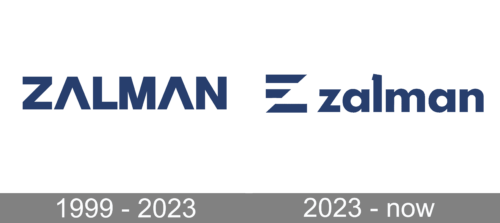
1999 – 2023
The Zalman logo which is used by the company was developed from the very outset of the company’s life. It is quite concise and simple: it’s the name of the company made in a stylish font very close to the commercial Aeonis Pro Extended Heavy. The contour of the letters “A” is changed, they have no crossbars. This straight and erect font causes the effect of straightforward visualization that allows prompt identifying the logo. Nevertheless, the wordmark is destined not only to ensure the identity of the company and make its products easily recognizable; it also had its inner philosophy. The word “zalman” translated from the Korean language has the meaning of “sufficient and satisfactory” conduct.
According to the company’s official site, there may be another explanation. The name “Zalman” is composed of two parts. The first of it is the Korean word “zal” which means “good”. Compound with the English word “man” the wordmark gives a “good man”, which underlines the company’s undertaking to make a positive impact on the society through enhancing the clients’ satisfaction.
A light tone of the azure blue colour of the wordmark should symbolize freshness and transparency. It is also linked to the spirit of innovation and progressiveness as a global corporation. The open and simple logo expresses the company’s sense of responsibility and honesty towards the society and underlines its endeavours to ensure “comfortable, abundant, and happy” lifestyle for its clients with the help of continued product development with innovative ideas.
2023 – Today

The use of the same color along with a simple logo design, make it recognizable and easy to associate with a company many became well familiar with. The designers used all lowercase letters to print the company name. It featured a bold, sans-serif font with straight cuts and clean lines. The letter “l” was an exception, as it had a serif and was cut on a diagonal at the top. Such small detail added interest and uniqueness to the logo. A stylized, capitalized “Z”, the company’s initial, was placed on the left. It had an imaginary diagonal line and two horizontal lines at the top instead of typical one line.


